Have you ever stood at the edge of the Grand Canyon and wondered about all the history of each cave or ridge? What about the multiple valleys that ultimately drain to the Colorado River? It is a daunting site to behold, but, as the winds blow past you and the hawks soar overhead, you can quickly see that just one viewpoint doesn't do it justice.
 Photo: Greg Schnell
This week's price action in the stock market reminds me that there are multiple perspectives of where we are in the stock market journey. Everyone's viewpoint is different, and that's what makes a market. Technology investors see one perspective. Commodity investors see another. Bank dividend investors are seeing a new view as well.
I went to look and see what were the top-performing industries over the last week while the banks were imploding, and it was travel and leisure, hotels, and gaming. I had no idea that the resilience of those groups could hold up a market.
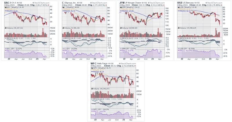
Financials:
Financials are breaking down, both big and small. Financials used to be important, but apparently they do not matter, as the $SPX touched a fresh 2023 high last week.The charts of C, WFC, and BAC don't look nearly as healthy as JPM. The regionals are bombing out, and a few might get merged this weekend. I think we have all seen the KBE and KRE ETF charts. The main point of the picture below is that JPM is holding up; the others are not.
Here is the banking index. That 2010-2023 trend looks broken. Even by just ignoring the COVID situation, this looks broke, and a test of $60 wouldn't be hard to imagine. The bottom panel shows 15-year relative strength lows.

The broker dealers, usually considered as one of the leading industries, looks better than the banks. Does the trend line hold? The PPO is going below zero again. This is a chart that suggests, to me, that this problem will get bigger.

Industrial Metals
The industrial metals commodity index by Goldman Sachs is making lower lows and lower highs since January. Is this just China managing commodity demand to load up on cheap commodities before the next run starts? That would be no different that the US government managing oil pricing by releasing the strategic petroleum reserve. So this isn't taboo, but other nations do it on a lot more commodities than just oil.

Crude Oil
Crude oil continues to struggle. That rally last Friday was just that. It was so-o-o last week, as crude slid below $65 this week. Before market open on May 5, this chart shows crude down 10% on the week, and that isn't even the bottom of the candle.

$SPX Price Earning Ratio
The price/earnings ratio for the stock market, sitting up near some of the most stretched extremes in history, was barely discussed at the CMT Association meeting. Purple is current, and the other three lines are where it would be based on lower P/E ratios. We have lived in a stretched world since 2014, so why would that view matter now? I show this chart to demonstrate that, if we reverted to 20, we would be below 3500, and if we reverted to a P/E of 15, 2600 is in play. It is not uncommon for recessions to cause a valuation reset of the market broadly.

Bonds and the Yield Curve
At the CMT Association meeting, the yield curve or the history of the yield curve was never mentioned in any of the conversations and presentations I sat in on. It didn't fit with the bullish narrative of the $SPX and $NDX at 2023 highs. By the way, most portfolio managers think we are going much higher (but don't mention the yield curve).
Actually, I was amazed that no one even mentioned it, even though the whole bank valuation issue right now is hold to maturity (HTM) bonds. Bonds are the problem, not the equity market.
The real deal is bonds add another perspective, much like the Grand Canyon viewpoints. Change any one viewpoint and it looks totally different. We find an entirely different view over in the yield curve. Bonds are one of the four major asset classes, but only Louise Yamada ventured there, showing a 40-year break of the interest rate trend line for long bonds.
The current yield curve did not seem to matter, nor did the history of the yield curve. So let me add a few yield curve charts here. The vertical line on the right side at year 2000 is the top yield curve line on the left. The vertical line at 2007 is the bottom yield curve line on the left.

So what does the yield curve line look like right now? It is the bottom line on this chart below, comparing with the 2000 top. They look similar to me.

Why does that matter? Let me use another chart to explain what is happening. The 30-year yield is now higher than the middle or the belly of the curve. This is changing rapidly as the yield curve starts to realign. If you look on the right side in the zoom panel, the 30-year yields are starting to hold above the middle of the curve yields. The 30-year yield may cross above the 2-year soon. But look at the congestion zones when the yields get tight. The equity market response is shown as this starts to broaden out. $SPX is on the lower panel.

Fed Rate
Now that a large portion of money managers assume the Fed is done raising rates, where does this leave us? The chart that makes a big impression on me is the rate of change of the Fed funds rate, shown in green in the lower panel. This isn't the rate of change of something like lumber. This is the rate of change for one of the most tracked interest rates in the world.

The assumption that the entire business world can adapt rapidly to absorb one of the fastest rate changes ever does not seem plausible to me. As this rolls through boardrooms across the world, when will it crack the equity market investors? So far, the equity markets are not blinking.
I am on another viewpoint -- wide-eyed, staring over my view, suggesting something is amiss and about to fall sharply. Will it happen in May or June? Or will it take until October? I don't know, but I don't see this working out 'perfectly' as we try to go to take out the 2021 highs.
To me, it looks like a setup we should be cautious of. When the market continues to struggle to make higher highs here after six weeks, is this just a consolidation? Or is it a final realization that it's about to get messy?
If you would like more perspectives on this, I'll be holding a monthly conference call for clients on Sunday. At Osprey Strategic, you can try out our services for just $7 for the first month. I'm a big fan of protecting capital until the time is right to step back in. Day traders need not test the waters. They won't find anything they like there. This is for investors with large amounts of capital with the wisdom and patience to wait for a better backdrop.
Good trading,
Greg Schnell, CMT, MFTA
Senior Technical Analyst, StockCharts.com
Author, Stock Charts For Dummies
Want to stay on top of the market's latest intermarket signals?
– Follow @SchnellInvestor on Twitter
– Connect with Greg on LinkedIn
– Subscribe to The Canadian Technician
– Email at info@gregschnell.com


