This week, I thought we'd revisit an article I wrote way back in November of 2001 about the "Six Steps" you can take at StockCharts.com to quickly guage the overall health of the market and find great stock opportunities. While the graphs are all out-dated now, the concepts are still very valid and hopefully helpful. Enjoy! - Chip
We get lots of questions about what the best way to use StockCharts.com is, so this week I thought I'd incorporate one answer to that question into the newsletter. While there is no 100% best way to use all of the resources that StockCharts provides, here's the routine that I follow at least once a day. Its goal is to offset all of the panicky, rush-rush information that the financial media spits out with a calm, top-down approach to market analysis. It incorporates all of the major tools on StockCharts and provides me with my technical "feel" for what's really happening to the markets. Here are my steps:
Step One - Gauge the Performance of the Major Markets
Up, Down, or Sideways? The market has to be moving in one of those three directions, right? So which way is it? Often, the media will mislead you badly when it comes to answering this simple question. As always, it boils down to time frame. Are you looking at the last minute, hour, day, week, month, year or decade? Each timeframe often has a different answer from the next. To deal with this question, I always start with our Major Market PerfChart.
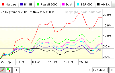
The key to using the tool correctly is to s-t-r-e-t-c-h the slider! Don't just stare at the chart like a zombie! Grab your mouse, grab the left edge of the slider at the bottom of the chart (see where my cursor has turned into a double-arrow in the picture above?), and start stretching! Find the major turning points in the market and stretch or shrink the slider until they are at the left edge of the chart. Only then can you really see how the major averages have done. By boiling everything down to percentages, uptrends and downtrends become clearer as does the other critical thing to look for - divergences. In early 2000, the blue chip averages diverged sharply from the high-tech stocks, signaling trouble ahead. Stretch your slider until you see this divergence clearly. It's the best argument I know of for checking this chart religiously.
After getting the longer term performance picture, press the F1 key. Boom! There's the last week in a nutshell. Now press F2. Bang! There's last month for ya. Finally - you guessed it - F3. Ka-blammo! Year-to-date in one pretty picture. Always start with this chart and don't leave it until you have a firm grasp of how the major averages are doing.
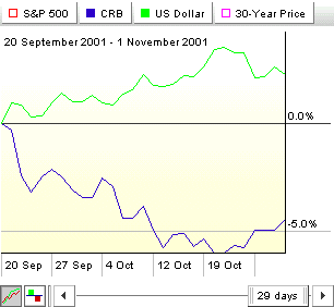
Step Two - Examine the Intermarket Picture
Bond prices, Commodity prices, and the Dollar all affects stock prices. And stock prices affect them. And they all affect each other. John Murphy has written about these intermarket linkages extensively. We maintain a special "Intermarket" PerfChart just for studying these linkages - specifically seeing whether each of these things are moving in tandem or moving apart (diverging). As we explain below the chart, you should look to see if three key things are happening: Are stocks and bonds moving in the same direction? Are commodities and bonds moving in different directions? Is the Dollar moving in a different direction from commodities?
Step Three - What's Sector Rotation Saying About the Economy?
Last week, we talked about Sector Rotation and the PerfChart that we use to analyze it. By "reverse engineering" the state of the economy from the strength of the various sectors, you can stay 2-3 months ahead of those big-whig economists and their lagging Government reports. Read last week's newsletter for more details.

Step Four - Study the Yield Curve
January 26th, 2000. That's when the one of the best signals for a looming market top was given. On January 26th, 2000, the Yield Curve inverted. Our Dynamic Yield Curve analysis tool shows this clearly. Never, never, never ignore the Yield curve. It can also be used to confirm the state of the economy from your Sector Rotation analysis. See the bottom of the Sector PerfChart page for details.
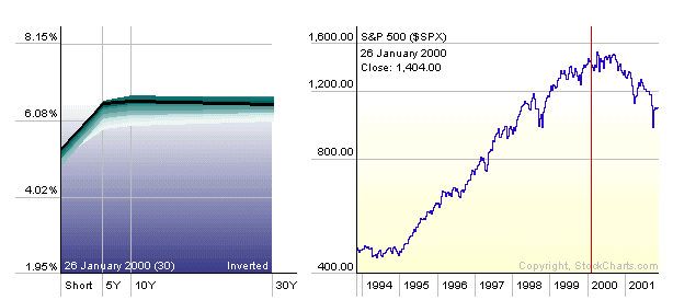
On the live version of this chart, don't forget to click around on the S&P part to see where the yield curve was at that point in time.
Step Five - Does Market Breadth provide Confirmation?
OK, by now you should have a good sense of where the markets are and where they may be headed. Now, study the market breadth charts and see if they support your conclusion. Many people like to start their analysis with breadth charts like the Advance-Decline lines, the McClellan Summation charts, and the Bullish Percent Indices. I think that is a mistake. Since the markets are the subject of this whole endeavor, they should be studied directly. Secondary data like breadth and volume should be "held in reserve" to confirm or dispute the analysis of the primary data - i.e. prices.
That said, now is the time. I LOVE THE BULLISH PERCENT INDICES! They are unlike anything else out there in that they summarize the price action of hundreds of charts, boiling them down to a percentage. What could be simpler? You don't even need to understand P&F charting to use these things! Our Bullish Percent CandleGlance page has everything you need. I look at it every evening.
The McClellan charts that we get from the good folks at DecisionPoint.com are the perfect compliment to our BPI charts. I'd never bet against the Summation Index. When it changes direction, the market's current trend is in doubt.
Step Six - Creating the "Hot/Not" List
OK, we've developed a solid understanding of the big picture (the market), now we can drill down with confidence and the Sector Market Carpet is where I go next. Updated throughout each trading day, the carpet shows me at a glance which sectors (and stocks within those sectors) have done well during the past day, the past week, and the past month. It's almost like seeing an X-ray of the S&P Sector PerfChart.
Some things I look for: Within each sector, do the brightly colored square (red or green) cluster towards the upper left corner of the sector (where smaller-cap stocks are) or do they cluster towards the lower right corner (the mega-caps)? Are there any sectors with (for instance) one or two bright-red squares with the remained light green (and thus the sector's overall rating could be misleading). How does the carpet change when I switch it to absolute RSI mode (select RSI from the dropdown, unclick the 'Delta' button - see the instructions page for details)? Next, I switch to RSI Change mode for the current week (click the 'Delta' button and then press F1). Which sectors (look at the number in the upper right corner of each sector's area) had the best improvement in overall RSI? Which stocks in those sectors led the way?
All of this visual carpet information goes into the making of my tentative "Hot/Not" list - stocks that I think are worth additional investigation. When I spot a promising stock that's part of a sector that, based on the previous steps, also looks promising, it goes on this list.
The Real Work Begins At the End
After completing these six steps, I am ready to analyse my Hot/Not list in detail using one or more of the more common TA techniques - P&F signals, chart patterns, support/resistance, Elliot Wave methods, candlestick signals, stock scans, indicator signals, etc. (all covered in our ChartSchool). Many people start their analysis process by using these techniques on individual charts. I think that is also a mistake. By taking the time to develop and confirm a sense of where the markets and sectors are going before looking at individual stocks you will always have the big picture in mind and can add the calm voice-of-reason to your investment decisions.
Again, there are hundreds, even thousands of different ways to look at the markets. This technique is only one of those ways. I offer it in the hopes that you'll take it and use it as a starting point for developing your own analysis routine that builds upon these ideas. Good luck!


