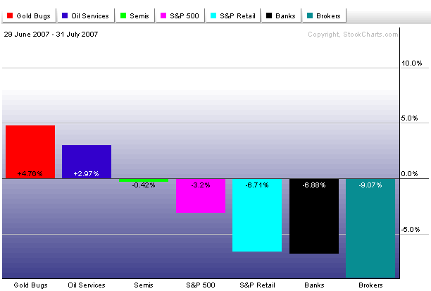
The chart above shows "John's Latest Performance Chart" that reflects the market's stronger and weaker groups during the hightly volatile month of July. All are plotted around the S&P 500 which lost 3.2% during July. [The S&P can also be plotted as a zero line]. The bars to the left of the S&P did better than the general market. The two top gainers were gold and oil service stocks. The AMEX Gold Bugs Index ($HUI) gained 4.5% in the face of a severe market downturn. Oil Service stocks held up well on the back of rising oil prices (although the've started to slip during the first week of August). Semiconductors lost a small -.42%, but held up better than the S&P. The bars to the right show where most of the weakness has been. Brokers, banks, and retailers were among July's weakest groups. [Homebuilders and REITs were even weaker]. I did a story on Thursday about how relative weakness in retailers was tied to housing problems. The beauty of the performance bars is that they can tell us in one picture where investors might be looking to invest (like gold) and what to avoid (financials, retailers, and anything tied to housing). That juxtaposition of the performance bars also carries a negative warning for the stock market.