Hello Fellow ChartWatchers!
A while back, demonstrated the concept of the Moving Average Ribbon here as a way for seeing the "waves and ripples" for any stock. The concept is simple - just plot lots of Moving Average overlays on the same chart but change the period for each MA by a fixed amount.
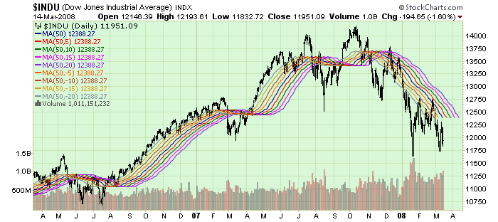
Many people really liked that concept and many people still use it in their daily analysis. Here's a different take on that same concept - the Displaced Moving Average Ribbon:
(StockCharts members can click the link above to see exactly how the chart was created.)
Just like the MA Ribbon, the Displaced MA Ribbon plots several Moving Average overlays on the same chart, only this time each MA has the same period BUT the offset for each MA is increased/decreased by a fixed amount. For those who aren't familiar with it, the Moving Average overlay on SharpCharts can take a second, optional parameter which represents the offset (positive or negative) for a moving average. For example, if you specify "50,5" as the parameters for a MA, SharpCharts will plot the 50-day Moving Average line and then shift it to the right by 5 periods. Similarly, "50,-5" shifts the MA line 5 periods to the left.
The Displaced MA Ribbon can help you see when a stock's current trend is "running out of steam" - if all of the lines are marching in step, things a great and the current trend should continue. When the lines start to get "tangled", it's time to re-evaluate things.
In the example above, I choose to use a Simple Moving Average with a 50-day period and displacement offsets of 5 periods. All of those things can be adjusted to suit your situation. You may find that a ribbon based on 20-day EMAs with 10-period offsets works better. That's great! Experimentation leads to familiarity and then to trust - and you need to trust an indicator before you can trade with it.
While I personally prefer the original MA Ribbon, the Displaced MA Ribbon can provide a different perspective on things and can help alert you to trend changes you might otherwise miss.


