With all the changes happening in the financial world right now it's gotten really hard to keep up with the latest news. This bank is failing. That company is merging with this one. That sector is over exposed to the credit crunch. Etc., etc., etc.
One of the great things about technical analysis is that it works REGARDLESS of market conditions - you just have to remain calm and understand how to use the tools at your disposal.
In this case, as always, a great place to start is our S&P Sector Market Carpet. Here are all the stocks that make up the nine S&P sector ETFs in one easy-to-use display. By using the slider at the bottom, you can quickly see which sectors and stocks have been weathering the current storm the best. It is like a "visual Scan Engine."
Let's look at the long-term view of the current MarketCarpet:
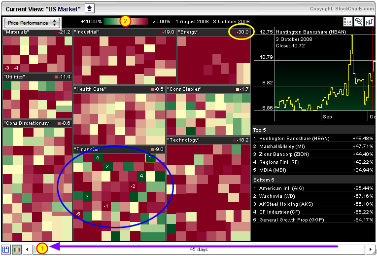
To create this chart, click on our "Market Carpets" link, then select the "S&P Sectors Carpet". Initially, you'll see a short-term view of things - two days long to be exact. But we are interested in the long-term situation. So the first thing to do is to use the mouse to drag the left edge of the slider at the bottom of the chart all the way over to the left side where "#1" is (see the purple arrow?). That will give us the Price Performance comparison for the past 45 days.
There is still a problem however. The carpet is almost all solid red or solid green. That's because the color scale at the top of the chart only goes from +5% to -5%. Since we are looking at a long term chart, we want to expand that color scale. Simply click where #2 is and the scale will expand to show +20% to -20%. Now there isn't as much solid red and solid green. That's all it takes to set up a long-term MarketCarpet.
There's still a bunch of solid red on the chart. Notice how Energy stocks in particular have been hammered. The stocks in that sector are down 30% on average (see the yellow circle?). Even though there are bigger losers in other sectors, the Energy sector has been hit the hardest over the past 45 days. The Materials sector is down 21.2% and Tech stocks are down 18.2%. Ouch.
But wait - what about all those bad Financial stocks we've been hearing about? The carpet shows that the story with Financial stocks is mixed and very volatile. Mixed in with the big losers like AIG and Wachovia (WB) are huge winners that you never hear about like Huntington Bancshare (HBAN) and Marshall & Isley (MI). Simply click on any of the green squares in the blue circle to see what those charts look like.
And what is the "strongest" sector these days? Not surprisingly, Consumer Staples is down the least - just 1.7% on average. Even though none of those stocks show up as big winners or losers, the lack of huge swathes of red in that sector really stands out.
The MarketCarpet shows you the "landscape" of the market. Don't forget to use it on a regular basis when looking for strong and weak stocks.
-- Chip


