Hello Fellow ChartWatchers!
Early last year, we added Dr. Alexander Elder's Impulse System to our SharpCharts charting package and it has proven to be quite popular. This is the system that colors the price bars red, green or blue depending on two criteria that Elder feels are very important:
1.) Is the 13-day exponential moving average moving higher or lower?
2.) Is the MACD Histogram moving higher or lower?
If both of those conditions are true, the corresponding price bar is colored green (indicating bullishness). If both of those conditions are false, the corresponding price bar is colored red (indicating bearishness). If the signals are mixed, the price bar is colored blue (indicating uncertainty).
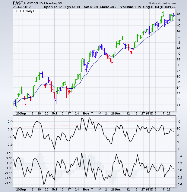
Here's an example of an Elder Impulse System chart:
(Click the chart to see a live version)
As you can see, prices for FAST have generally moved higher after the first green bar appears (at least for a couple of days) and lower after the first red bar appears (again, at least for a couple of days). The bullish moves that started on October 18th and December 18th are particularly impressive.
(How did I find FAST as a good bullish example? Easy - its SCTR number was over 99!)
Some people have asked if we could change the Elder Impulse System's parameters or provide more insight into what is happening when the bars are blue. If we change the system's parameters, then it would no longer be the Elder Impulse System. That said, it is possible to create your own system with your own parameter by using the two indicators that I've included at the bottom of the chart above.
The first indicator shows the slope of the 13-day EMA. It was created by plotting a MACD with parameters of 13,0 (faint red line) and adding the Slope overlay (black line) on top of it. If the black line is above zero, the 13-day EMA is rising. If the line is below zero, that EMA is falling.
The second indicator shows the slope of the 12,26,9 MACD Histogram. If the black line is above zero, the histogram is rising. If it is below zero, the histogram is falling.
Notice how when both indicator lines are above zero, the corresponding price bars are colored green by the Elder system. Similarly, when both lines are below zero, the corresponding price bars are colored red. That confirms that these indicators are working for the standard Elder Impulse System parameters.
OK, now that you've seen how the indicators on that chart correspond to the colors on Elder's Impulse system, you can - if you are a StockCharts member - change the parameters of those indicators to create your own custom version. The colors of the bars won't change - instead you can visually determine when both indicator lines are up and when both are down.
Alternately, you can use the chart above to see what is happening when the Elder bars are blue. That may help you anticipate whether the bars will next turn green or red.
The Elder Impulse System is described more in our ChartSchool area. It was originally described in the book Come Into My Trading Room. All of Dr. Elder's terrific books on trading can be seen here.
- Chip
Note: The original version of this article incorrectly stated that the first criteria compared prices to the 13-day EMA. Instead, the slope of the 13-day EMA is used.


