The Chartwatchers newsletter is an interesting one. On all the other blogs, we write whenever we see something interesting on a daily basis, but the ChartWatchers newsletter is unique. With a different audience and a release period two to three weeks apart, it earns a unique perspective.
So when I have a story to tell in a few charts in Chartwatchers, it forces me to be very selective. What is the most compelling 'One picture is worth a thousand words' chart? Today, I came across Utilities. Really. Utilities? Let's go deeper.
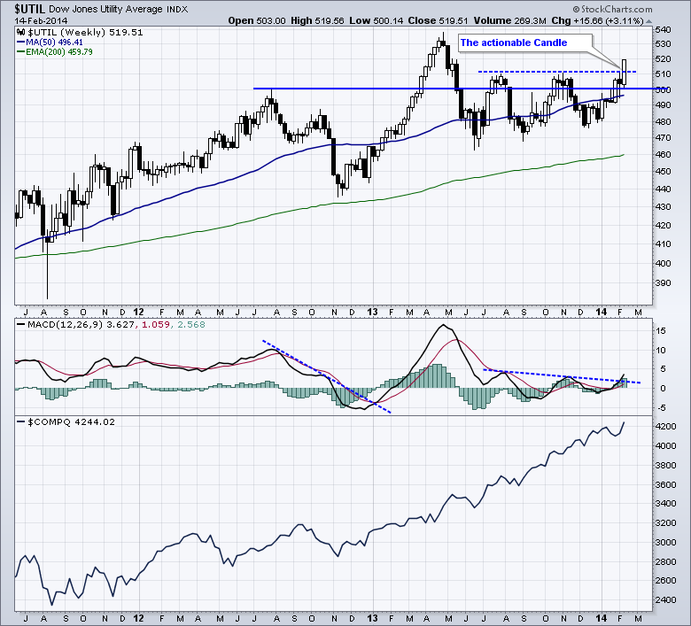
I want to spend a minute and talk about how charts change. Sometimes, every sector rises but the super strong growth sectors make new highs before the other sectors. In a bull market we expect Consumer Discretionary, Technology, Industrials to be running and leading. In weak markets, defensive sectors rise faster as investors (think institutions) look for stable and predictable earnings. So when everything is making higher highs, Utilities might too. However, when a chill comes into the markets, growth stocks tend to go flat or down while the defensive sectors like Utilities start to move above the 40 WMA, make new 6 month or 1 year highs well before the other sectors are challenging their recent highs. That is the picture we have today. In the chart below, I have posted a weekly chart of Utilities. What is remarkable is that Utilities touched a low level during this week that the Utilities chart had also touched in July 2012. The lower pane is the $COMPQ. Notice what low price level the $COMPQ touched this week and compare it to the price area back in 2012. The Utilites enjoyed the ride off the Nov 2012 lows for a while, and then it spent 10 months oscillating around the 500 Level..
You can see in April May June of 2012,the equity market rolled over but utilities kept surging.
Now we have the $UTIL breaking out from the long horintal resistance for a new push. The only actionable candle on a chart is the current week. All the rest are historical records. While the main markets are trying to take out their previous highs, the $UTIL chart looks engaged and breaking higher in a breakout above 9 months of resistance on this actionable candle. While the $COMPQ has made higher highs and is still making new highs, the defensive stocks are adding the power. The probability rises that the growth sectors may pull back.
The $INDU is well behind trying to exceed recent highs(not shown). Seeing the $UTIL chart in breakout mode and the REIT sector and bond sector start to power above their 40 WMA, suggests something is changing.
That is the most powerful message I can send in Chartwatchers this week. An investor might not go all defensive but defense could be starting to hold a larger percentage in a portfolio until proven otherwise.
Good trading,
Greg Schnell. CMT


