Hello Fellow ChartWatchers!
Is the market too expensive right now? Our P/E ratios for the various market indexes can show you the answer to that question. Currently, we have P/E values for the following indexes:
- The Dow (!PEDOW)
- The S&P 500 (!PESPX)
- The S&P 100 (!PEOEX)
- The Nasdaq 100 (!PENDX)
These symbols are updated on a daily basis after the market closes. Basically, we add up all the prices (i.e., closing values) for each stock in those groups and then we divide that total by the total of the TTM Earnings value for each of those stocks. We store the results in the appropriate database and voila!
OK, so let's chart these bad boys and see what they can tell us about current market conditions:
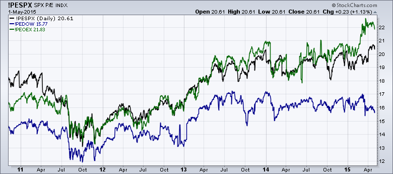
This chart shows the P/Es for the Dow, the SPX and the OEX going back to late 2010. Unfortunately, if we go back much further, things start to get jumbled due to the echos of the 2008 Financial Crisis. Late 2010 is where these charts start to become useful again. In addition, you'll notice that I've left off the Nasdaq 100 P/E graph. The Nasdaq 100 P/E numbers are much higher than these P/E numbers and that makes sense considering the higher P/Es of the companies than make up the tech-heavy Nasdaq.
So what is this chart telling us? First off, the P/E for the S&P 100 (green line) has recently surged up to around 22 - higher than it has been in quite some time. Similarly, the P/E for the entire S&P 500 (black line) has also moved higher recently and is retesting the high it set at the start of 2014. Finally, the P/E for the Dow Industrials (blue line) has been treading water for months now and is actually towards the bottom of its recent range.
So how does this compare the "historical norms?" Well, unfortunately, our historical data for all of these symbols only goes back to the middle of 2004 (and, as I mentioned, the data from 2008-2010 is jumbled). Here's a chart of the pre-Crisis years:
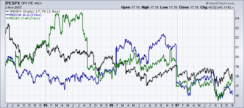
So we can see that - under "normal" conditions - the OEX P/E has been as high as 25 and the Dow P/E has been as high as 22.5 which suggests that the current P/E values for those indexes are not unusually high at all.
There's good news with respect to historical data for the S&P 500's P/E chart. We have data for its P/E ratio going back all the way back to 1926(!). You can see several historical charts of the S&P 500 and its P/E ratio in our Historical Chart Gallery - yet another "hidden gem" on our website. Here's the current version of the S&P P/E ratio chart (click to see the full-scale version):
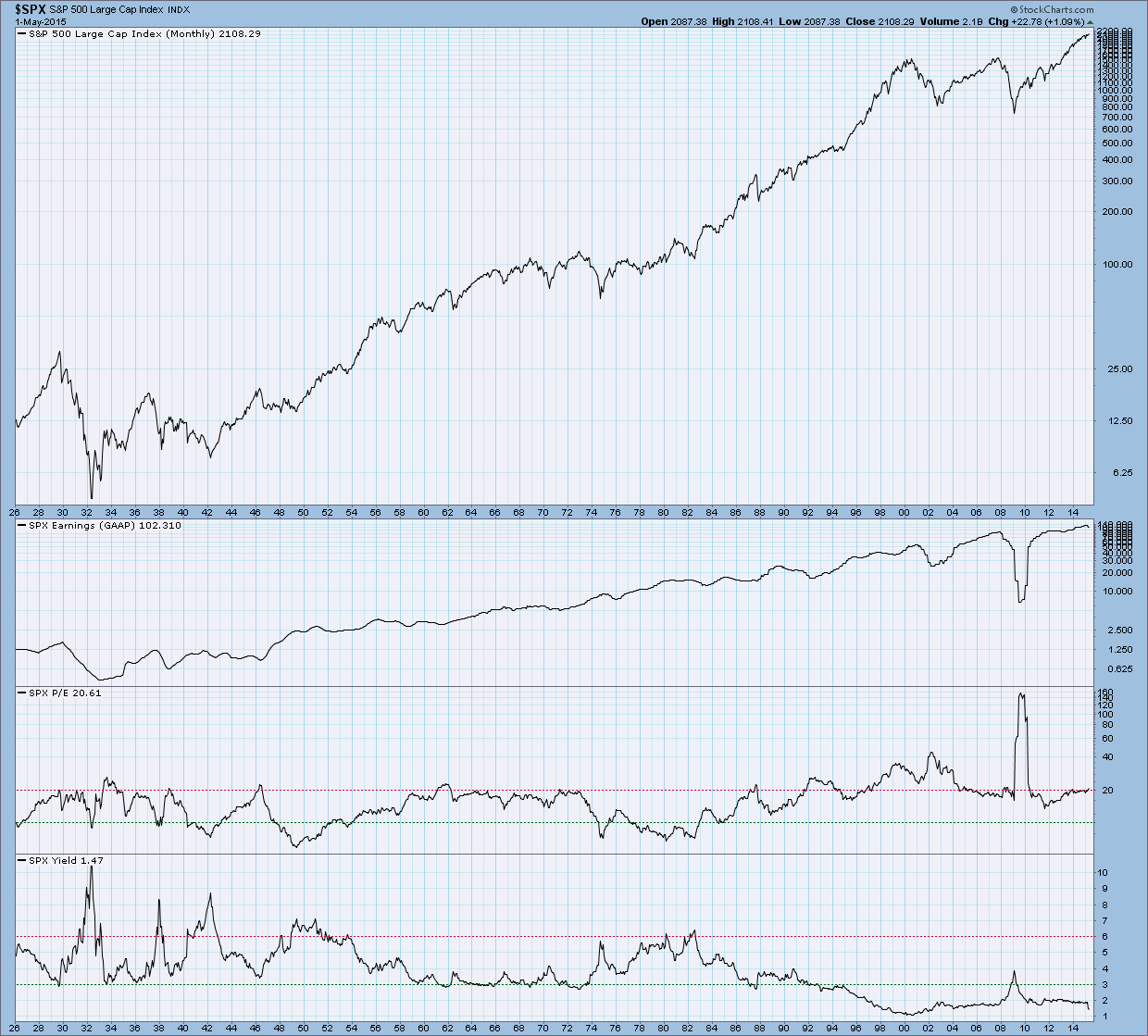
On this chart, the S&P 500's P/E ratio is the second line from the bottom of the chart. You can see that - excluding the Financial Crisis - the number has stayed near 20 since 2004. You can also see that it hovered near 20 for the entire 1960s. Based on this chart, I think it is fair to say that 20 is the "new normal" for the S&P 500's P/E ratio. Given that, the current value (20.61) seems fine. Looking at the data around the time of the "Dot Com" bubble, it looks like readings above 30 would be cause for concern.
Here's a list of the other P/E ratio datasets that we track. Next time, I'll drill down into the Sector P/E charts!
- Chip


