|
|
 In the previous RRG blog, I introduced the availability of pre-populated groups holding individual equities for each of the ten S&P sectors. This addition makes it much easier for users of the Relative Rotation Graph tool on Stockcharts.com to drill down to the individual equity level from asset class and/or sector level.
In this article, I want to grab the bull by the horns and zoom in on the current equity rotation inside the Energy sector (XLE).
Summary
- XLE leading the market and the only sector inside the leading quadrant
- Watch XLK and XLY for a rotation back up to leading
- HES and MRO breaking out while showing strong rotations inside leading quadrant
- Not owning XOM and CVX is the key to outperforming XLE now
At sector level
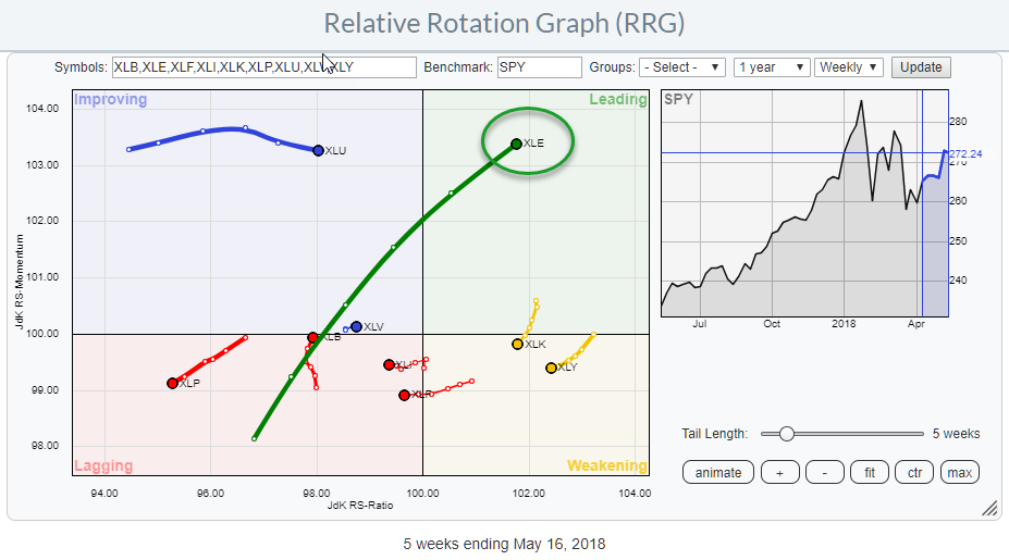
The Relative Rotation Graph above shows the rotation for the ten S&P sectors against SPY. Without a doubt, the Energy sector (XLE) is drawing the most attention.
A big move in an almost straight line from lagging, through improving into leading in four to five weeks while showing a long tail and continuously at a positive RRG-Heading (0-90 degrees).
At the moment the Energy sector is the only sector inside the leading quadrant and only one of three at the right-hand side of the graph (JdK RS-Ratio > 100). The other two sectors in a relative uptrend against SPY are XLK and XLY which just dropped into the weakening quadrant.
The tails for XLK and XLY are relatively short and they are still relatively far away from crossing below 100 on the RS-Ratio scale which means that it is very well possible that both sectors are going through a corrective move within a longer-term rising relative trend.
It is definitely worthwhile keeping an eye on the rotation for XLK and XLY in coming weeks and be on the lookout for them to curl back up while still inside weakening. A tail rotating into a 0-90 degree heading would be a potential re-entry moment.
Energy Select Sector SPDR Fund - XLE
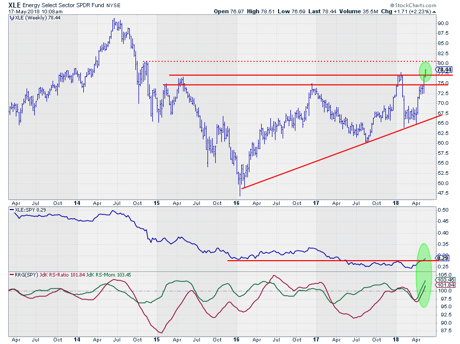
The strong rotational picture on the RRG is fully backed by strong developments on the price and relative charts.
On the weekly price chart above, the area between $ 75-77.50 was an important resistance level which has just been taken out. There is now a minor resistance level around $ 80 but beyond that, it is all the way up to $ 90 where the 2014 peak is expected to kick in as resistance.
The relative strength line has been predominantly moving lower from 2014 onwards with the exception of 2016 when XLE outperformed SPY.
The recent relative improvement for XLE has caused the RS-Line to rally above its previous peak, breaking the rhythm of lower highs and lower lows. This level also happened to be an important former support level which acted as resistance since RS broke below it halfway through 2017.
The improvement in relative strength had already been picked up by the RRG-Lines as the Jdk RS-Momentum lines crossed above 100 a few weeks ago and was recently followed by the RS-Ratio line, putting the sector comfortably inside the leading quadrant and still pushing higher.
Down to individual equity level
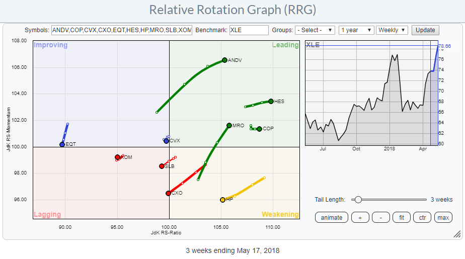
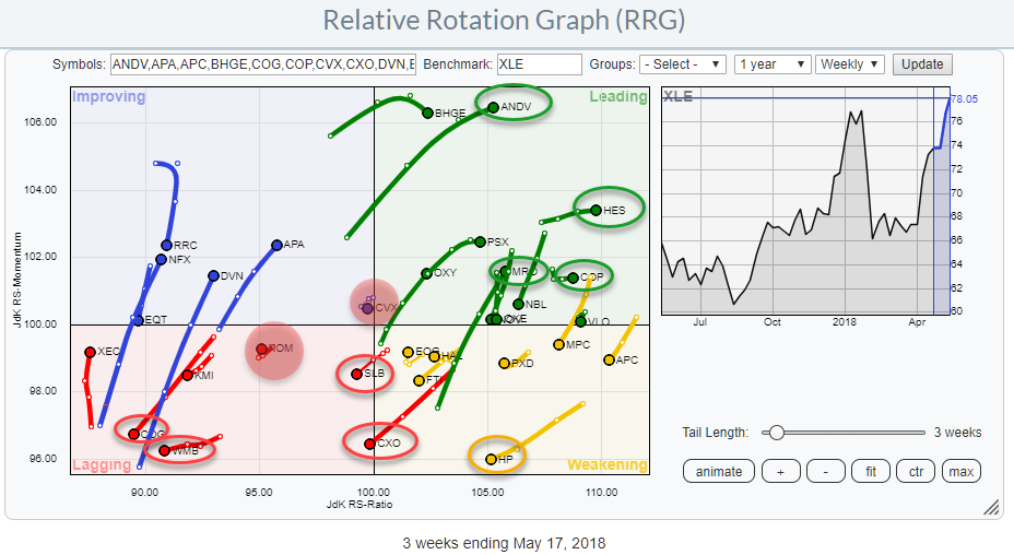
The RRG above is the same, individual energy stocks against XLE, as the one at the top of the article. But here I have zoomed in on a few stocks which' rotations, IMHO, are worth watching more closely.
In the weakening quadrant, it is HP rotating towards lagging. I am keeping an eye on this stock as it could be a corrective rotation with HP curling up towards leading again without reaching the lagging quadrant.
The catalyst for such a move could be an upward break out of the ascending triangle that is currently put into place on the price chart.
SLB and CXO are crossing over into lagging at negative RRG-heading so I would avoid those as more underperformance is likely in coming weeks.
Inside the improving quadrant, the direction of EQT is sending negative signals as it turned down sharply after only a short period inside improving and now close to crossing back into lagging again.
The leading quadrant shows a few stocks with good potential. ANDV has a long tail, indicating strength and strong JdK RS-Momentum. Although it is, undeniably, a strong stock with a strong relative picture, I would be reluctant to pick it up now as it rallied very fast and very far which makes it unattractive from a risk/reward perspective.
Also in leading is COP which is a situation similar to ANDV. A strong relative picture a strong rotational pattern on the RRG chart but already had a big run making it less attractive to pick up at this time.
Hess Corp. - HES
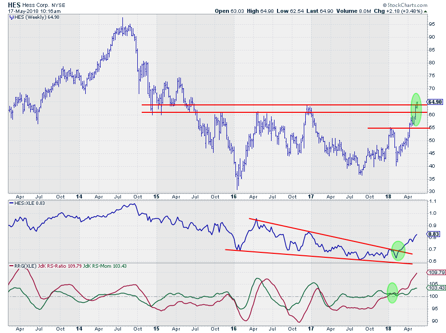
HES is found inside the leading quadrant, pushing higher on the RS-Ratio scale and mildly rising on the RS-Momentum scale.
An inspection of the price/relative charts backs up a positive view for this stock. Developments in relative strength have caused HES to rotate into the leading quadrant in the first place but the way it happened is interesting.
The raw RS-line shows a break out of a big falling wedge pattern a few weeks ago which basically signaled the end of the relative downtrend that had been in play since mid-2014. This upward break caused the RS-Ratio line to break above 100 and join the RS-Momentum line, which had been in positive territory already since Q4-2017, and push HES into the leading quadrant.
HES is breaking above major resistance on the price chart which will very likely add new fuel to the rally enabling the stock to continue its strong rotation going forward.
Marathon Oil - MRO
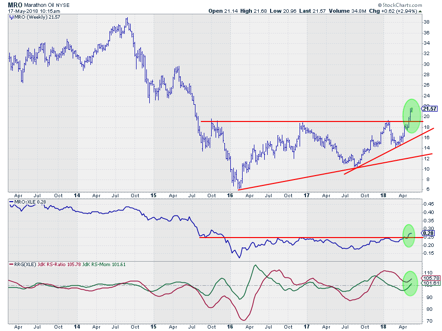
MRO is also found inside the leading quadrant but at a much stronger momentum based move. Relative strength for MRO just broke above a horizontal resistance level which is clearing the way for more relative upside in coming weeks.
Looking at the RRG-Lines we can see that MRO rotated into the leading quadrant at the end of 2017 when the RS-Ratio line crossed above 100. At the beginning of this year, RS-Momentum dropped below 100, pushing MRO into the weakening quadrant but only for a short period of time.
The strong rally that emerged out of the $ 14, higher, low on the price chart caused RS to improve and break higher and this is now pushing RS-Momentum back above 100 and MRO back into the leading quadrant from weakening, which is usually a strong sign.
Combining this improvement in relative strength with the break above major resistance on the price chart, make MRO one of the strongest stocks inside the Energy sector for now.
Exxon Mobil Corp. - XOM
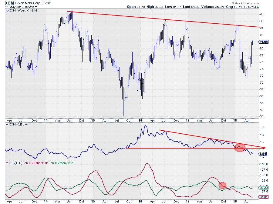
At almost 22% weight inside the Energy sector, XOM is one of the big ones and only that would be reason enough to pay attention to its movement.
The chart above does not show a pretty picture. Over the past years, all major highs came in at lower levels and the falling trend line connecting all these lows is now causing major resistance to come in around $ 86 which limits upside potential from a price perspective to begin with.
Looking at the relative charts does not make me happy either. The downtrend in RS, since early 2016, is clearly visible and was confirmed with the recent break below horizontal support.
On the RRG, XOM is already camping inside the lagging quadrant since October last year with two, failed, attempts to rotate into improving (green RS-Momentum trying, but failing, to break above 100).
The short tail on XOM indicates a stable position, albeit negative vis-a-vis XLE
Chevron Corp. - CVX
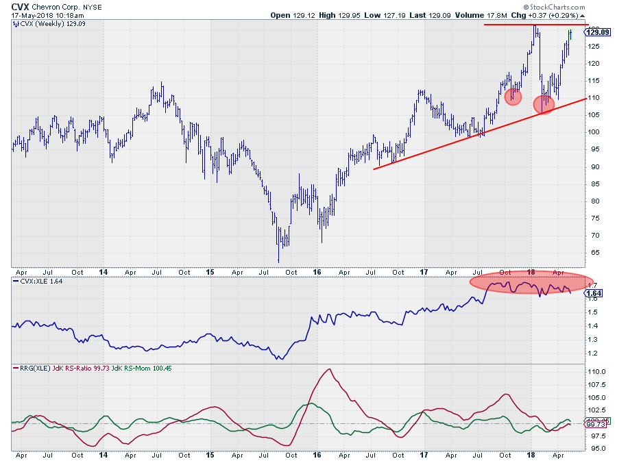
The other big name in the Energy sector is CVX at a little over 17% in weight. But here also the price and relative charts are, to put it mildly, not the best in this sector.
The price chart in 2018, so far, is characterized by big swings but a flat performance. $ 130 is now an important resistance level to watch but given the steep move from early April onwards, it is doubtful if enough price momentum is left to break this barrier right away. I am looking for additional supply to kick in at current levels.
The relative strength line shows a sideways to rounding-top like pattern which is hard to take as a positive sign, As a matter of fact, a break of the RS-Line below its most recent low will complete that top formation and very likely trigger a downward acceleration of relative strength.
On the Relative Rotation Graph, CVX is inside the improving quadrant but very close to the center (benchmark) of the chart and rolling over downward towards lagging again.
The limited upward potential on the price chart and the continuing threat of relative strength rolling over and accelerating downward make CVX a stock that's better avoided for the time being.
Beating the sector by avoiding the big boys
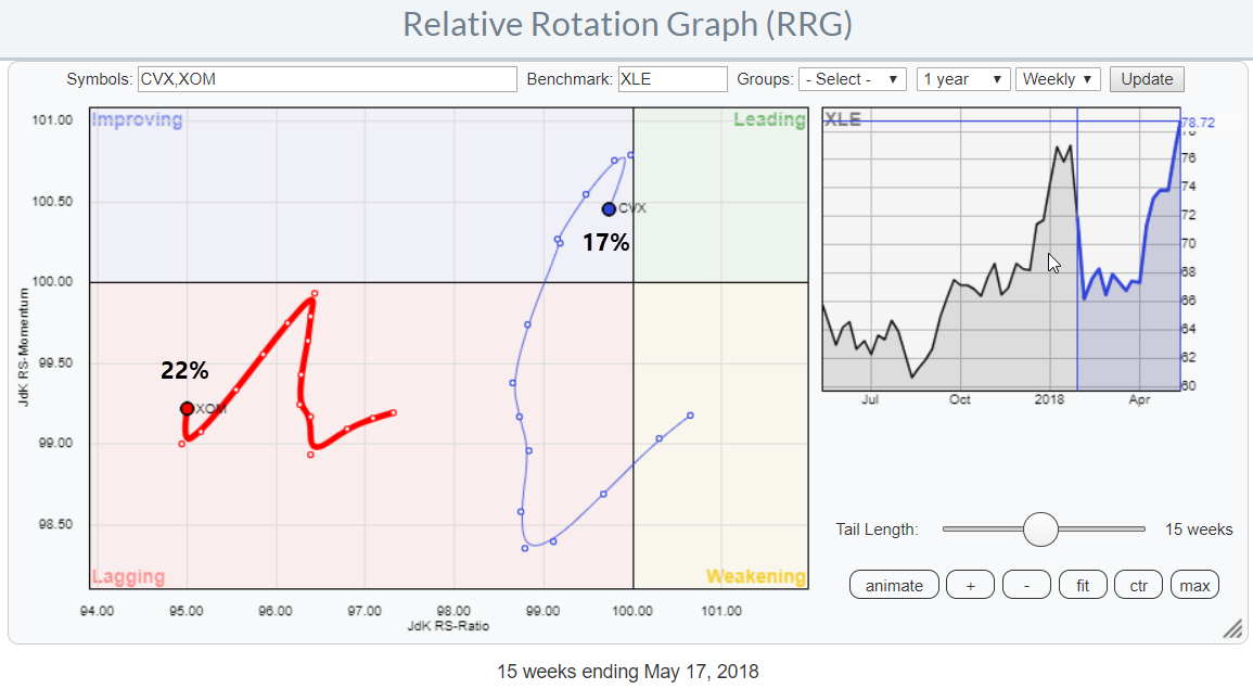 This RRG shows the rotations for CVX and XOM. Together they are almost 40% of the sector and following the analysis of both stocks above they are both expected to underperform XLE in the weeks to come.
From an investment/trading perspective, this means that NOT owning XOM and CVX is the key to beating the (sector-) benchmark, XLE.
Let me know what you think of this usage of RRG in the comments? If you want to receive a notification when a new article in the RRG blog is published? Simply "Subscribe" and leave your E-mail address.
Julius de Kempenaer | RRG Research
RRG, Relative Rotation Graphs, JdK RS-Ratio, and JdK RS-Momentum are registered TradeMarks ®; of RRG Research
Follow RRG Research on social media:
If you want to discuss RRG with me on SCAN, please use my handle Julius_RRG so that I will get a notification.


