Editor's Note: This article was originally published in Martin Pring's Market Roundup on Monday, September 16th at 6:04pm ET.
First of all, Chart 4 features the NASDAQ bullish percentage. You can see how it has been gradually working its way lower since early 2018, having fallen from a heady reading of 70% to a more modest current reading around 50%. That now leaves plenty of unrealized upside potential before becoming overstretched. This indicator has already managed to clear its 20-day MA, but the barrier that I am really interested in is that green downtrend line, which is quite lengthy and has been touched on numerous occasions. Consequently, its penetration would represent a powerful signal of market strength. Such a break would suggest that the number of stocks in a positive trend would expand. That kind of condition almost invariably translates into a higher NASDAQ as well.
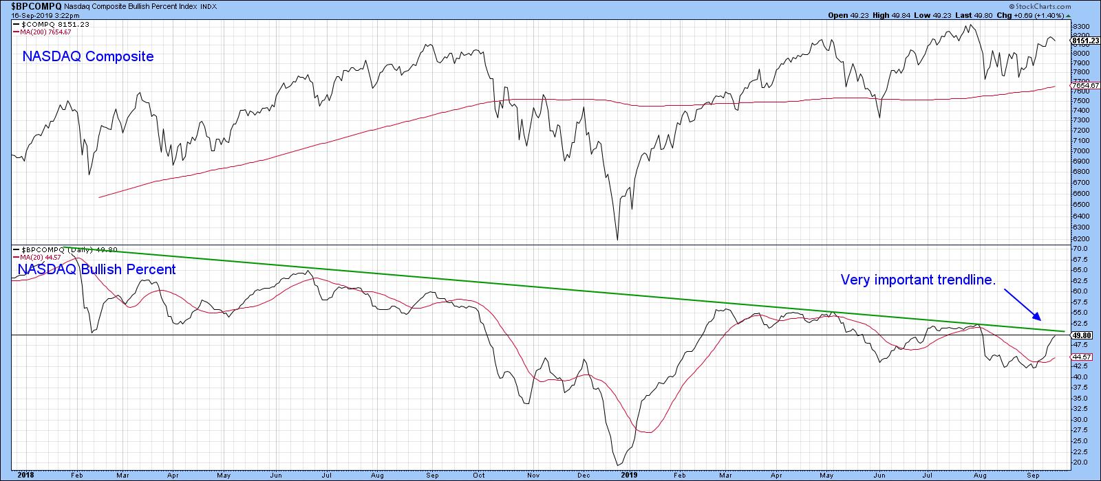
Chart 4
By way of encouragement, Chart 5 shows that the McClellan Oscillator for the NYSE has already broken above an equivalent downtrend line.
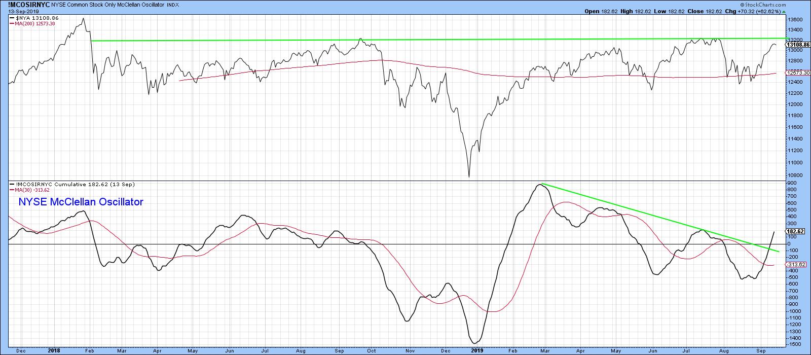
Chart 5
The next chart worth following is the ratio between the SPDR Technology and Consumer Staples (XLK/XLP), which is a proxy for identifying swings in investor sentiment. When the indicator is rising, it tells us that traders are becoming more confident, as they are bidding up the more speculative technology stocks against their defensive consumer staple counterparts.
When this relationship is rising, the overall market is usually stronger as well. Using the benefit of hindsight, the green-shaded areas represent the major rallies in the ratio itself. You can see that such periods were generally pretty positive for the S&P Composite. Note also that the ratio broke out of a huge base some time ago and has yet to achieve the upside objective called for by that pattern. More recently, ratio has been moving in a narrowing trading range bounded by the two converging trend lines. In the late summer, it teased the red line, subsequently bouncing in a current attempt to surpass the green one. The unrealized upside objective from the giant base suggests that the break, when it comes, will be on the upside. A positive short-term KST backs up this view. Given the strong and close relationship between the ratio and the market itself, I am watching this one very closely.
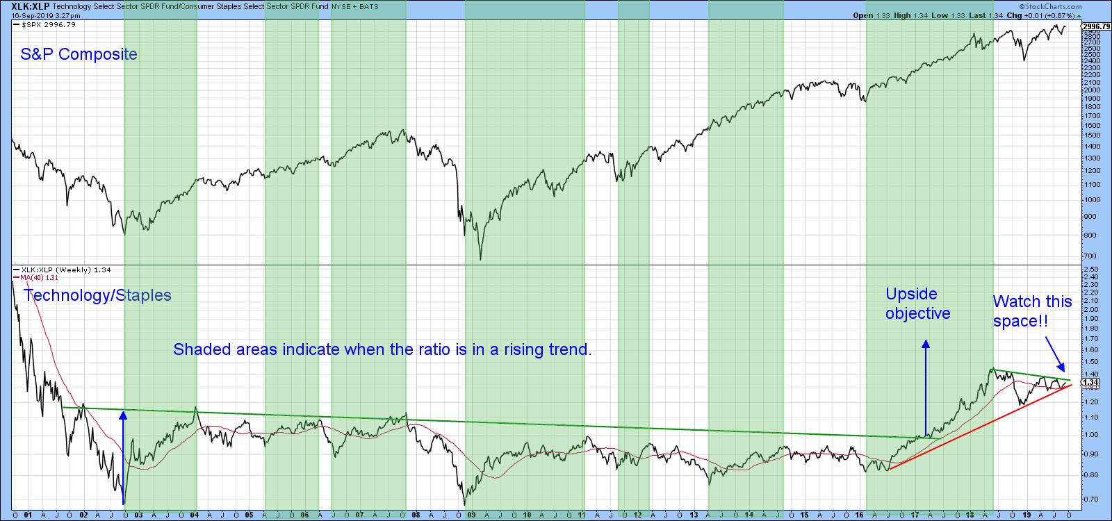
Chart 6
Our third watchable chart is more of a global one, as it compares the Dow Jones World Index to a global ratio between junk and government-issued paper. A rising relationship indicates growing confidence amongst global bond market participants, which usually translates into stronger equity prices. The green arrows point up the fact that lows in the ratio often correspond with equity lows. That means that, if it can reassert its upward breakout above the green downtrend line, it ought to generate a spurt of confidence sufficient to propel the Index itself above its green downtrend line.
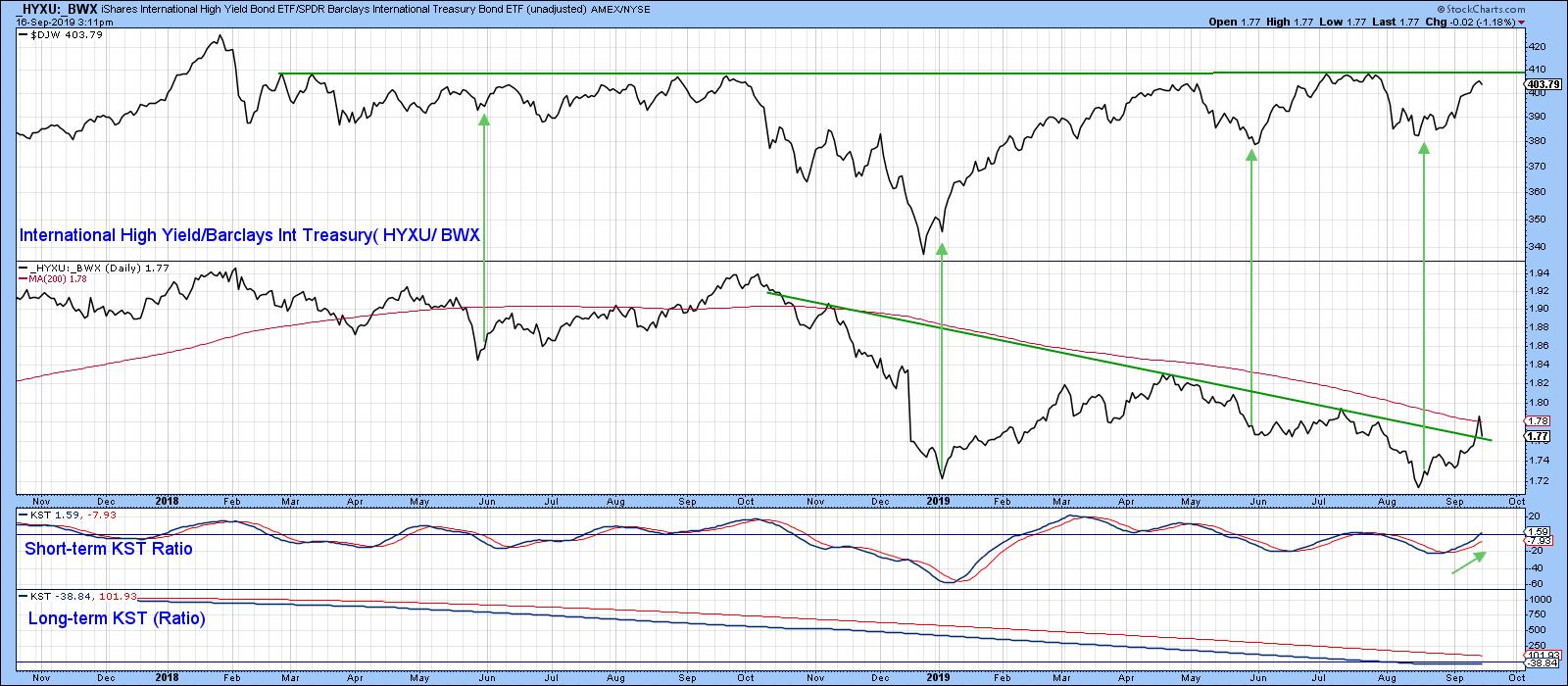
Chart 7
Good luck and good charting,
Martin J. Pring
The views expressed in this article are those of the author and do not necessarily reflect the position or opinion of Pring Turner Capital Group of Walnut Creek or its affiliates.