Editor's Note: This article was originally published in Martin Pring's Market Roundup on Friday, September 27th at 1:25pm ET.
Last week, I wrote that the short-term technical picture looked positive, but that I was watching three charts which would confirm a significant extension to the bull market in the event that they experienced upside breakouts. This week, I'll reverse the process by examining what happened to those three charts and then re-examining the current short-term position.
Chart 1 features the bullish percent for the NASDAQ. I was particularly interested in the 2018-19 green downtrend line, since a breakout would indicate that the number of NASDAQ stocks in positive trends would expand. That would presumably be sufficient to power the NASDAQ higher as well. The signal was never given, and the indicator is now in a declining trend just shy of its 20-day MA. Obviously, there is no signal there at the moment.
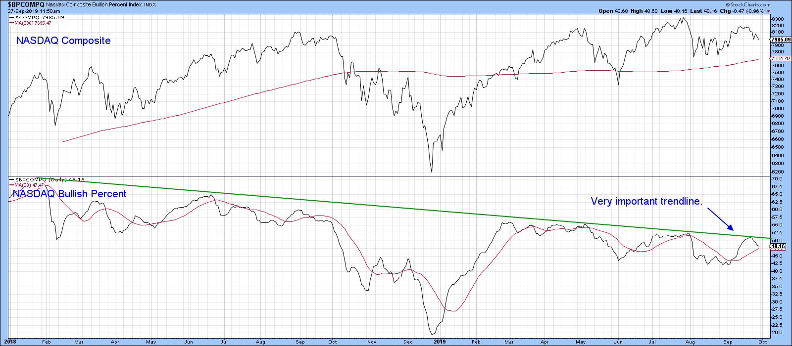
Chart 1
Our second chart featured a ratio between the SPDR Technology (XLK) and the SPDR Consumer Staples (XLP). The idea here was that a rising ratio reflected growing confidence, with traders flocking to higher-risk technology over the more defensive staples. The green-shaded areas indicate that a positive trend in this relationship is also bullish for the S&P. Consequently, I was looking for a break above the upper green trend line, rather than one below the red 2016-19 uptrend line. That break never came; now, the indicator is testing its 40-week MA and uptrend line, which are pretty well at the same level. Whenever you see a trend line and a reliable moving average in the same vicinity, they reinforce each other as a support/resistance zone (in this case, support). Consequently, a downside penetration would not be a good sign.
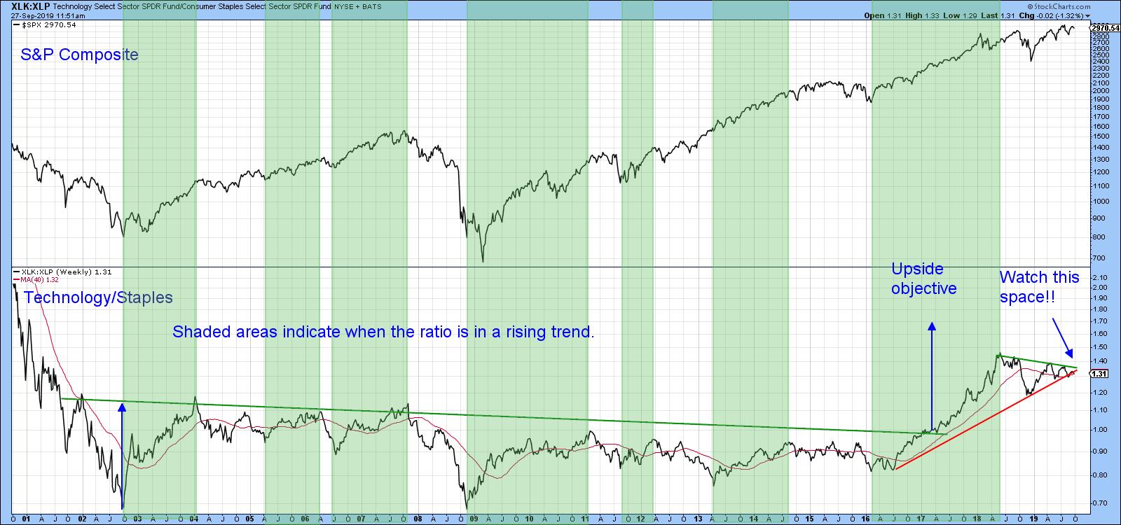
Chart 2
Our third indicator was effectively an international bond spread, where the price of the iShares International High Yield Bond ETF is compared to the Barclays International Treasury fund (_HYXU/_BWX). Since the Dow Jones World Index itself was very close to an upside break like the ratio, I was looking for a joint upside move. Instead, what we saw was an attempt at new highs by the Index and a false upside breakout by the ratio. Now, its short-term KST has begun to roll over. The chart has now moved from being a potentially bullish one to reflecting a relationship that is questionable.
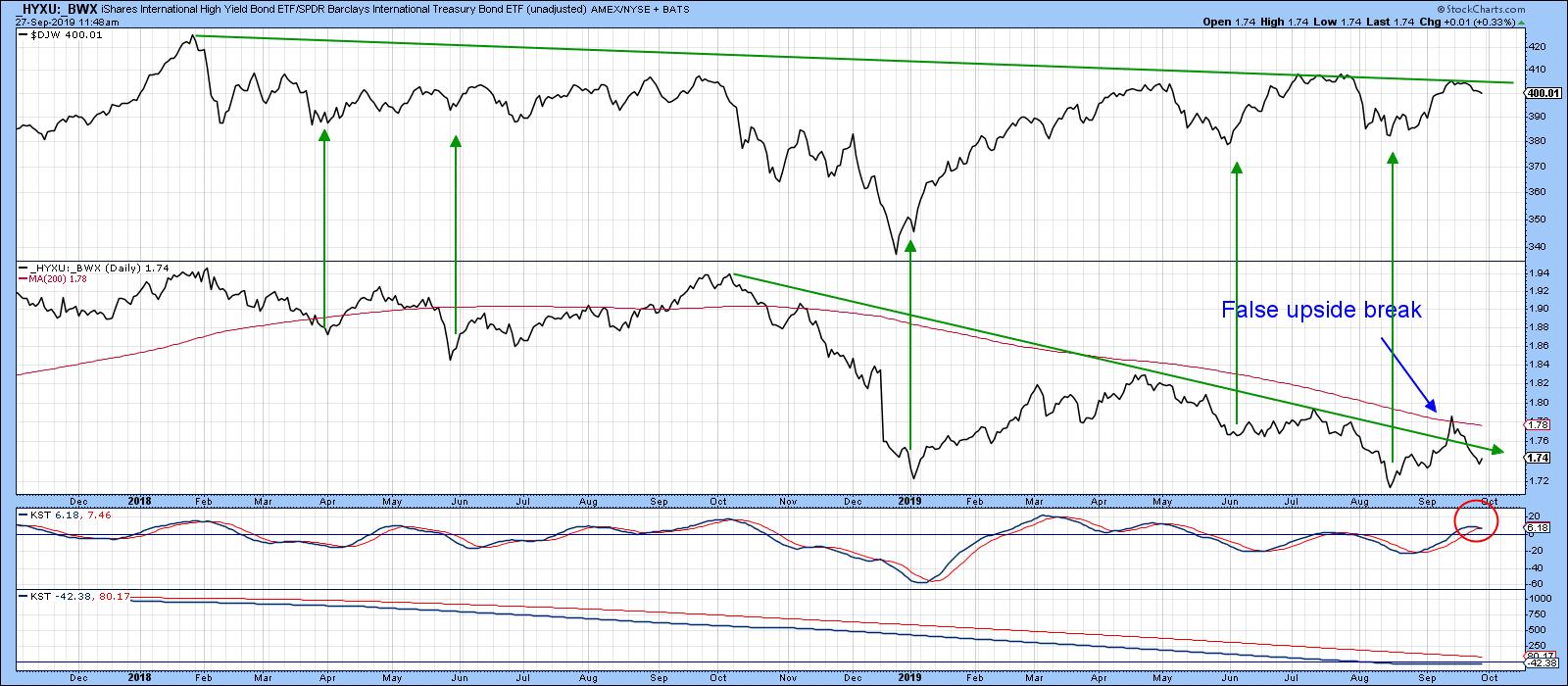
Chart 4
So far, then, none of the charts being monitored have yet broken to the upside, thereby confirming what was an improving short-term technical position. The question naturally arises as to the current position of some of those short-term oscillators themselves.
Good luck and good charting,
Martin J. Pring
The views expressed in this article are those of the author and do not necessarily reflect the position or opinion of Pring Turner Capital Group of Walnut Creek or its affiliates.