It's been quite a week, but the charts are starting to look to me as if a bottom is close at hand. In order to identify one, I look at a couple of factors. First, are there any signs of a one or two bar reversal pattern? Take Chart 1, for instance. It features the Wilshire 5000, arguably the broadest measure of "the" market. It shows two things. The first thing is that a bullish hammer was formed on Friday. Beyond that, though, take a look at the huge volume. There is nothing in the rule book that says the volume won't increase some more on Monday, but the hammer suggests that it might be time to head higher. The problem is that other averages are not sporting a hammer, with the exception of the S&P Composite. That's a shame, as more hammers or other reversal phenomena would increase the of odds of a reversal.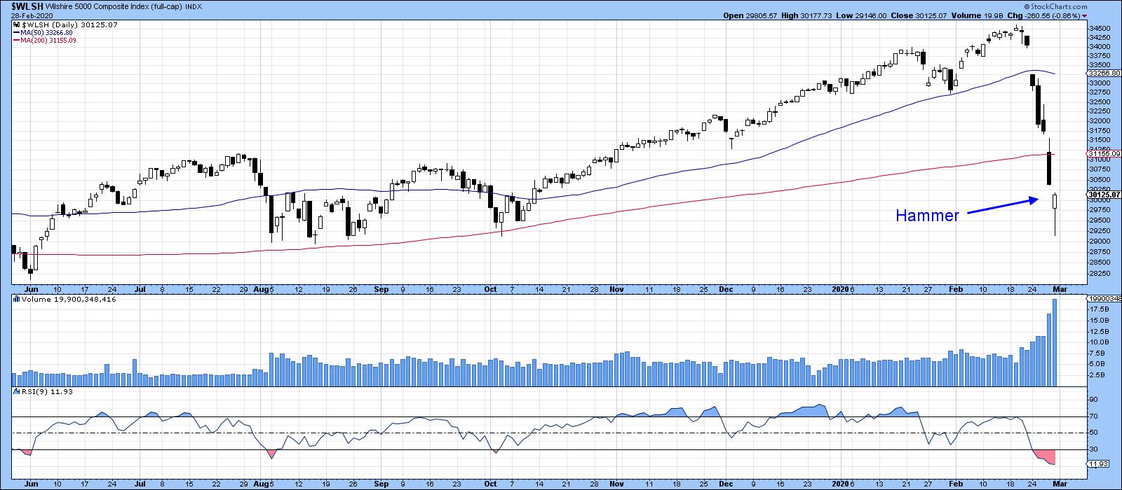
Chart 1
The second thing I like to see is a selling climax, and we have a really big one in Chart 2. The data is arranged so that we can observe a 9-day RSI oversold condition, required for a selling climax, with an overbought reading in the price volume oscillator (PVO). That high reading in the PVO tells us that the oversold condition is characterized by a massive increase in volume. The arrows point up those periods when the RSI was oversold and the PVO was overbought. Typically, a rally follows.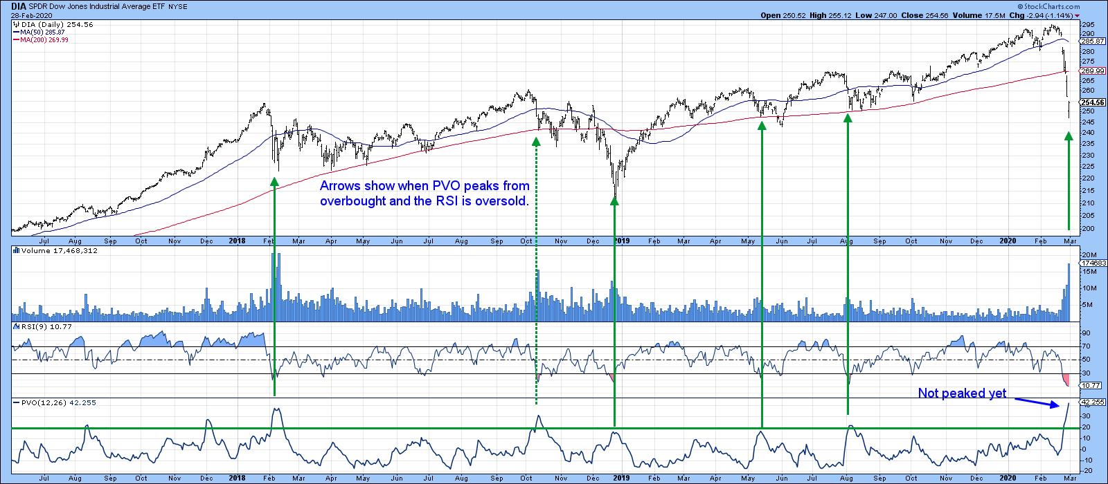
Chart 2
Finally, it wouldn't be a bottom without some measure of fear being present, and that's what we see in Chart 3, which displays the ratio between the VIX and the 20-year yield. When the VIX rises, it indicates fear, and when treasury yields drop, that reflects a flight to quality. By relating the two, the falling yield has the effect of driving the VIX even higher. I showed this chart earlier in the week, when the ratio was already at an elevated reading. Now it's at a record level. Clearly the current level is unsustainable, which means that a peak is at hand. 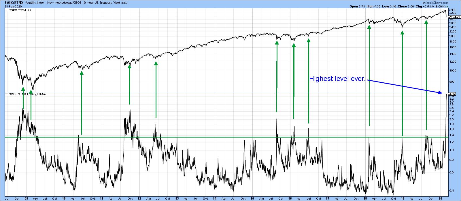
Chart 3
These indicators tell us nothing about the long-term trend; they merely show that, based on historical precedent, we should expect to see an end to the recent short-term decline. That could take the form of an immediate rally or, more likely, an extended trading range as prices probe for a more durable bottom. Since many important long-term MAs have already been violated, it seems to me that they had better be successfully challenged in the next couple of weeks or so; otherwise, the technical picture will start to look more like a primary bear.
Good luck and good charting,
Martin J. Pring
The views expressed in this article are those of the author and do not necessarily reflect the position or opinion of Pring Turner Capital Group of Walnut Creek or its affiliates.