
Bitcoin and, more broadly, cryptocurrencies, are back to the forefront of financial markets. A lot of new participants are entering the crypto-space and they are all looking to get a piece of the bitcoin-pie.
So what can we learn from the Bitcoin chart when we want to get an idea about its future price movement?
Bitcoin vs... yeah, vs what?
The first thing that we need to realize is that Bitcoin, or any other cryptocurrency for that matter, can be expressed in many different fiat- or other cryptocurrencies. Just like there is no (single) price for the USD, there is no single price for Bitcoin.
Currencies are always expressed in "another" currency. The USD, for example, can be expressed vs the Euro, the Japanese Yen, the British Pound etc... and it will be a different price against each of them. Likewise, Bitcoin can be expressed in USD, EUR, JPY etc., but also vs. other crypto currencies. This is an important consideration you want to be aware of when looking at (crypto)currencies, Bitcoin in particular.
Over time, markets will find "conventions" or generally accepted ways of expressing things. With regard to the price for Bitcoin, it seems that BTC/USD (Bitcoin expressed in USD) is accepted as "the" price for Bitcoin.
As very little "fundamental" data is available for Bitcoin, the price discovery is a very pure process of supply and demand which, as always, is driven by fear and greed. This makes Bitcoin and the crypto markets very suitable for technical analysis.
So what can the charts tell us about the potential future of Bitcoin? Lets' start by looking at a long-term chart of Bitcoin vs. the USD. The chart below shows the historical price development of BTC/USD since early 2014.
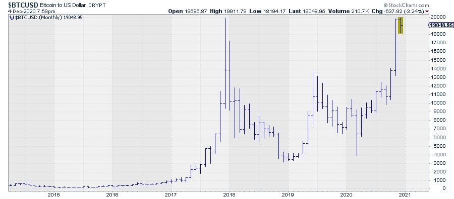 Figure 1Price Swings Are Off the Charts, A Log Scale Is Needed
The one thing that is immediately clear is that the price swings are huge. This is one of the reasons why a lot of new market participants are attracted to Bitcoin trading.
Returns are shooting "off the charts" in a very short amount of time. Unfortunately, that goes both ways, up and down. Risk and return still go hand in hand - it is no different in the crypto space.
On the first chart, one could easily think that bitcoin did not move much from 2014 – 2017 and only really started to move at the start of 2017.. Don't be fooled. For markets like this with very big price moves over a long period of time, it is often better to use a Log-chart, which uses a logarithmic scale for the vertical price axis. These charts "magnify" the seemingly smaller moves and put things in proper perspective.
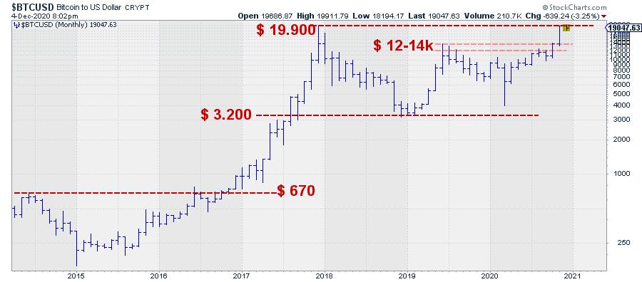 Figure 2This chart is the same as in Figure 1, but now uses a log scale. It becomes immediately visible that the 2014-2017 period was not boring at all. We see a more-than-70% decline from the peak in 2014 to the lows in 2016, followed by a 270% move back to the 2014 high. That resistance area around $670 kept BTC/USD under pressure for a few months before it broke higher.
That break was the start of the mega 2700%, rally from $670 to $19,900. We see all the time in markets that previous highs act as "resistance". People who bought at that level were facing a loss since the entry, and they are more likely to be relieved to be able to get out of that position without a loss, thus creating supply.
There are also people who recognize this resistance and will try to take advantage by selling (short) Bitcoin, anticipating a decline from that peak level. If and when such a level is then taken out following strong demand, we often see an acceleration of the move, initially driven by stronger demand but accelerated by additional demand coming from short sellers who need to cover their losses, plus sellers who have no position anymore and want to get back into the market again.
This buying frenzy process lasted for a year and a half and ended at the $ 19,900 top at the end of 2017, from which an > 80% drop followed to the $ 3,200 area. After being in the news on a daily basis, the world, or at least the newswires, pretty much forgot about Bitcoin.
This sequence of events repeated again, albeit a bit less spectacularly, in 2019, with a 340% rally followed by another 70% drop into 2020.
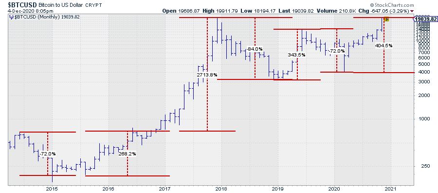 Figure 3Out of the 2020 low around $ 4,000, Bitcoin rallied over 400% to current levels. On the way up, the market faced overhead resistance between $ 12-14,000 where the market stalled mid-2019, and again briefly in mid-2020.
Breaking Beyond $ 12k Ignited a New Rally
The weekly chart below shows in more detail how the market peaked near $14,000, but had three peaks put into place around $12,000.
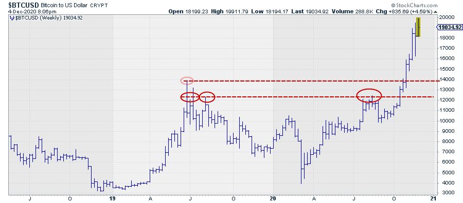 Figure 4Taking out that barrier caused the acceleration we saw in October and November. And here we are in December, pushing against all time high levels around $19,900 - and Bitcoin back on the news wires.
What does all this mean with respect to the potential future price move(s) for BTC/USD?
First of all, a market that is pushing against the highest prices ever recorded is not bearish. As a matter of fact, it is a (very) bullish characteristic. Also, the series of higher lows and higher highs that are visible on both the monthly and the weekly charts are characteristics of a bull market.
As described above, these levels, where former peaks were formed, are usually levels where extra supply comes to the market. When the market will be able to absorb this supply, followed by more demand and a break to new all-time-highs - especially when it is a nice round number like $20,000 - a further acceleration is very likely. We have seen it happen before!
Pegging a price target after such a break is difficult, but when history is our guide, a doubling of BTC/USD to $ 40,000 seems to be a conservative estimate. When we get another one of those 300-400% moves... we all can do the math.
A Pause First?
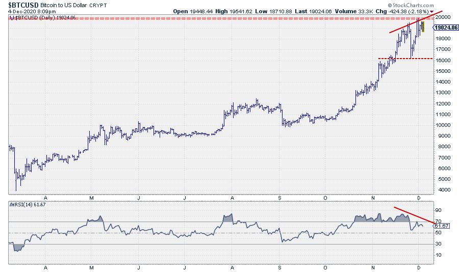 Figure 5
As this $20k area is definitely heavy on the supply, we may see some short-term weakness. Markets may need a bit of time to absorb the additional supply before actually breaking higher.
One of the things we see at shorter-term (daily) charts when a market is approaching a long-term resistance area is a so-called "negative divergence" between price and the RSI (Relative Strength Index), which is a technical indicator (oscillator).
Usually, this RSI peaks and bottoms together with price. When that does not happen anymore, a divergence is building. In this case, price has formed successive higher peaks recently, while the RSI put lower highs into place. This is called a negative divergence and often signals a pause in the rally or an upcoming decline.
With the longer-term perspective of a bull market in place for Bitcoin, and a potential break beyond $20k around the corner, such a setback has to be seen as temporary and a little breather before jumping higher.
Relative Rotation Graph Shows Strength for Bitcoin
Another, more out of the box, method of looking at (cryptocurrency) markets is through a Relative Rotation Graph®, or RRG® as they are commonly referred to.
This visualization plots multiple securities, in this case cryptocurrencies, against a common denominator on one graph, which allows users to track the relative positions of all members of a universe against a benchmark and against each other.
As all relationships are relative, you will notice a rotational pattern taking shape around the center, in this case the USD, of the graph.
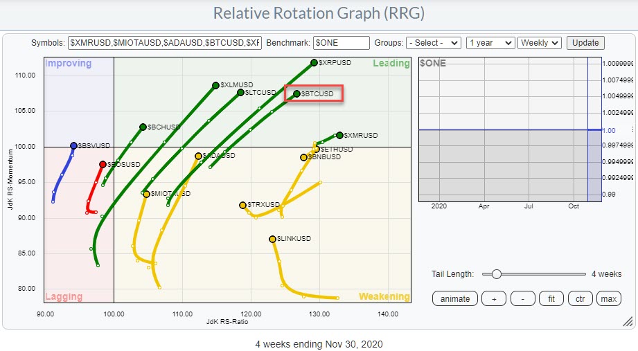 Figure 6This RRG shows the rotations for a group of cryptocurrencies against the USD. The tails moving in a North-East direction indicate that these coins are improving and in an uptrend against the USD. As you can see, Bitcoin ($BTCUSD) is right at the forefront together with Ripple ($XRP).
This is another sign of strength for cryptocurrencies in general and for Bitcoin in particular!
#StaySafe, --Julius
This article was originally published on Watson News on 12/4.
My regular blog is the RRG Charts blog. If you would like to receive a notification when a new article is published there, simply "Subscribe" with your email address.
Julius de Kempenaer
Senior Technical Analyst, StockCharts.com
Creator, Relative Rotation Graphs
Founder, RRG Research
Host of: Sector Spotlight
Please find my handles for social media channels under the Bio below.
Feedback, comments or questions are welcome at Juliusdk@stockcharts.com. I cannot promise to respond to each and every message, but I will certainly read them and, where reasonably possible, use the feedback and comments or answer questions.
To discuss RRG with me on S.C.A.N., tag me using the handle Julius_RRG.
RRG, Relative Rotation Graphs, JdK RS-Ratio, and JdK RS-Momentum are registered trademarks of RRG Research.


