
Relative Rotation Graphs, or RRGs, can help you get a better view of the big picture.
One of the RRGs I often use to get a handle on international developments on stock markets around the world is to pull up the Relative Rotation Graph for international stock market indexes, as shown below.
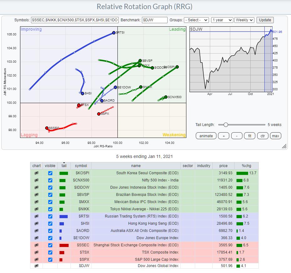
This chart shows the rotations for various international stock market indexes, using the Dow Jones Global index as the benchmark.
A word of caution!!
I know many of you like to trade ETFs, and that's all cool. In particular, if you want to benefit from performance in overseas markets, they are an easy way to do that. HOWEVER!! Be careful. The ETFs that are quoted on US exchanges are quoted in US dollars, while the stock markets that they are tracking around the world are trading in their local (different from USD) currencies.
This implies that, whenever you buy an ETF that tracks a foreign market which is not trading their stocks in USD, you are de facto "inheriting" a currency position with that trade. That's not necessarily a bad thing as long as you are aware of this. And, unfortunately, I still come across many people who are just not aware of this currency effect.
So for my analysis purposes, I prefer to use the underlying indexes - not only on an RRG but also on regular charts, as they represent the true buying and selling that is going on in that market. The USD-quoted ETFs allow us to easily create exposure to that market, and the price of that ETF is simply the index it is tracking multiplied with the xxx/USD currency value for that index.
The RRG above shows the US inside the lagging quadrant traveling at a negative RRG-Heading, going further into negative territory. And it is the only market on the chart with a truly negative heading.
China, also inside the lagging quadrant, has just, albeit slowly, started to pick up some relative momentum, as did Canada ($TSX).
Inside the improving quadrant we find Hong Kong and Australia moving lower on the JdK RS-Momentum scale while stable in terms of RS-Ratio. Inside the leading quadrant, Indonesia and Mexico have leveled off on the RS-Momentum scale, but still moving higher in terms of RS-Ratio.
ALL OTHER markets are at a strong RRG-Heading, gaining strength on both axes. Looking at the length and the direction of the tails in combination with their positions on the RRG, a few indexes deserve a bit of extra attention. I have isolated them on the RRG below.
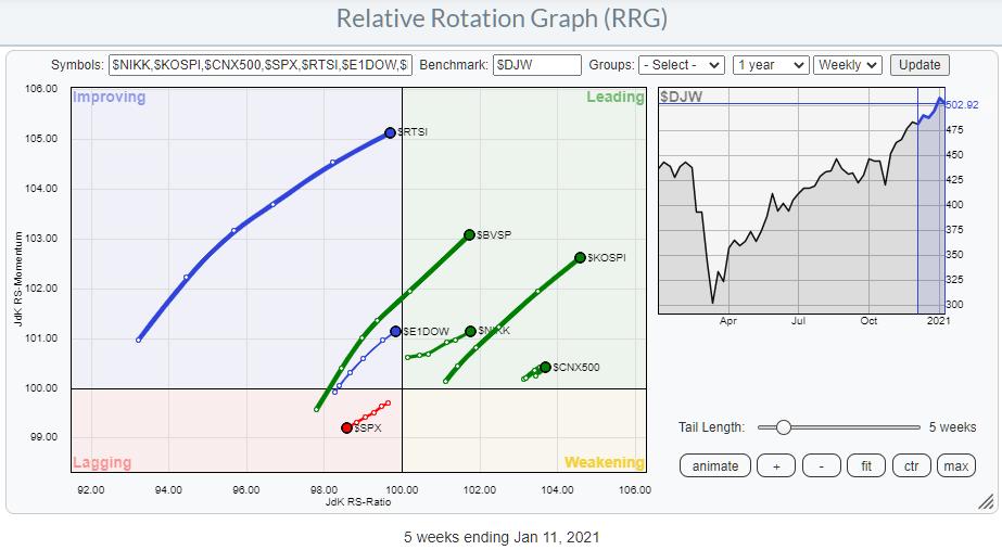
Let's take a look at the individual charts.
Russia ($RTSI)
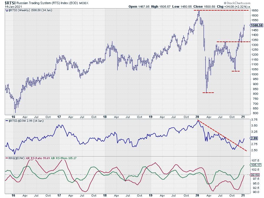
Relative strength broke its downtrend a few months ago and the new up-move is being picked up by the RRG-Lines, which are both pushing higher, positioning $RTSI inside the improving quadrant at a very high RS-Momentum level. The crossover into leading from improving is only a matter of time.
The recent break above 1325 was a good confirmation of the new uptrend that is underway, with new higher highs and higher lows. The next area of resistance is found near 1650, where the last major peak was formed.
Brazil ($BVSP)
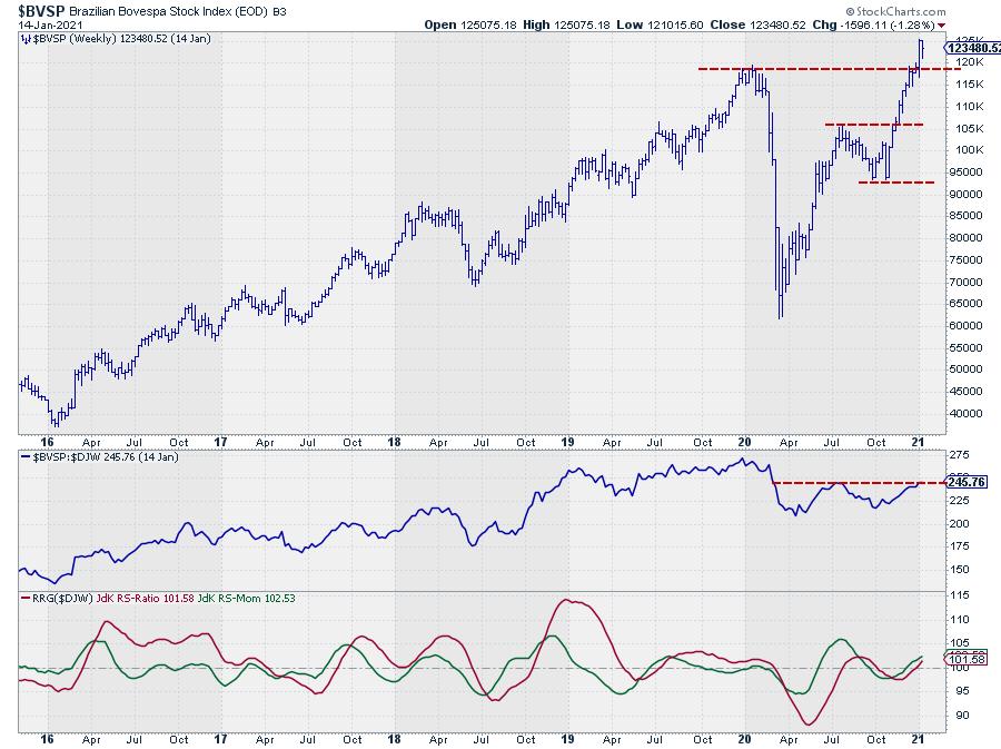
I actually wrote about the Brazilian market and the break to new all-time-highs in a DITC article. Read here: Brazil is Beating the US! (and We're Not Talking about Soccer).
South Korea ($KOSPI)
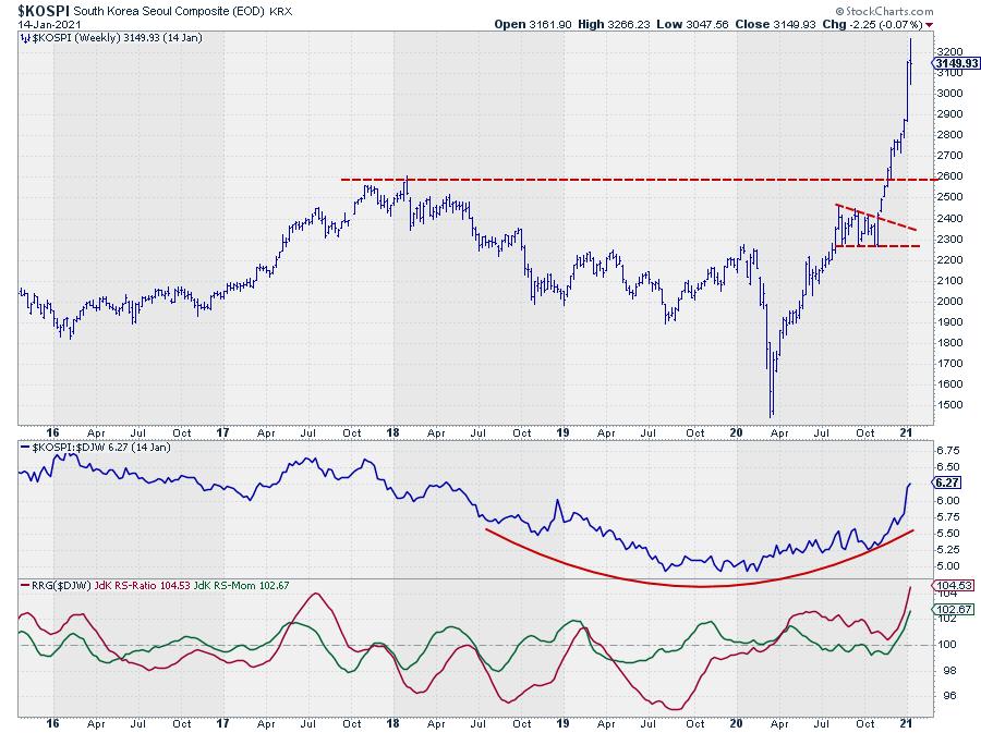
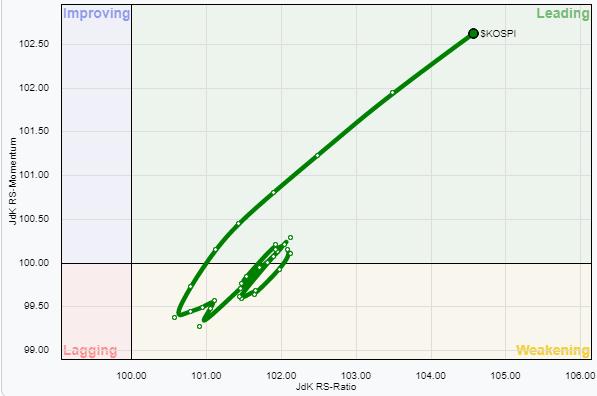 The South Korean KOSPI index is the highest-ranking index on the RS-Ratio scale and the chart above shows why. The break to new highs happened already at the end of November, arguably even earlier, when the market left the consolidation area prior to breaking to a new ATH.
The move since the break has been almost vertical, which makes this a high-risk market at the moment. IMHO, the Risk/Reward ratio is now just too high for me to justify immediate entry.
It is, though, a very nice example of a turnaround in relative strength after a multi-year decline that was picked up by the RRG-Lines in April, then went through two short leading-weakening-leading rotations before taking off into leading space.
India ($CNX500)
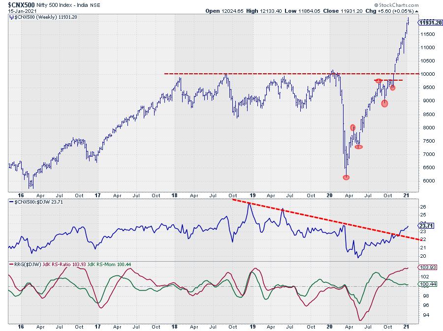
India's NIFTY 500 index is showing a similar picture as the KOSPI. After breaking to new highs, the rally went vertical, which makes it hard to get a good entry level without getting too much downside (price) risk in the position.
On a relative basis, I am watching the green JdK RS-Momentum line. When a new low can be put into place, a further relative strengthening is likely.
However, in order to benefit from such a relative improvement, I would always look to get some sort of off-set or hedge in place to protect the position against a drop in price in absolute terms.
Japan ($NIKK)
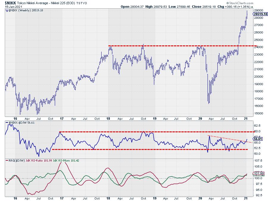
The Japanese Nikkei index is positioned much lower on the RS-Ratio scale and at lower RS-Momentum levels. Still, the price move has been very violent after breaking the heavy horizontal barrier near 24,000.
The relative strength chart looks quite different, as the RS-Line is caught within the boundaries of a trading range that has been in play already since 2017. There is some room for further improvement towards the top of that range in relative strength.
Once that upper boundary can be broken, things will get really interesting.
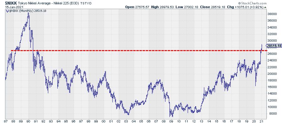
For Japan, it is important to go way back in history. On the chart above, it looks as if Japan just moved to new all-time-highs, just like many other international markets. Truth is, that is not the case. In fact we just moved beyond the highest level for the Nikkei index since 1991.
There is plenty of upside before Japan reaches resistance from its highest point ever. The price chart probably also needs some pause or correction before attractive entry levels become available but, from a relative perspective, it looks as if a big turnaround in favor of Japan is underway.
Europe ($E1DOW)
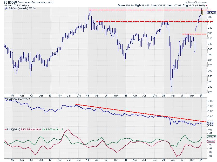
Europe is positioned inside improving and just about to cross over into leading at not-too-high RS-Momentum levels. This makes it a very interesting region to look at.
Several individual European markets have already broken to new highs but the European index has not done so yet. We are pushing against early 2018 highs. The all-time high for this index is even further back, in 2007!!
The relative strength has been in a strong downtrend since 2007 and, more recently, since mid-2017.
If and when the index can break beyond the 2018 resistance level, relative strength will very likely follow higher, which will be interesting to watch as it may offer a good trading opportunity to buy Europe against the US. At the moment. Europe seems to be the region with the most upside potential relative to the world/US in relative terms. Watch for a break beyond 375.
Enjoy your weekend,
#StaySafe, --Julius
My regular blog is the RRG Charts blog. If you would like to receive a notification when a new article is published there, simply "Subscribe" with your email address.
Julius de Kempenaer
Senior Technical Analyst, StockCharts.com
Creator, Relative Rotation Graphs
Founder, RRG Research
Host of: Sector Spotlight
Please find my handles for social media channels under the Bio below.
Feedback, comments or questions are welcome at Juliusdk@stockcharts.com. I cannot promise to respond to each and every message, but I will certainly read them and, where reasonably possible, use the feedback and comments or answer questions.
To discuss RRG with me on S.C.A.N., tag me using the handle Julius_RRG.
RRG, Relative Rotation Graphs, JdK RS-Ratio, and JdK RS-Momentum are registered trademarks of RRG Research.


