Technology, as reflected in the tech-dominated NASDAQ Composite, peaked as a group in 2000 and sank in popularity for the next 3 years. Since then, as shown by the relative graph in Chart 1, it has recaptured all of that lost ground. Now, its long-term KST may have started to flatten. Since the RS line is struggling to push above its 2000 high, the technical position could be hinting at a possible top.
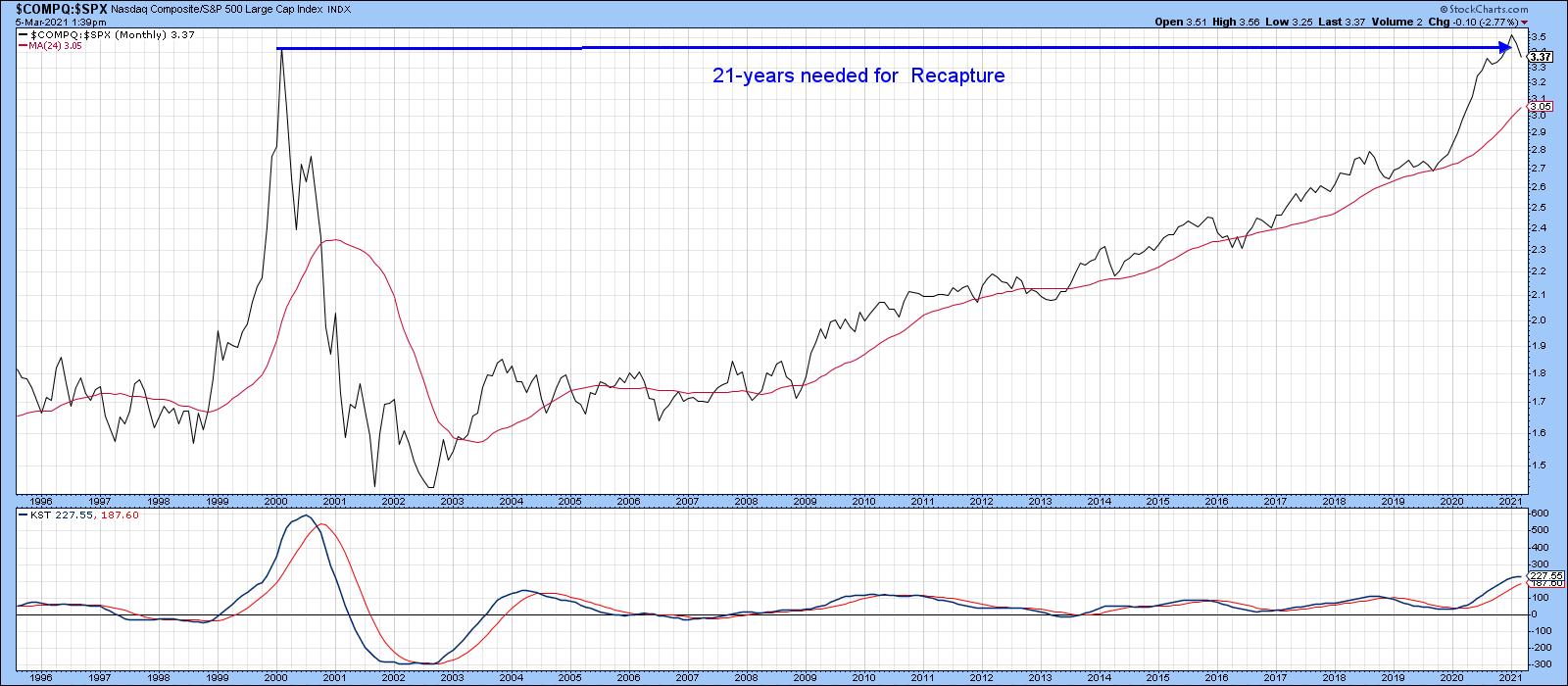 Chart 1
By the same token, Chart 2 indicates that the relative strength for energy, as represented by in the NYSE Oil Index ($XOI), bottomed in the 1999-2000 period and experienced a huge rally into 2008. It slipped in popularity until last October, when a sharp rally began. That formidable bounce was sufficient to reverse the downward trajectory of its long-term KST, thereby offering a credible reason why the post-2008 decline might be over.
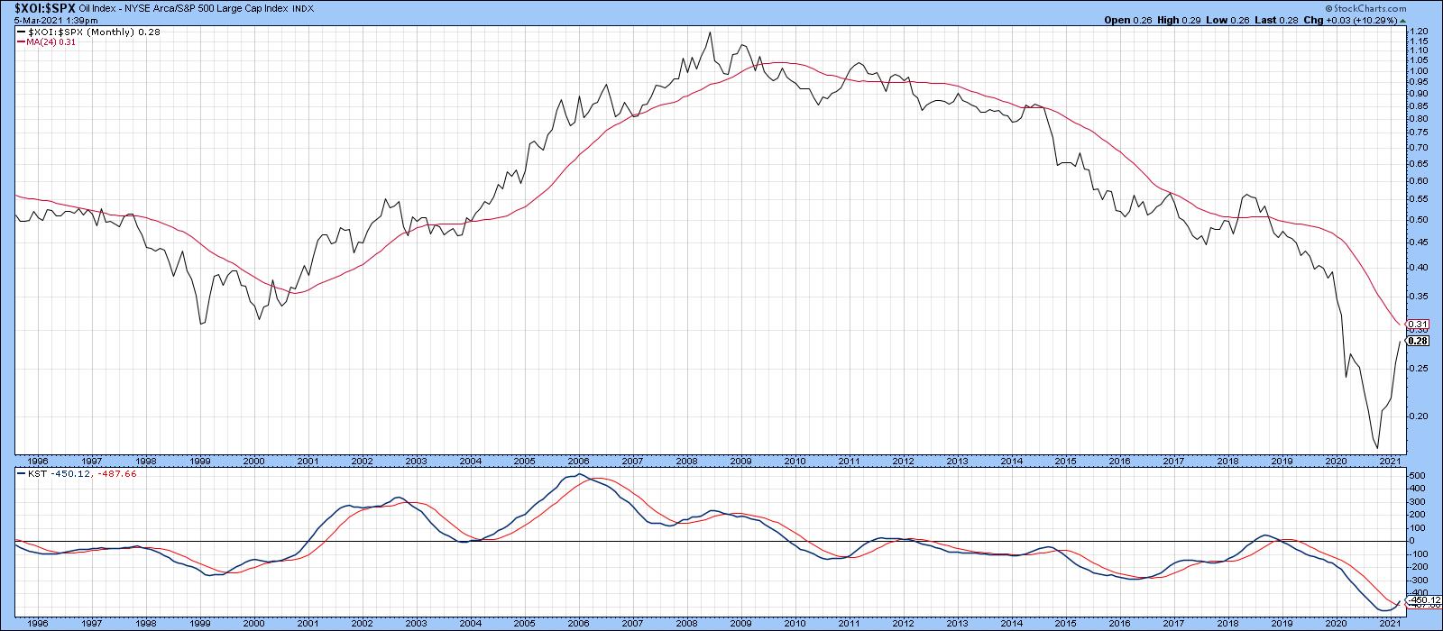 Chart 2
In relative terms, both sectors have essentially been moving in opposite directions for three decades. Since the KST for relative action has started to flatten for the NASDAQ Composite and reverse to the upside for energy, perhaps now is a good time to anticipate a changing of the sector guard.
Examining the NASDAQ (Tech)/NYSE OIL Index ($COMPQ/$XOI) Ratio
In that respect, Chart 3 shows the ratio between the technology-dominated NASDAQ Composite and the Energy-influenced NYSE Oil Index. Since the early 1990s, there have been three broad movements: two between 1990-2000 and 2008-2020, both of which favored technology, and the third between 2000 and 2008, when energy outperformed. Since 2008, this relationship has rallied by an approximate factor of 12x, which undoubtedly places it in bubble-type territory.
Furthermore, some indicators are suggesting that another reversal, favoring energy, is in the cards. For example, the ratio has dropped below its 12-month MA and the KST is on the verge of a sell signal. However, it's important to note there have been numerous 12-month MA crossovers in the last 30 years that have ultimately proven to be whipsaws.
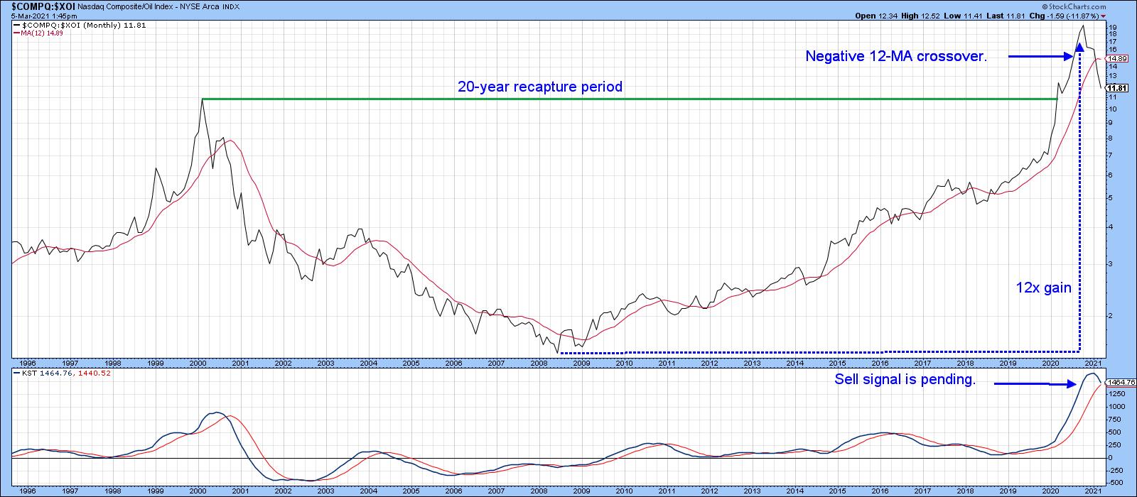 Chart 3That's why it's probably better to adopt a 24-month MA, as in Chart 4. It's not perfect, but it greatly limits the number of whipsaws in the last few decades. It's still bullish (for technology), of course. The lower window displays an 18-month ROC. Note that it has attained a reading in excess of 200%, which means that this relationship has doubled within the scope of a year and a half. In our book Investing in the Second Lost Decade, an appendixciting 30 examples of markets doubling in price during that 18-month period is included. It's a very unusual situation, which, if preceded by an extensive advance developing over many years, is almost invariably a sign that a bubble has burst. When such a reading is recorded coming off a major low, that is also unusual, but is positive because it demonstrates strong underlying momentum, rather like a bread thrust. Such action is usually followed by a small correction, but the function of early-on powerful momentum is to tell us that higher prices are ultimately likely.
Based on our sample of 30 cases that developed in the decades following 1974, it took an average of 15 years to return to the original bubble peak.
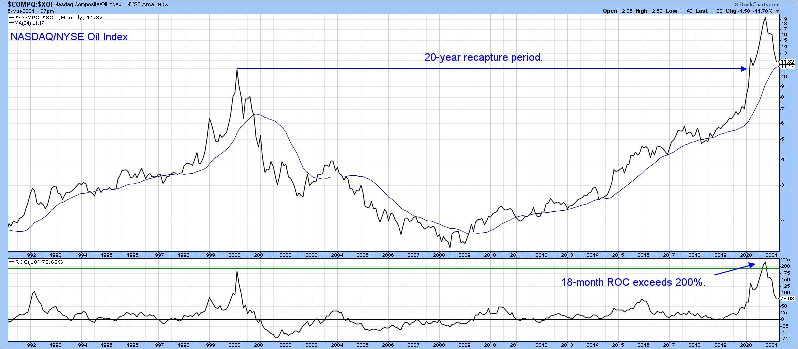 Chart 4Returning to Chart 4, you can see that, since 2009, energy has been completely outperformed by technology. That may be about to change, as the 18-month ROC, having recently exceeded the 200% level, now looks as though it has peaked, not unlike its 2000 experience. Note that the re-capture period in that instance took 20 years. If a reversal has taken place, it will say nothing about the absolute prices of these sectors - merely that leadership is in the process reverting away from technology and leaning more in the direction of energy and other resources.
The NASDAQ Composite/ Energy Sector Relationship Updated
Chart 5 shows a similar relationship, but this time in weekly format, where the XLE is substituted for the $XOI. Note that it has completed and broken down from a head-and-shoulders top under the backdrop of a rolling-over long-term KST. It's also well below its 200-day MA. The short-term KST, in the center panel, is getting a bit oversold, which means that some form of a retracement rally is very likely. If so, that would extend the topping out process, prior to achieving ultimately lower levels.
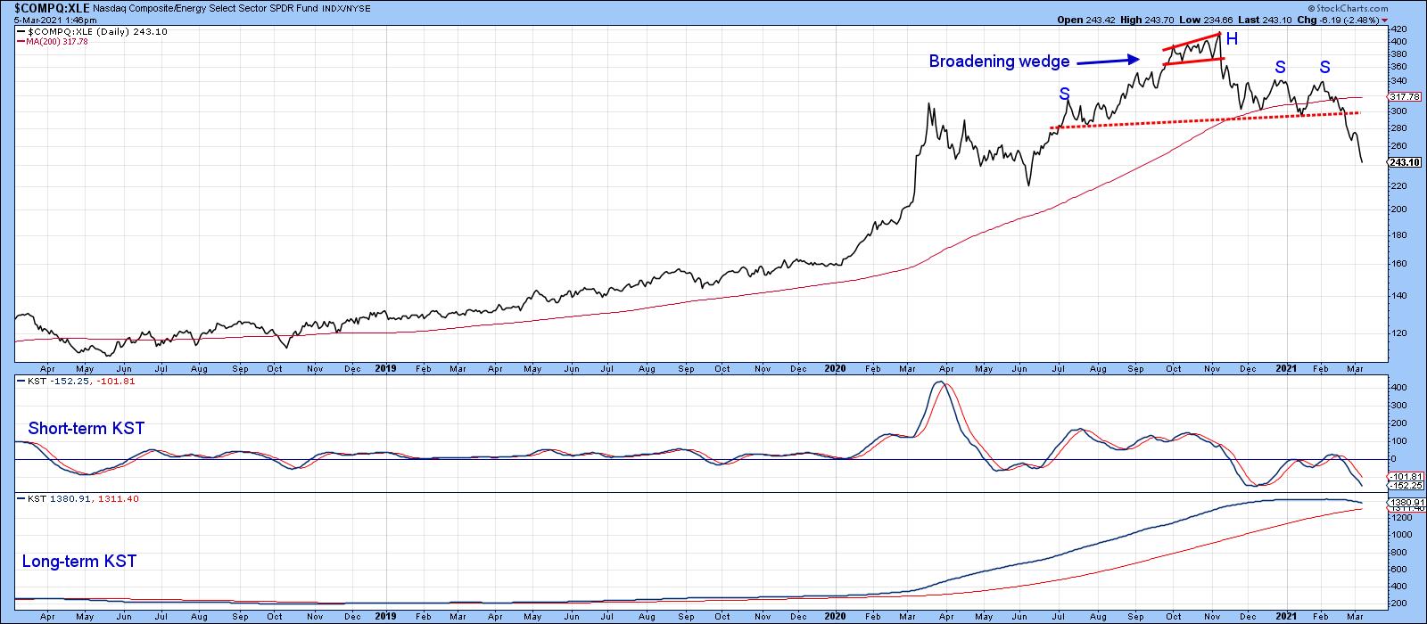 Chart 5
Stocks vs. Commodities
A lot of the strength reflected by the S&P Composite in the last few years has come from the buoyancy of tech stocks. As a result, equities have been able to strongly outperform commodities. Chart 6 portrays that battle since 2011. In the last couple of months, though, the ratio between the S&P and the DB Commodity ETF (SPY/DBC) has decisively broken in favor of the DBC. That's because it has violated the 2011-2021 up trendline, crossed below the 12-month MA and triggered a long-term KST sell signal. In effect, this action is confirming some of the signals currently being given by the energy/technology relationship.
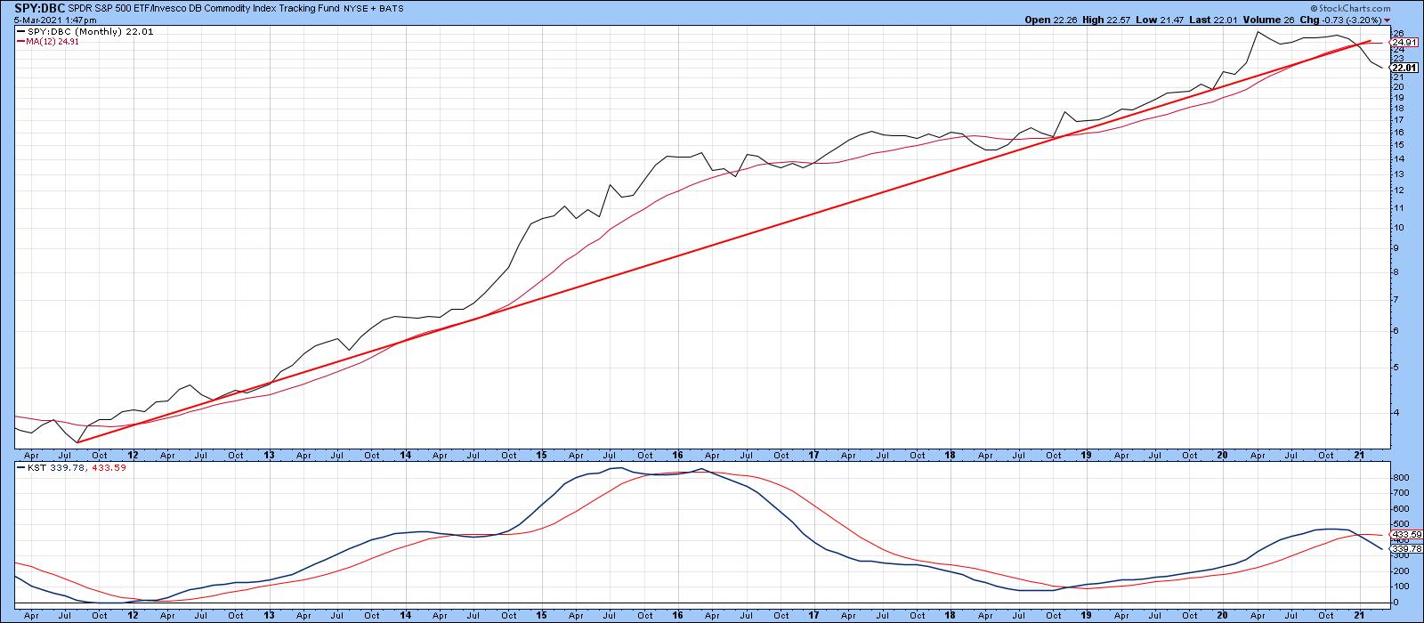 Chart 6
This is an updated version of an article previously published on Tuesday, March 2nd at 5:39pm ET in the member-exclusive blog Martin Pring's Market Roundup.
Good luck and good charting,
Martin J. Pring
The views expressed in this article are those of the author and do not necessarily reflect the position or opinion of Pring Turner Capital Group of Walnut Creek or its affiliates.