When a market makes a quick move lower from an established peak, then quickly rebounds back to the upside, you will hear the dreaded phrase "dead cat bounce" emerge on trading floors. What is this pattern, and what can it tell us about next steps for the S&P 500?
Basically, the phrase is a somewhat vulgar way to imply a market that is bouncing after a first move down, but, overall, the swing higher is not a sign of a life but simply the market's involuntary rise after a quick drop.
Royal Caribbean (RCL) provides a pretty good example of this pattern in mid-2020.
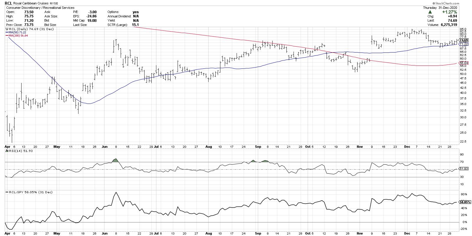
After moving from the low 20s to the upper 70s in early June, RCL gapped up in one final push higher. Notice how that last move higher included a number of topping signals, including an exhaustion gap (a gap higher after an extended uptrend), a dragonfly doji candle (open and close even with no upper shadow and a long lower shadow) and the RSI in the overbought range. Following this confluence of topping signals, RCL traded down heavily in what appeared to be a clear distribution move after the long uptrend. Three days later, the stock jumped higher in reaction to the initial selloff.
The initial selloff from the highs tells you of an exhaustion of buyers. The quick bounce higher is considered the "disbelief" phase, where buyers are sucked in on the assumption that they've bought on the dip and are prepared to ride the price back to new highs.
So what confirms this dead cat bounce? Once the stock continued its downtrend, signaling that upside is limited and downside potential has increased, investors get nervous and start to sell. This causes further downward pressure and a feedback loop that pushes prices down even more.
In this case, the downside was relatively limited. The stock found support around the 50-day moving average, but never traded below that support level in the weeks to come. That serves as a solid reminder to always look to key support and resistance levels during periods of market dislocation.
Now let's review the current S&P 500 chart.
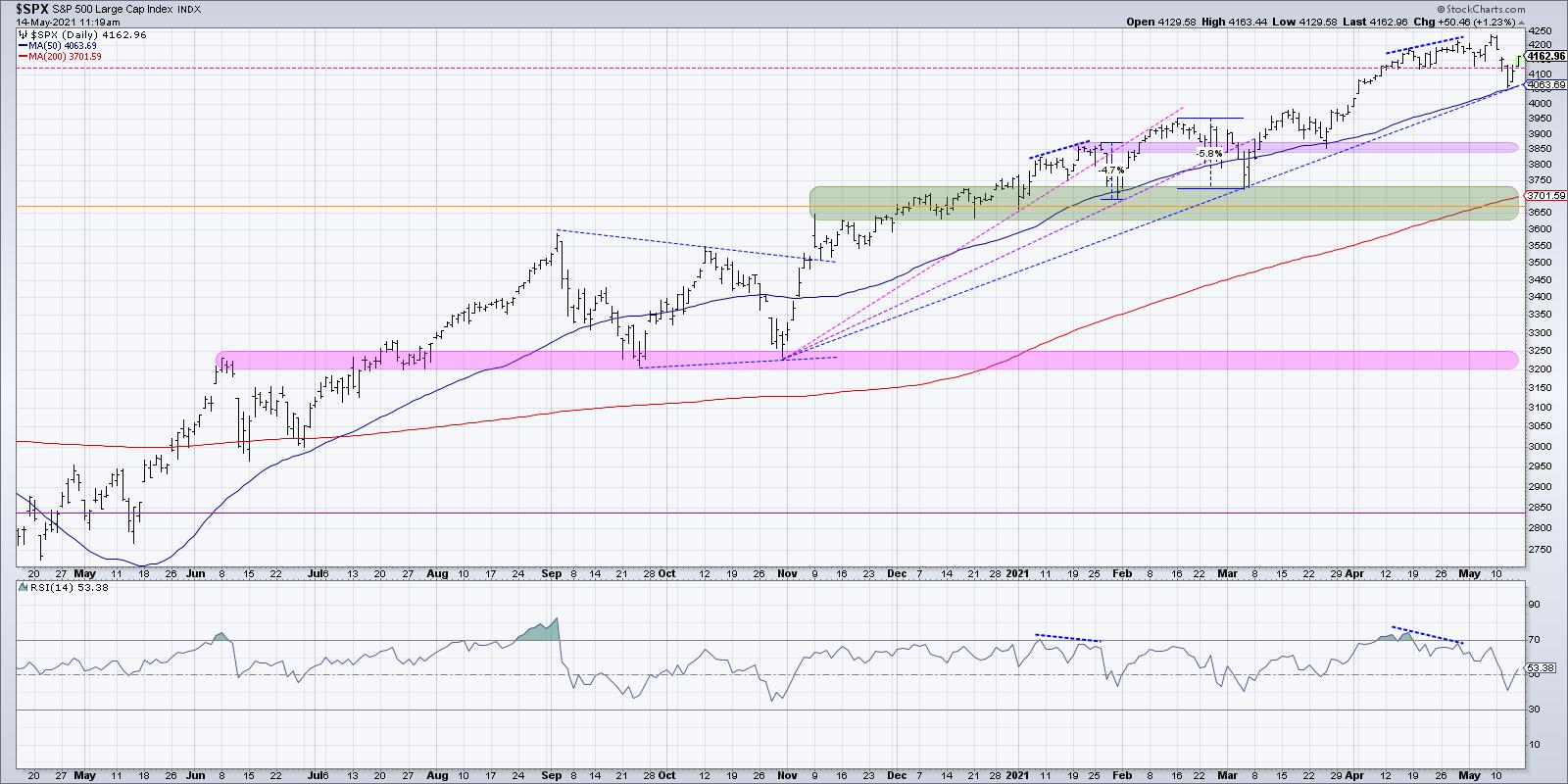
Wednesday's selloff this week brought the S&P quickly down to the 50-day moving average, bringing the index about 5% below its recent all-time highs. This is about the same pullback that we saw in January, coincidentally, after a similar bearish momentum divergence. After trading down to the 50-day moving average as well as clear trendline support, the S&P bounced higher on Thursday, then really followed through to the upside on Friday.
Investors have clearly bought into the "buy the dip" strategy, and Friday's rally seems to indicate the disbelief mindset often seen after an initial selloff from a market peak.
What would confirm the dead cat bounce thesis? Quite simply, a break below the 50-day moving average and trendline support would indicate that Friday's rally was a reaction move within a longer corrective period. This would also differentiate the current move from January's 5% selloff, drawing comparisons to deeper price/time corrections such as September/October 2020.
What would invalidate the dead cat bounce thesis? A move back to the 4200-4250 range early next week would certainly suggest that we have experienced yet another garden-variety pullback within an increasingly euphoric uptrend phase.
Either way, this week's increased volatility suggests investors are nervous about potential downside risk. At the same time, the fear of missing out appears alive and well!
Want to digest this article in video format? Here we go:
RR#6,
Dave
P.S. Ready to upgrade your investment process? Check out my free course on behavioral investing!
David Keller, CMT
Chief Market Strategist
StockCharts.com
Disclaimer: This blog is for educational purposes only and should not be construed as financial advice. The ideas and strategies should never be used without first assessing your own personal and financial situation, or without consulting a financial professional.
The author does not have a position in mentioned securities at the time of publication. Any opinions expressed herein are solely those of the author, and do not in any way represent the views or opinions of any other person or entity.


