The Big Picture
Before we get into the subject of corrections, it's important to make sure that we do not lose focus on the big picture. For instance, take Chart 1, which features the Value Line Geometric Average. It reflects the performance of the average stock, as opposed to the big cap-weighted indexes. This series recently broke above a 23-year resistance trendline, which implies a multi-year advance. Perhaps we will see a pullback towards the breakout point, perhaps we will not. The point I am trying to make is that the big picture is bullish.
Getting hung up on a 5-10% correction does not make a lot of sense unless you are hugely leveraged and can't afford to endure the pain. Alternatively, lightening up in anticipation of a short- or even intermediate setback can be problematic, because things can abruptly reverse, leaving the unwary trader as a sold-out bull. Playing a counter-cyclical correction in a primary bull market is not unlike a youngster trying to build a small wall to protect his sandcastle against an incoming tide. It's generally a losing proposition.
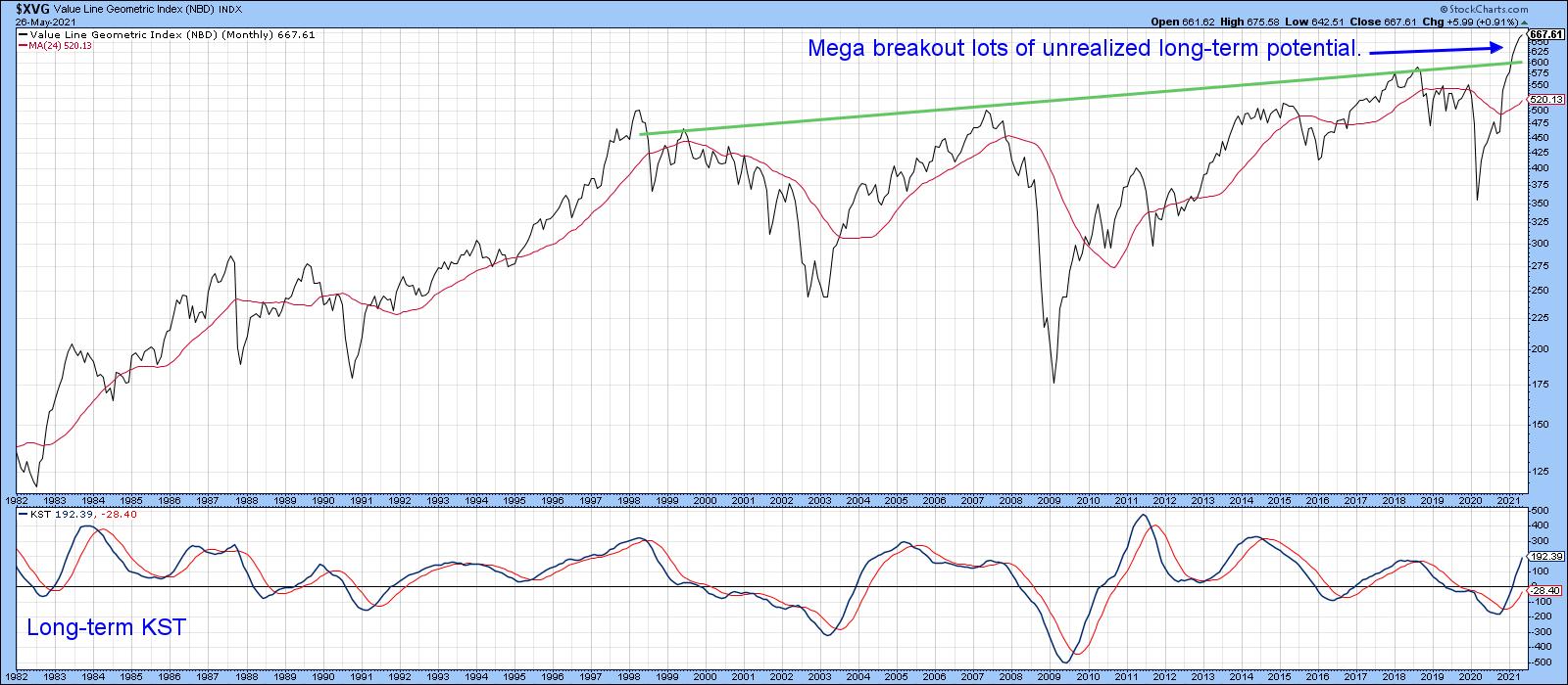 Chart 1Another indicator that has recently gone bullish is shown in Chart 2, where the S&P Composite is compared to the long-term KST for the relative action of the financial sector. The arrows demonstrate that improving relative action by the financials is generally a very positive sign for equities in general, notwithstanding corrections along the way. That indicator has only recently gone bullish. Bearing in mind its almost perfect track record in the last 25-years and the fact that a bullish signal has only recently been triggered, it reinforces the idea that equity prices are headed substantially higher over the next year or two.
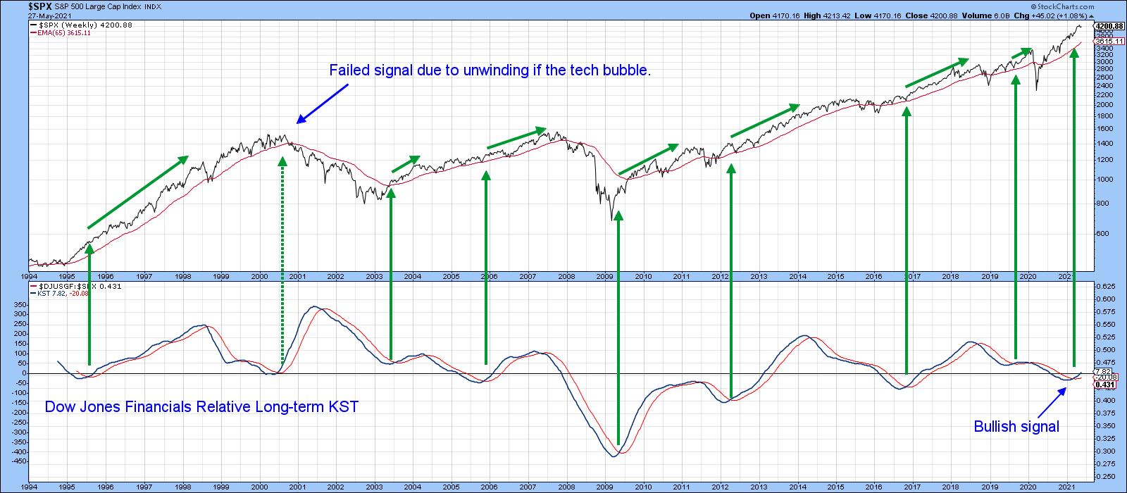 Chart 2Will the Recent Correction Extend? Five Charts to Monitor
The NASDAQ peaked in mid-February, followed by the NYSE and S&P Composites at the beginning of May. Since those dates, the three Indexes have been rangebound, with their 50-day MAs effectively serving as the bottom of these trading ranges. The following five charts are presented as worth watching to see if an extension to that corrective activity is likely.
Chart 3 shows that the S&P Composite can't decide whether to get back above its late October/May up trendline or not. Both the Common Stock and regular NYSE A/D lines remain above their equivalent up trendlines. Indeed, the series in the bottom panel actually registered a new bull market high this week. Until these two indicators break trend, it seems unlikely that the correction will extend.
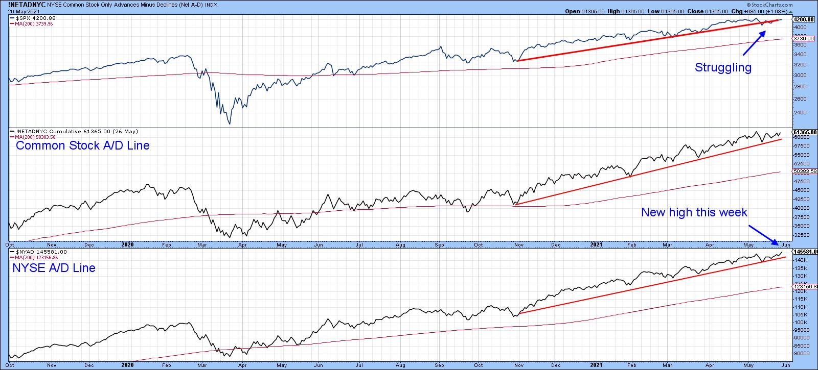 Chart 3The 10-day EMA of the number of NYSE stocks above their 50-day MAs, shown in Chart 4, has been in a declining trend since the beginning of the year. That tells us that, while the NYSE Composite itself has been rising, fewer and fewer stocks have actually been participating. Three instances of joint trendline penetrations in the past were followed by some kind of a setback. A fourth such setup developed in late March, but nothing untoward has yet occurred.
I am watching that dashed line for the NYSE Composite very carefully, since a drop with a decisive close under 16,000 will complete a small top and confirm the 2020-2021 up trendline violation. The 65 level for the 10-day EMA of the indicator is also crucial. That's because a drop below it would re-confirm the pattern of declining lows that has been in force since February.
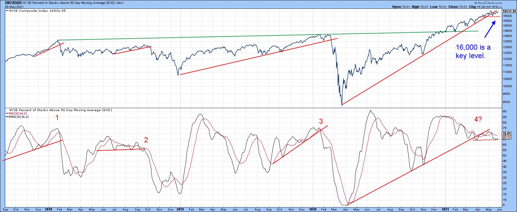 Chart 4Chart 5 plots the VIX inversely to correspond with swings in the NYSE Composite. In order to reduce unwanted volatility, it is also being displayed as a 10-day MA. There have been three occasions since 2015 when it has been possible to observe the violation of an up trendline for the inverted VIX. Each was followed by a correction of some kind. A fourth trendline, emanating at last March's low, is so far intact. Indeed, the MA is currently moving away from the line. As long as that is the case, an extension to the correction is unlikely. However, should this indicator revert to the downside in the immediate future, it would not take much to rupture that up trendline.
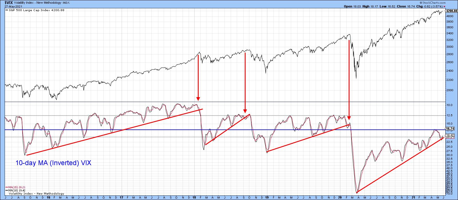 Chart 5Chart 6 shows that when the 45-day ROC of the S&P Composite drops decisively below zero after spending 6-months or more above, it's usually associated with a correction. Most times, the majority of the correction follows the signal, as was the case in February of last year. At other times, the bulk of the downside has already taken place, as in early 2018 and October of last year. This indicator has been above zero since last November, so it's certainly not yet bearish.
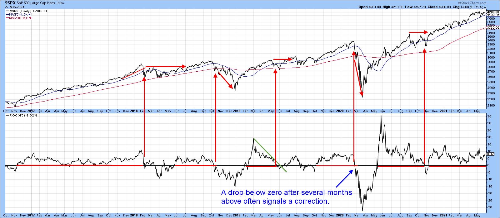 Chart 6Neither is the 10-day EMA for the percentage of NYSE stocks above their 200-day MA, though it's certainly overextended. The red arrows show that, when it crosses below the 80 level, this has often been associated with some kind of a correction. We have seen four successful signals since 2003 and one failure. At the current reading of 82.6, this 10-day EMA remains above the danger zone, but is so close that it is another one worth monitoring. Waiting for the actual signal certainly makes sense, as demonstrated by the 2004 and 2009 examples, where selling on an initial reading of 80 would have left a lot of profit on the table. Please don't forget that you can update any of these charts by simply clicking on them.
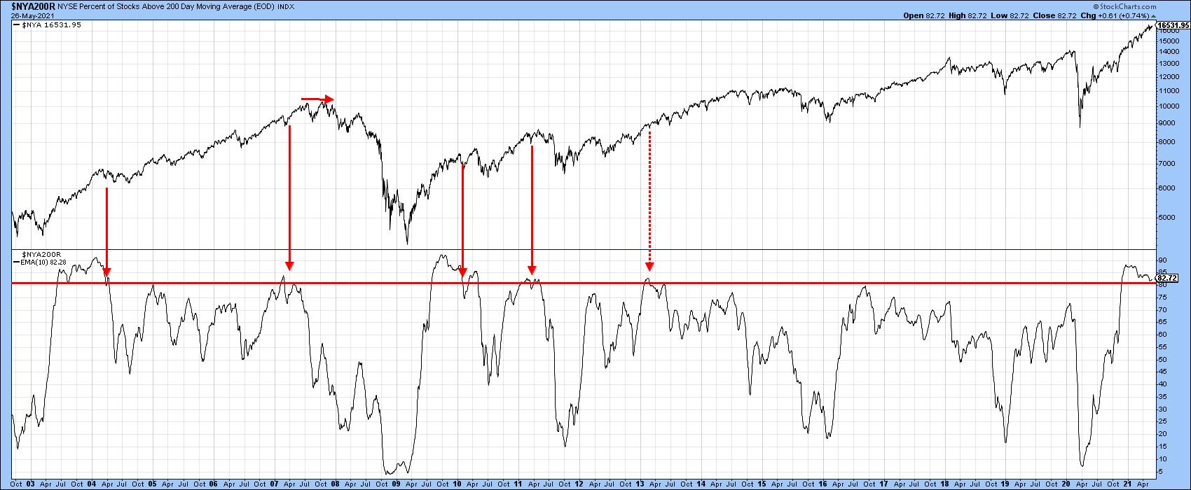 Chart 7
Good luck and good charting,
Martin J. Pring
This article was previously published on Thursday, May 27th at 6:20pm ET in the member-exclusive blog Martin Pring's Market Roundup.
The views expressed in this article are those of the author and do not necessarily reflect the position or opinion of Pring Turner Capital Group of Walnut Creek or its affiliates.