This week has taken quite a few investors by surprise. One thing technicians have learned over the years is that the news is usually created after the price of the stock, bond commodity or index has dropped. This week is a classic example. The message is to ignore the news and watch the price.
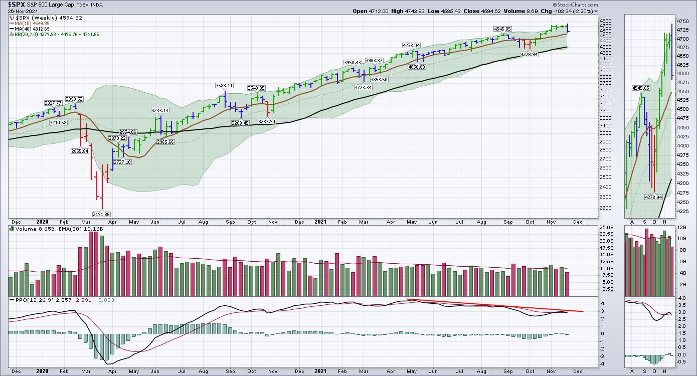
Looking at the $SPX, I have been informing clients that the momentum indicators are weakening on the daily charts, but the weekly charts look even more precarious in terms of momentum.
Here is a daily chart, with the PPO kicking off a sell signal a week ago after a spurious rise. The run up off the October lows has been faster and more significant than most of the rallies in the last year. The April rally was significant as well, but the actual low was early March, so the April pullback knocked a bit of confidence out of the rally. The PPO indicator got as extended, as it did two other times this year. In November, it was on the back of the vaccines becoming available. That was good news and the market soared. The April high was a solid push after the February selloff that many of the SPAC names imploded in. This was a magnitude of similar proportion.
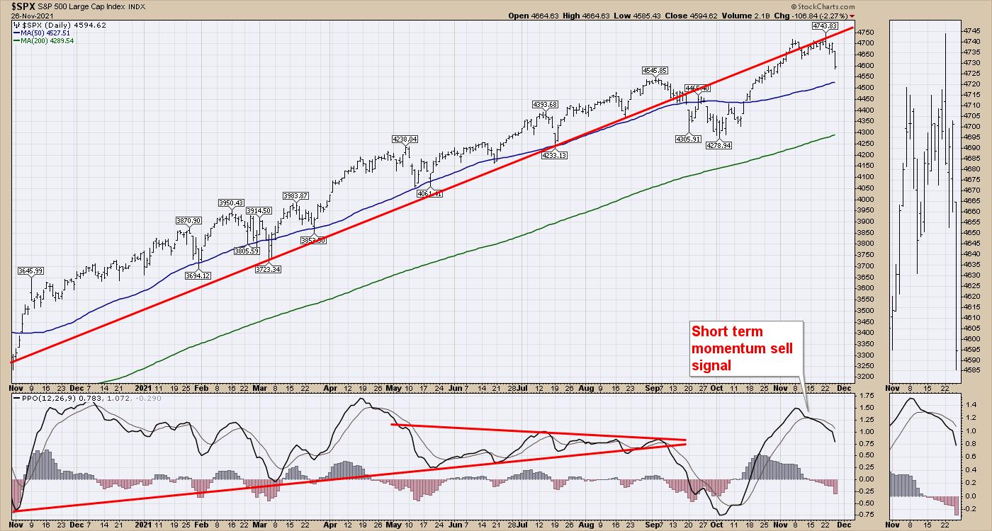
But the weekly chart carries important news for us. The PPO momentum indicator has been getting weaker on every rally and is making a series of lower lows and lower highs. This is adding caution, in my opinion. With the PPO really dropping in September, this rally was important to see if it could muster more power to support the market moving higher. While it looked pretty healthy, my momentum indicators gave sell signals two weeks ago for clients warning them to keep stops tight.
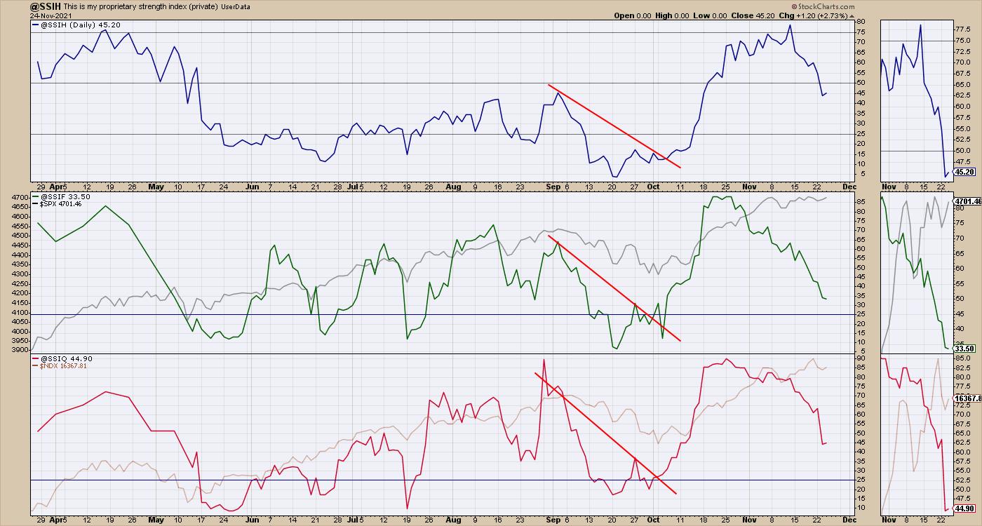
The lower two Schnell strength indexes (faster versions, measured differently) have been weakening for a while. The green one crossed below 50% last week, but have been declining since early November, warning us that the market was getting extended and the power of the rally was fading. On Monday, both of the others fell below 50%, confirming the weakness.
The chart above also holds other clues. Through the summer months, the market was still rallying, but the majority of industries were not participating in the rallies. That makes it harder to invest when only a few are winning if you have a widely diversified portfolio. The rally in October was one we were ready for; clients got a really nice entry close to the bottom. However, even some areas like oil looked great early in the week, only to end up getting bludgeoned along with Friday's 1000 point drop in the $INDU.
It still makes this market hard, as the breadth is surprisingly weak. As I wrote about earlier in the week, the broad investment community has been hiding out in the six mega-cap names as a place to protect capital. Currently, the indexes are pulling back and, until breadth improves, we stand at a very important crossroad. If you would like to learn more about some of the signals and indexes we use to protect capital, check out gregschnell.com/explore.
Good trading,
Greg Schnell, CMT, MFTA
Senior Technical Analyst, StockCharts.com
Author, Stock Charts For Dummies
Want to stay on top of the market's latest intermarket signals?
– Follow @SchnellInvestor on Twitter
– Connect with Greg on LinkedIn
– Subscribe to The Canadian Technician
– Email at info@gregschnell.com


