Chart 1 reflects the fact that some market averages are on the edge of a cliff, in the form of major support trendlines marking the lower edges of potential top formations. Another, such as the Russell 2000, has already completed a top and is edging below a subsequent trading range.
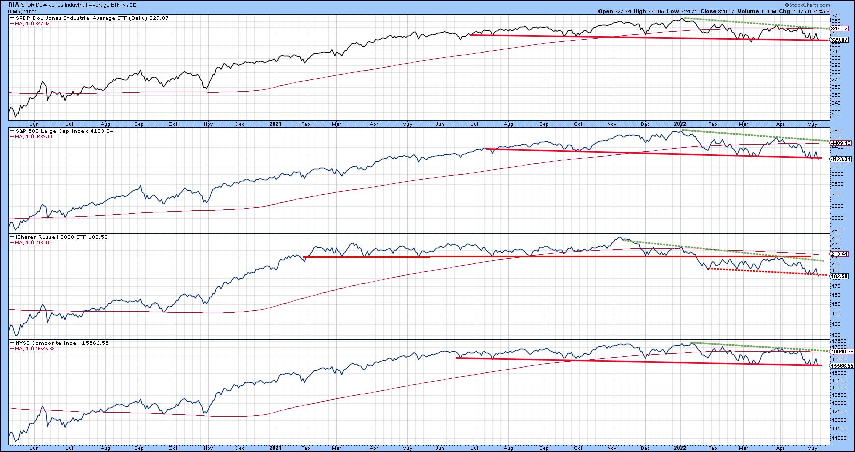 Chart 1
Most egregiously of all, the NASDAQ Composite has completed an eighteen-month head and shoulders formation, with a solid Friday close under the neckline. The two blue arrows suggest that if the break is valid (and does not turn out to be a whipsaw), the indicated minimum ultimate downside objective would call for a drop to around 10,000. The word "if" has been emphasized because sentiment has definitely moved to the bearish side.
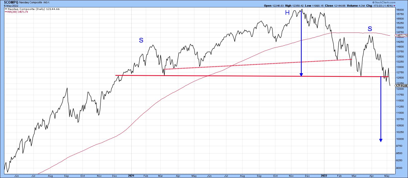 Chart 2
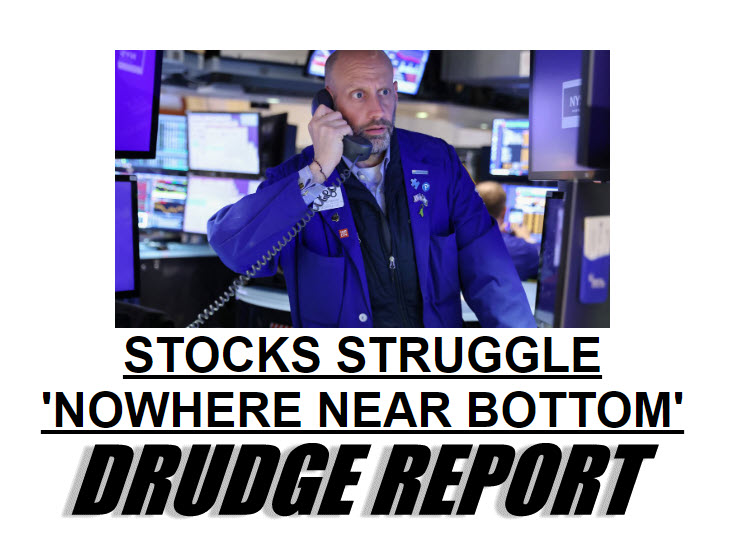
As testimony, take a look at today's headline for the Drudge Report: "Stocks Struggle: 'Nowhere Near Bottom'". When the stock market is featured in a general purpose media outlet, it usually means two things. First, that fear in the exchanges has percolated to just about everyone. Second, dissemination of that news has given all investors the opportunity to get off the railroad tracks, if they choose, before the "financial crash" train arrives. Consequently, the vast majority of the bad news has already been factored into prices. From a contrarian aspect, that could mean that those breaks that have already materialized fail to elicit further downside action, while those that have not bounce to the upside.
That possibility is also reflected in Chart 3, which shows that the 4-week MA of American Association of Individual Investors bulls has reached a record low reading. The arrows show that previous reversals from an overstretched level have consistently been followed by a rally. Last week, the indicator ticked up a little, but not enough to conclude that a reversal has taken place. You can always click on the chart next week, when new data becomes available, to see if it does.
Note that only one signal failed prior to 2022; it has been flagged by the dashed arrow and developed in the 2007-2009 bear market. February's failed reversal signal could be interpreted as a bear market characteristic; however, the record low reading does indicate a very high level of pessimism is already baked into the cake. That could mean significantly lower prices will be more difficult to achieve than the recent breakdowns suggest. Alternatively, those indexes that have not yet broken could receive a new lease on life by reversing to the upside and avoiding the cliff entirely. Either way, we are likely to find out in pretty short order.
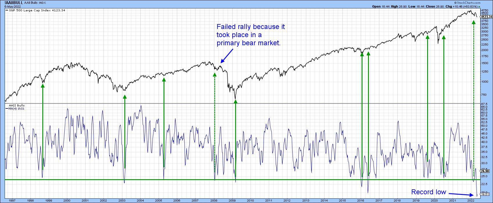 Chart 3
For more insights from Martin Pring, subscribe to read his expert analysis in the member-exclusive blog Martin Pring's Market Roundup.
Good luck and good charting,
Martin J. Pring
The views expressed in this article are those of the author and do not necessarily reflect the position or opinion of Pring Turner Capital Group of Walnut Creek or its affiliates.