
With CPI data coming in as expected and a cooler PPI, it's clear that inflation is heading in the right direction, with the exception of a few areas such as housing. Overall, the data seal an interest rate pause from the Federal Reserve.
After 10 consecutive rate hikes, the Fed decided to leave the Fed Funds rate unchanged at 5.00–5.25%. But the messaging suggested the possibility of a couple more rate hikes this year. The median terminal rate forecast for 2023 is 5.6%.
Market's Reaction To Fed Decision
The market moved sharply lower on the news, and Treasury yields rose. However, towards the end of J. Powell's presser, equities rebounded, except the Dow Jones Industrial Average ($INDU), which was lower mainly because of UnitedHealth Group (UNH). At the close, the S&P 500 index ($SPX) was relatively flat, and the Nasdaq Composite ($COMPQ) closed higher. Tech was back in the lead.
The main takeaway from Powell's presser is that the Fed is committed to bringing inflation down to 2%. Although inflation appears to have moderated, inflationary pressures are still high, and it'll take longer to get to the 2% level.
The Fed's narrative has mostly stayed the same, in that the decision to raise rates in the future will be data-dependent and determined on a meeting-by-meeting basis. The pause gives time to assess the situation and determine if the previous rate hikes have had an impact.
A couple of areas that need to be addressed are the labor market and the supply chain situation. The labor market is still tight. Powell commented that its extreme resilience—more jobs and higher wages—supports consumer spending, which continues to increase. Labor market conditions need to loosen to lower inflation. Meanwhile, the supply chain situation is improving, but is still far from where it should be. A further improvement would help lower goods prices.
State of the Market
It was almost as if the market had already priced in a rate pause, but not necessarily a hawkish pause. Ahead of the Fed's decision, there was a broadening in market participation. Many uncertainties are resolved—the debt ceiling was resolved, the regional bank crisis seems to be in the rear-view mirror, and inflation seems to be cooling. So while Technology and Communication Services were dominating the stock market rally, it's nice to see other areas of the market performing well.
How do you know market participation is broadening? One way is to view a chart of the S&P 500 Equal-Weighted Index ($SPXEW). All stocks in this index are equally-weighted, unlike the S&P 500 index, which is cap-weighted. The chart below displays the $SPXEW with the $SPX as an overlay.
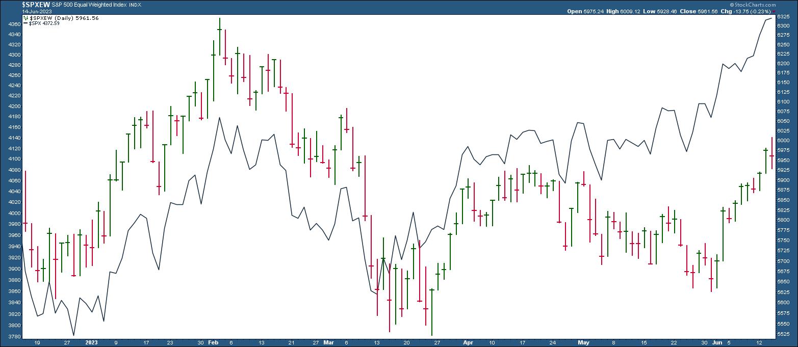
CHART 1: S&P EQUAL WEIGHTED INDEX VS. S&P 500 INDEX. In May, the two were moving in opposite directions but since June the two have been moving in the same direction. Keep an eye on the relationship between these two indexes.Chart source: StockCharts.com (click on chart for live version). For illustrative purposes only.
In May, there was a clear divergence between the two. But in June, $SPXEW started rallying along with $SPX. This upward trend in $SPXEW is a welcome change from the narrow Tech and Communication Services leadership dominating the rally. An upward-trending $SPXEW means broader stock market participation.
To get a better sense of market participation, take a look at the Industrial sector. The Industrial Select Sector SPDR Fund (XLI) has gained momentum in June (see chart below) and is trading at highs.
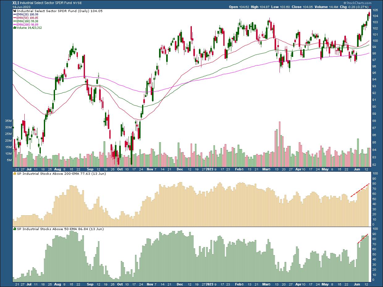
CHART 2: INDUSTRIAL SELECT SECTOR SPDR FUND (XLI) TRADING AT HIGHS. XLI's rally is accompanied with improving market breadth, with more stocks in the sector trading above their 50- and 200-day exponential moving averages.Chart source: StockCharts.com (click on chart for live version). For illustrative purposes only.
XLI is trading above its 50-, 100-, and 200-day exponential moving averages. Market breadth is improving, as indicated by the Industrial stocks trading above their 200- and 50-day exponential moving averages (lower panels below price chart).
The most recent jobs report from June 2 showed that construction, transportation & warehousing saw job gains. This could have helped boost the Industrial sector. The Fed's decision did bring about a selloff in the sector, but it's still holding up.
Global stocks are also reaching new highs. The chart below of the Vanguard Total World Stock ETF (VT) shows that it's trading above its 20-day, 50-day, and 200-day moving averages.
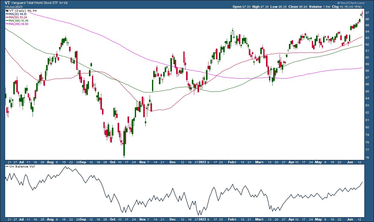
CHART 3: VANGUARD TOTAL WORLD STOCK ETF (VT) HITTING NEW HIGHS. The On Balance Volume (OBV) indicator in the lower pane shows that buying pressure is increasing.Chart source: StockCharts.com (click chart for live version). For illustrative purposes only.
As VT is reaching highs, the On Balance Volume (OBV), which is a market breadth indicator, is moving higher as well. This indicates that buying pressure is increasing, which supports the up move in VT. A divergence between price and OBV could indicate a trend reversal or pullback.
Looking Ahead
With the Fed's pause, will the broad market participation continue, or will Tech and Communication Services take the lead again? Given that the market priced in a rate hike pause, it's likely the broad participation will continue. The wavering was probably because the market was a little surprised by the initial hawkish tone of the pause. But that changed while Powell was speaking. So, maybe the other sectors will continue their upward move, but it doesn't hurt to monitor market breadth in different areas of the market.
Monitoring market breadth gives you a "big picture" view of the stock market and can identify changes in investor behavior, so save these charts to your ChartLists and regularly go through them. StockCharts has an extensive collection of market breadth indicators that can help you analyze different asset classes and sectors.

Disclaimer: This blog is for educational purposes only and should not be construed as financial advice. The ideas and strategies should never be used without first assessing your own personal and financial situation, or without consulting a financial professional.
Happy charting!