|
|
This week I'm attending the International Federation of Technical Analysts (IFTA) conference in San Francisco. The conference started with a great presentation from Richard Arms. Many of you may recognize his name. Richard is probably most known for inventing the Arms Index (a.k.a. $TRIN).
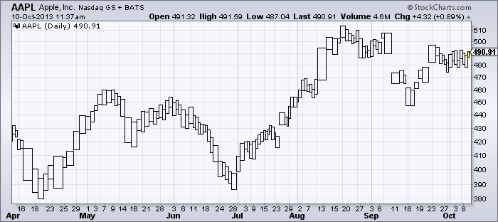
Richard has made several other important contributions to technical analysis as well however including popularizing EquiVolume charts. Those are the charts that show price movements as boxes whose height is equal to the stock's daily range and whose width is proportional to the daily volume. Here's an example of an EquiVolume chart for AAPL:
(Click the chart for a live version)
In his presentation yesterday, Richard explained that he really likes how the boxes give you a great sense of the "supply and demand" for the stock. In the chart above, notice how the boxes are generally bigger near bottoms and the generally get smaller towards the tops as the rallies run out of steam.
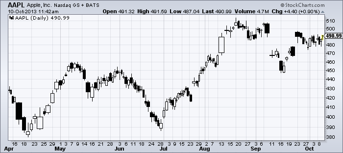
Richard explained that several of his partners took the concept of EquiVolume charting and then applied it to candlesticks, eventually coming up with what we now call CandleVolume charts. CandleVolume charts are candlestick charts where the width of the candle is proportional to its volume. Here is that same AAPL chart using CandleVolume:
In a statement that was a surprise to me, Richard said that he never liked CandleVolume charts because, by not emphasizing the stock's entire range, they don't fully show the supply and demand characteristics that EquiVolume charts do. (Remember, candlestick charts emphasize the distance between the open and the close, not the high and the low.)
In the two charts above, you can see what Richard is referring to. The differences between the bottoms and the tops are much more noticeable on the top chart. For example, the bottom in late June is preceeded by a very noticeable cluster of small boxes on the EquiVolume chart and then, during the bottom's formation, the boxes are larger and taller. That price action is much less noticeable on the CandleVolume chart.
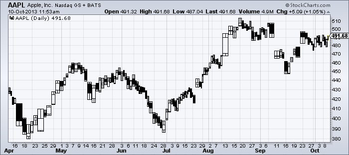
Despite that weakness, Richard did say that there were several other aspects of CandleVolume that he liked and so he had been working with his partners to create a new kind of chart with the benefits of both. He's calling this new type of chart the "Arms CandleVolume" and it, quite literally, is the combination of both styles - a CandleVolume chart with EquiVolume boxes around each candle.
During his presentation, Richard said that this new kind of charting would be available in a couple of weeks or so. That got me to thinking and, a couple of chat messages later... ta da!
Aren't our programmers wonderful? Richard was thrilled when I showed him.
As of today, anyone can now create these charts using our normal SharpCharts workbench. Simply select "Arms CandleVolume" from the "Type" dropdown on the SharpCharts page.
Everyone should consider this chart type to be "experimental" for now. Richard himself is still playing with them to see if they are really as useful as he thinks they should be.
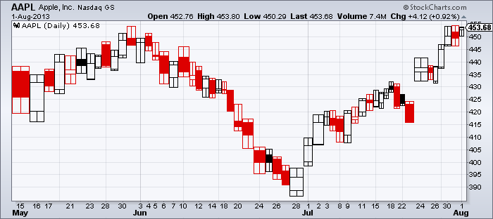
I will say that, in general, these new bars are more useful on larger charts where the boxes can be visually larger and more distinct. Coloring the bars can also help. Here's a "Zoomed in" version of that bottom on the AAPL chart I was discussing previously:
Please spend some time with this and let me know you thoughts in the comments section below.
Want to learn more about these kind of charts? Check out our ChartSchool articles on them and also check our Richard's book on the topic.
- Chip


Posted by: Mark Dobbins October 10, 2013 at 02:58 AM
Posted by: Tim Farrar October 10, 2013 at 12:26 PM