 The definition of "Smart Money": Money bet or invested by people with expert knowledge. I won't claim expert knowledge, but the pursuit of getting as close to that as possible is what we are doing here on StockCharts.com. In many of my previous DecisionPoint blog entries I've shown you how to use scans, DP Tracker Reports (members only), Price Momentum Oscillator (PMO), among others to help you find opportunities in a smart way. I'm going to tell you how to visually scan for the best prospects, see relative strength and evaluate the charts using only a few clicks.
I'm going to make a few assumptions up front: you have a ChartList and you know what CandleGlance (I have an article here that tells you how to set up a DecisionPoint CandleGlance style if you want to). Keep reading, you don't have to set up your CandleGlance style just yet to understand the article or make it work.
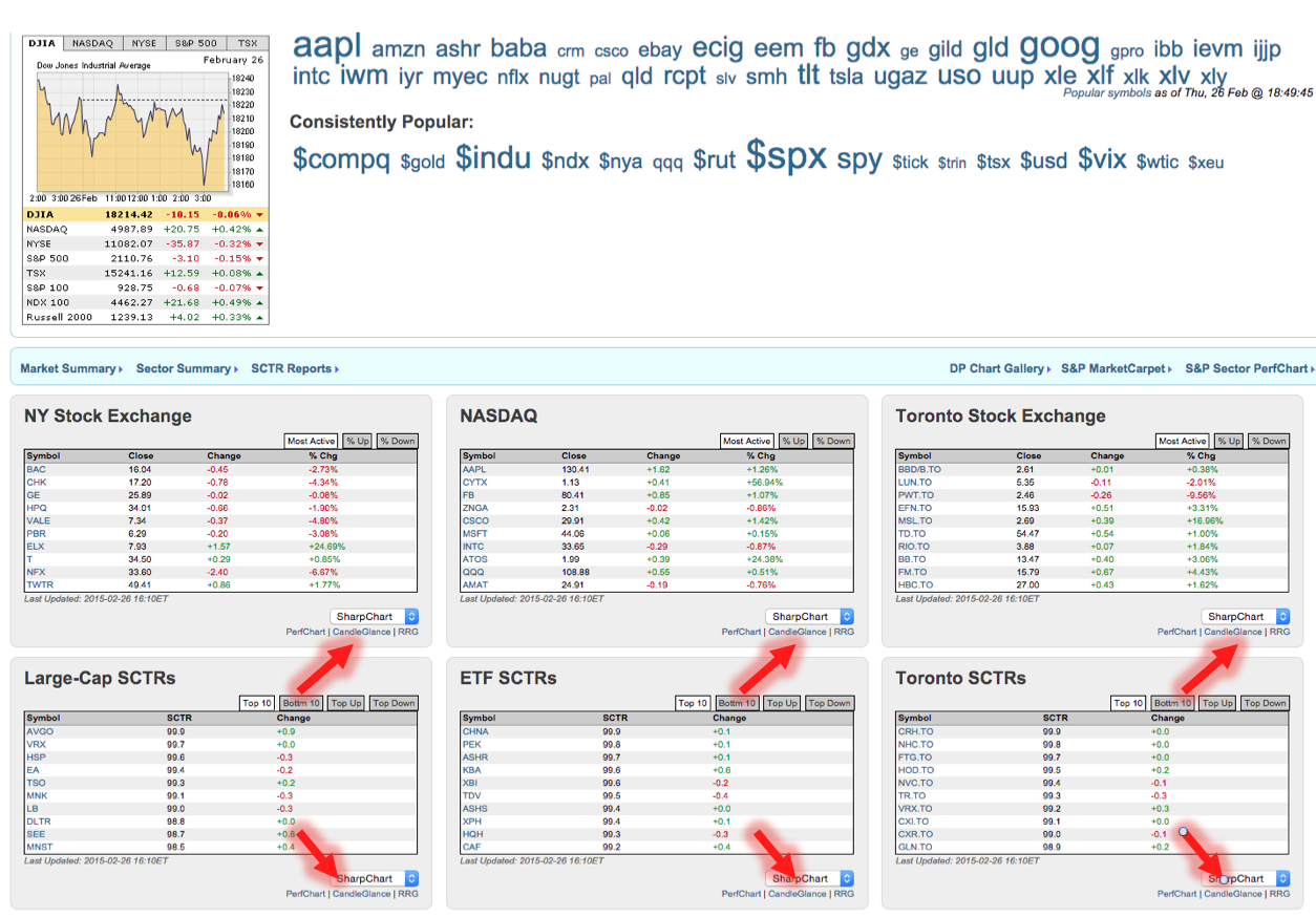
So first things first, you'll want to pick a ChartList to review. All you need in that list are the stocks, indexes, ETFs that you want to scan. Create your ChartList from a scan or your watch list or pre-created list you've saved or if you have downloaded the "StockCharts.com Essentials" ChartPack (members only) you can use ChartLists made with essential market groups or you can even go to the homepage and click on "CandleGlance" underneath any of the summary lists.
Now that you have your CandleGlance screen up, if you clicked on one of the homepage CandleGlance groups above, your screen should look something like this (with your CandleGlance style):
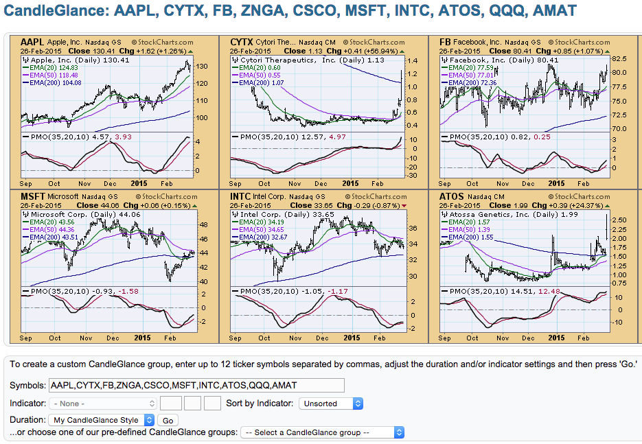
Notice at the bottom of that screen (sometimes it will be at the top), you can choose an Indicator and duration. Right now you are able to quickly see PMO configurations if they are part of your CandleGlance style, which is great, but if your CandleGlance doesn't have the PMO or it has over a hundred entries, you'll want a way to see the PMO and have the list ordered by PMO value. When we do that, we can compare values visually for relative strength, meaning those with the lower readings will be at one end and higher readings on the other end.
You can sort by PMO value by first picking a duration for visual comparison in the drop-down menu. I'll pick a "1 year". Then you choose "DecisionPoint PMO" from the indicator drop-down menu (that menu will only activate after you've chosen a duration). Be sure to click the "Sort by Indicator" button so we can make the relative strength comparisons. The result will look something like this with the PMO now included if it wasn't before (note my colors change to a StockCharts default so yours might too):
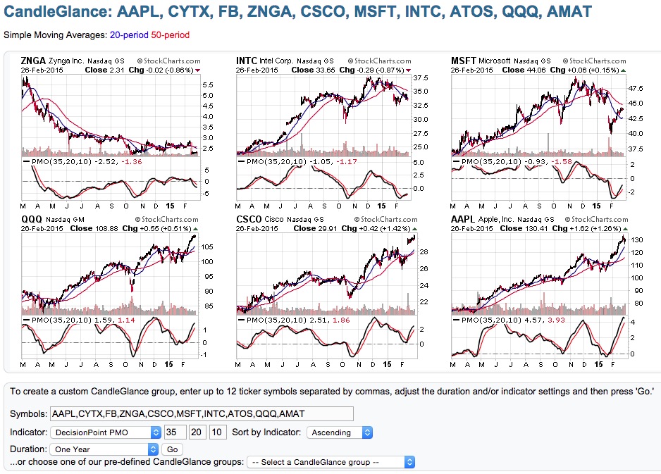
We can now decide where we want to "pick" from as far as PMO strength reading. I visually scan for an oversold PMO or a PMO positive crossover or one nearing. I am also scanning the price patterns, looking for a promising pattern with a great PMO configuration. When your list is very large, you'll definitely want to use an approach of scanning weakest to highest or vice versa, knowing that depending on the location in the ChartList it has more or less internal strength. "Glancing" at the list above, Intel looks interesting with a recent oversold PMO positive crossover BUY signal and possible reverse island formation. If a stock interests you in CandleGlance, simply click on it and it will appear on your SharpCharts workbench, ready for further review.
The DP Tracker Reports are great for those who want to see the numbers in a table and then look at the chart, but using CandleGlance, you get the same information, only visually first before you call up the chart for closer review.
I'll be demonstrating this technique during my next DecisionPoint LIVE! webinar on Wednesday, March 4th at 4:30pm EST. Sign up here!
Happy Charting!
Erin