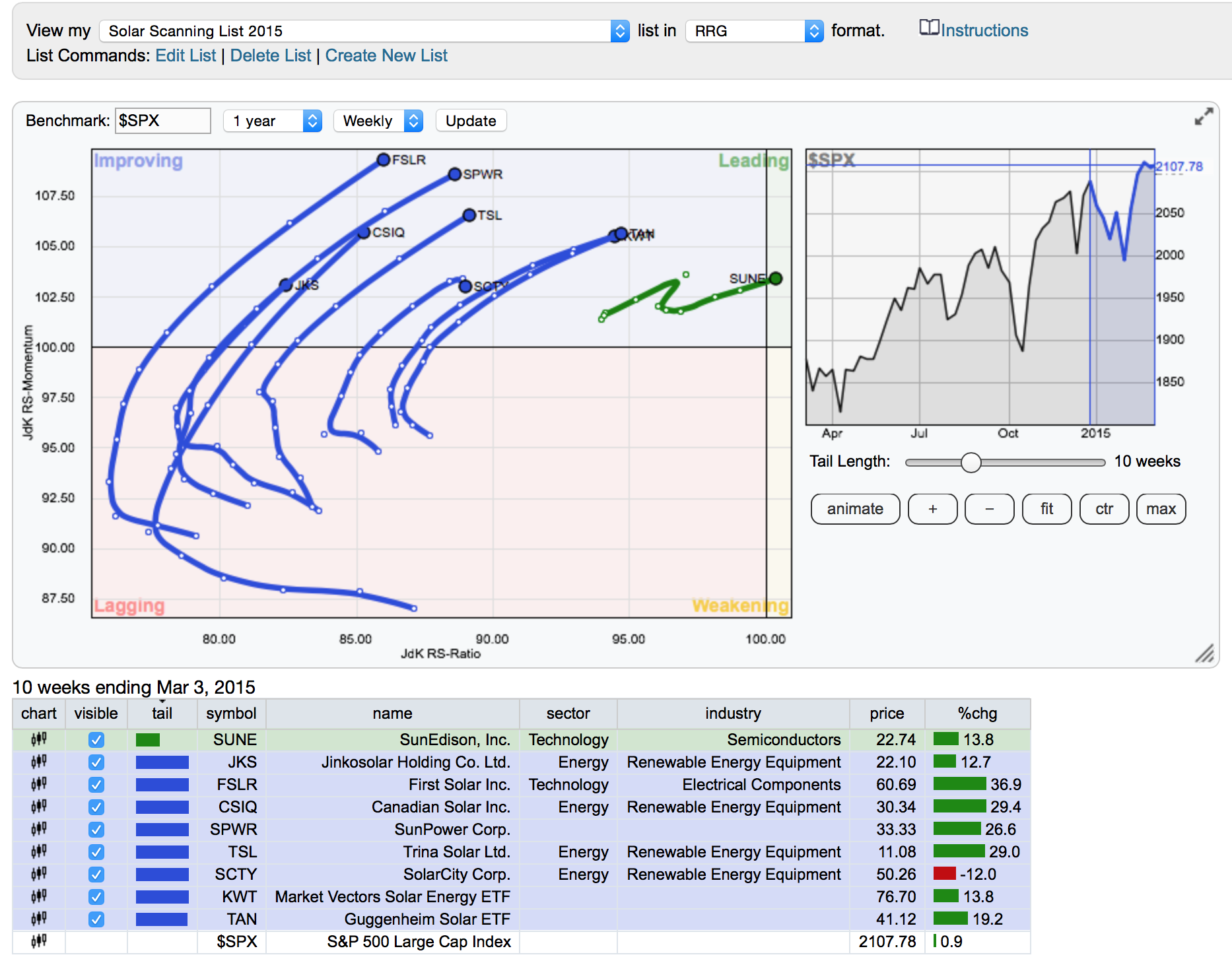
The RRG charts were introduced to StockCharts.com last year. They create such an interesting view of the markets. In December, we talked about the solar stocks being pulled back on the back of lower crude prices. The 9 part series on Solar stocks used the RRG as one tool to demonstrate the trend change in an industry group. That group of articles can be found by following this link. The Solar Stock Series. The RRG chart starts to show the industry group direction relative to a benchmark like the S&P 500 ($SPX). The solar stocks have rotated from one of the weakest industry groups in the red zone to one of the more powerful industry groups rising in momentum and relative strength. The chart shows the individual stocks rotating out of the red zone, into the improving zone (blue) and now flying in formation towards the green zone. This week the solar stock Sun Edison (SUNE) moved into the green zone which demonstrates a stock outperforming the $SPX on momentum and relative strength on a weekly basis.

This symmetry of all of the stocks moving together is pretty bullish. However, they can also turn down while left of the centre point. The chart view above shows the centre point at 100.00 on the x-axis. This week is an excellent place to watch price action closely. Further strength will probably push this to one of the top performing industry groups. However, should they all start to turn down here, it would be wise for investors to protect profits. The group needs to move to the right side of the grid to outperform the $SPX in relative strength. More information on RRG can be found in the ChartSchool. Here is the link to RRG.
Good trading,
Greg Schnell


