I don't talk about the technology stocks a lot as Arthur and Tom do a great job of zeroing in on them. This week seems like a good week to change it up a little. The QQQ is the focus of my attention today as a few simple reversal bar patterns put the highs of this week in question.
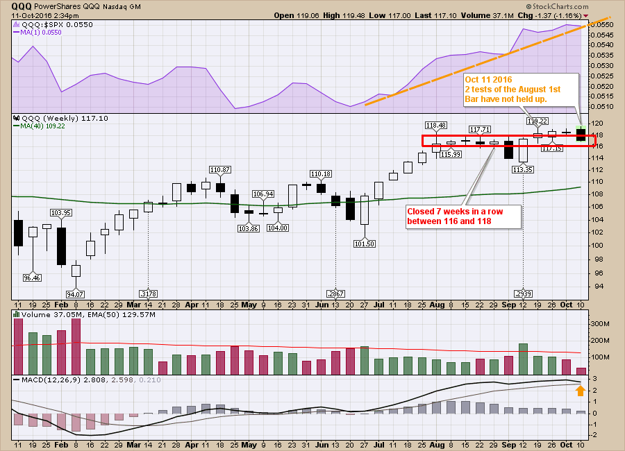
We are already making a higher high and lower low than last week which makes this an outside week and we are only on Tuesday. We are also taking out the previous weeks' highs and lows so it is a double outside week. Last week was a doji candle which implies uncertainty, but it did make a higher high. What these candles are telling us is that the market is having trouble holding these higher highs after breaking out 3 weeks ago.
In terms of price, we are below where the market opened three weeks ago, but not below the intra-week low which is the bottom of the wick. With 7 weekly closes between 116-118 through all of August and some of September, then three weeks sideways after breaking above the 118 level, the market is losing the upside momentum. We had a two-day surge (Sept 21-22) out of the previous zone, and have done nothing for three weeks hence. So after making higher highs this week, we are now trading at three-week lows. Let's call it very sluggish. To just pile on the bearish thoughts, the market topped on October 9, 2007, after briefly taking out the July highs.
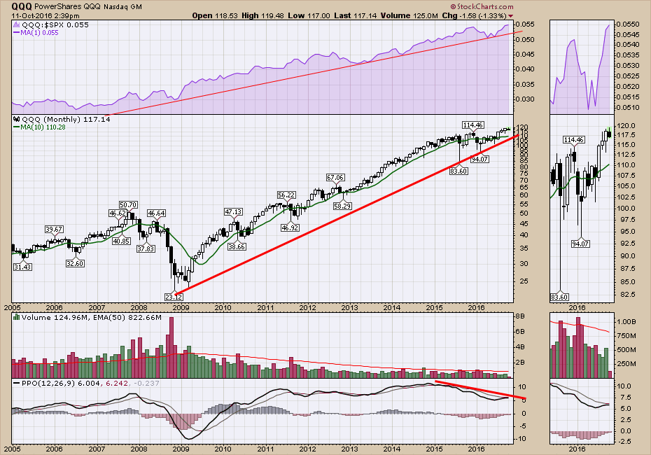
While everything looks like it is slowing down on the weekly chart, the monthly charts have some signs of caution as well. Monthly charts take a long time to play out, and we are not even at the halfway mark for the month of October, so let's be aware that this months candle is lacking a few weeks of trade data. The top shaded area in purple shows the Nasdaq outperforming the $SPX. That relative strength (QQQ:$SPX) recently made new highs so that is bullish. That indicator did not provide any clues of a larger top in the past either.
However, the PPO indicator has a lot of negative slope to it. It is currently near a bullish cross to its signal line as you can see in the zoom panel. The value in this chart is the combination of weak price action on the weekly chart above and significant declining momentum on the monthly chart suggests to me that there are some warnings showing up. The PPO can waddle sideways as it did in 2011-2013. A downsloping PPO suggests caution is in order. If it can't get back above its signal line soon, this adds to the larger bearish picture. Negative divergence is the name, but monthly negative divergences are not great for timing. They do write clues to help investors be aware of the potential for a major trend change.
 Everything trend-wise is still on a buy signal. The sluggish momentum is concerning and the outside candle that has formed for this week has taken out the lows and the highs for the previous two weeks. The monthly paints a picture of weakening momentum. This is not a sell everything and head for the hills article. I wanted investors to be aware of the larger picture for overall context. That's why I think this is a timely article for the Don't Ignore This Chart!
Good trading,
Greg Schnell, CMT, MFTA.


