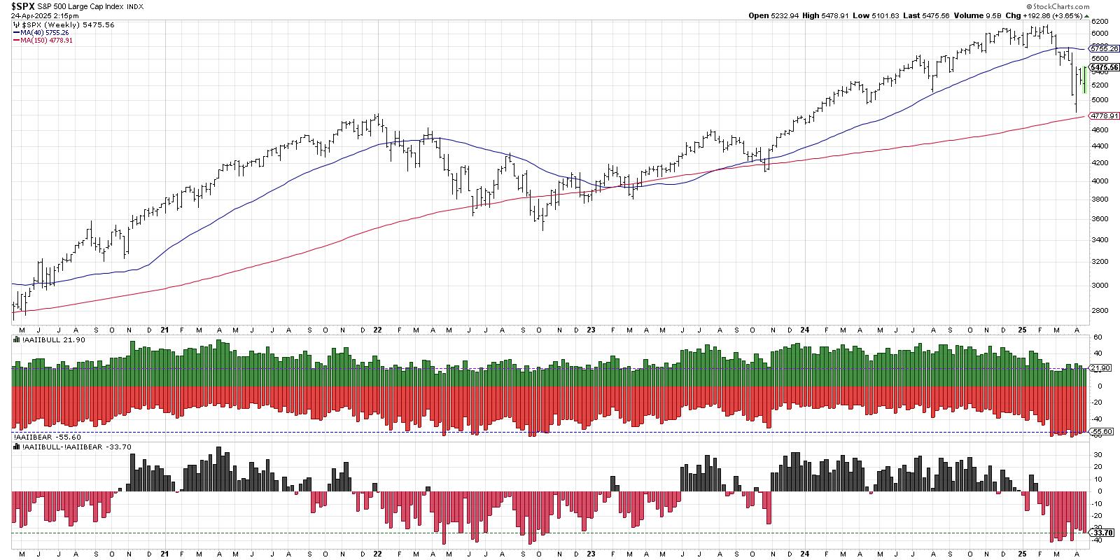
With the ongoing market turmoil, it seems that the P&F charts are plummeting. This style of charting does a great job of clearly illustrating support - you can see when price break downs as support is broken. The chart below demonstrates how well the price has been supported at 2600. The second-to-last column of O's briefly broke below the two prior lows, forming a pattern called a triple bottom breakdown. After a small bounce up, the price failed to make a higher high. When the final column of O's formed, the price plummeted lower.
After the price reached the up-sloping blue line, that level became support. Now that price has broken below that level, it has switched and drawn a red line on the top, indicating a bear market.
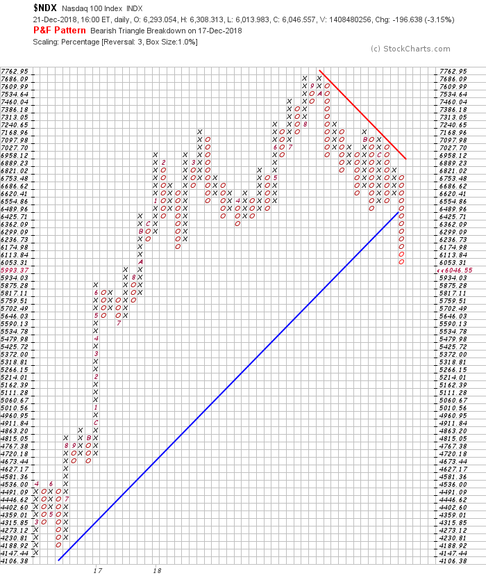
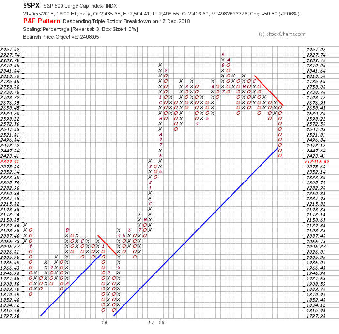 P&F charts focus on price and, consequently, the time axis can vary widely. Notice how the time scale on this chart is not consistent.
The chart below is for the NASDAQ 100. This chart has clearly fallen below support and has also broken the blue uptrend line. The red downtrend line is currently resistance and, until the price breaks back through the red line, the market is considered to be bearish.
 There are lots of reasons to use P&F charts, particularly as their clarity is very high. More information can be found in these ChartSchool articles.
The markets had a brutal 4th quarter, with price action ranking down there with the 4th quarters of 1929, 1987 and 2008. A sour group of grinches indeed.
On The Final Bar, I mentioned a lot of negative sentiment indicators. If you are not familiar with sentiment indicators, you may find this video helpful. There are some other charts to take note of as well.
The Canadian Market Review goes through the significant breakdowns on the charts and what to look for.
For those of you looking for a small gift, you might have some family or friends that would like to learn more about the basics of charting; if so, they'll love Stock Charts for Dummies. The first section of the book walks through all the chart settings to get the charts you want, the second section explores why you might use charts for investing and the third section is about putting it all together.
Click here to buy your copy of Stock Charts For Dummies today!
If you are missing intermarket signals in the market, follow me on Twitter and check out my Vimeo Channel. Bookmark it for easy access!
Good trading,
Greg Schnell, CMT, MFTA
Senior Technical Analyst, StockCharts.com
Author, Stock Charts for Dummies
Hey, have you followed me on Twitter? Click the bird in the box below!
Want to read more from Greg? Be sure to follow his StockCharts blog:
The Canadian Technician