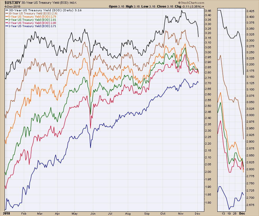
The yield curve has been the talk of the town as the Fed has raised interest rates. With lots of discussion, a part of the yield curve finally inverted this week. The issue at this point in time is the bond market has seen the 2, 3 and 5-year yields invert. How can we show that on a chart? The real problem for chartists is getting the settings right to make it easy to see. On the chart below, I have used the Price (same scale) overlay tool rather than the Price selection as an indicator. By using the Price (same scale) it separates each of the lines nicely. However, Monday and Tuesday marked this inversion on the short end of the curve.
What do we mean by that? Well, the short end (1-year, 2-year and 5-year) treasury products have reversed where the 5-year in orange is below the two-year or three-year yield. Notice how they were nicely sorted earlier in the year. Now this inversion suggests we may have a recession coming. Usually a more meaningful signal comes when the 10 year (brown line) drops below the 2-year (red line). At the close of trading on Tuesday, we can see they are only 11 points apart (see legend). Back in February, they were 75 points apart.
 Click on this chart for an updated version and save it to your chartlists. You can also see the settings down below after clicking if you want to adjust your own.
While the Fed has been hammered with this yield curve information over and over, the December 2018 rate hike is widely expected. If the Fed doesn't hike in December, that might suggest they see bigger problems too. So now it is a battle of nerves. Will the market fall either way? Would the market rally if they didn't hike? It adds to the Fed related uncertainty, that is for sure.
With the market closed Wednesday, watch carefully to see how things evolve here. We were setting up higher lows in momentum on the equity indexes. Can this be a pullback and big institutional buyers step in for another drive to higher highs? This is what makes the setup so difficult. The yield curve tells us to expect a softening economy. It does not tell us if it will be a major recession.
For more information, you might find the last two videos I recorded informative.
A funny story from Thanksgiving weekend. My daughter was at the library signing out books. She looked to see if the City Of Calgary library had ordered any of my books. Well, the good news was they had five in inventory, but they were all signed out and a waiting list! That's fun for me to hear!
If you are looking for a small gift, you might have family or friends that would like to learn more about the basics of charting. The first section of the book walks through all the chart settings to get the charts you want. The second section is why you might use charts for investing and the third section is putting it all together.
Click here to buy your copy today! Stock Charts For Dummies.
The Final Bar video shows three simple scans users can work through to help find strong stocks off the lows.
If you are missing intermarket signals in the market, follow me on Twitter and check out my Vimeo Channel often. Bookmark it for easy access!
Good trading,
Greg Schnell, CMT, MFTA
Senior Technical Analyst, StockCharts.com
Author, Stock Charts for Dummies
Hey, have you followed me on Twitter? Click the bird in the box below!
Want to read more from Greg? Be sure to follow his StockCharts blog:
The Canadian Technician


