|
|
There are two ways to compare securities using SharpCharts. The first method is simply to analyze the price plots together, one overlaid on the other. Another security can be overlaid by choosing “price” in the indicator box, entering “$SPX” for parameters and choosing “behind price” for position. Any symbol can be entered here. I chose red for color contrast.

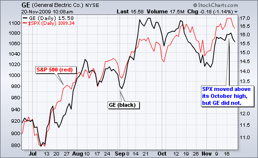
The chart below shows General Electric (GE) in black and the S&P 500 in red. Both moved higher from July to September, but started to diverge in October and November. Notice that the S&P 500 recorded higher highs in October-November, but GE formed lower highs. GE is not keeping pace with the S&P 500 and shows relative weakness.
 Click this chart for details.
The second method involves a ratio chart. Choose “price” in the indicator box and then enter the two symbols you wish to compare for parameters. I want to know the performance of GE relative to the S&P 500 so I enter the symbols as a ratio (GE:$SPX). You can use any two symbols. I elected to show this indicator below, but you can also choose to view is behind the main price plot (GE in this case).

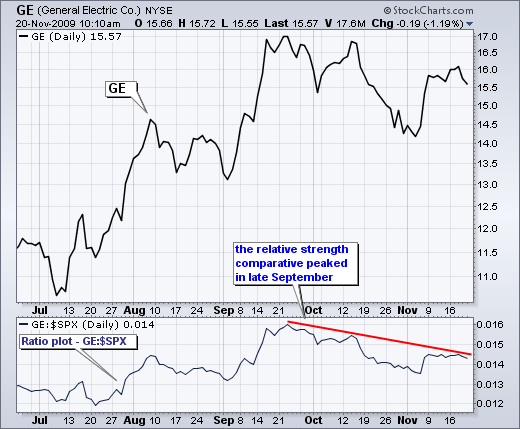
The chart below shows the relative strength comparative or ratio plot for GE and the S&P 500. Notice that the ratio peaked in late September and declined the last two months. GE started lagging the S&P 500 in late September and continues to lag as long as this ratio moves lower. A break above the November highs is needed for GE to start showing relative strength again.
 Click this chart for details

The chart below shows General Electric (GE) in black and the S&P 500 in red. Both moved higher from July to September, but started to diverge in October and November. Notice that the S&P 500 recorded higher highs in October-November, but GE formed lower highs. GE is not keeping pace with the S&P 500 and shows relative weakness.
 Click this chart for details.
The second method involves a ratio chart. Choose “price” in the indicator box and then enter the two symbols you wish to compare for parameters. I want to know the performance of GE relative to the S&P 500 so I enter the symbols as a ratio (GE:$SPX). You can use any two symbols. I elected to show this indicator below, but you can also choose to view is behind the main price plot (GE in this case).

The chart below shows the relative strength comparative or ratio plot for GE and the S&P 500. Notice that the ratio peaked in late September and declined the last two months. GE started lagging the S&P 500 in late September and continues to lag as long as this ratio moves lower. A break above the November highs is needed for GE to start showing relative strength again.
 Click this chart for details


