|
|
Interactive Perfcharts
TM compare performance of up to 10 different securities over a given timeframe. For example, the Sector SPDR Perfchart compares the performance of the nine S&P Sector SPDRs against the S&P 500. This is one of the most popular PerfCharts. Performance can be measured on an absolute basis or a relative basis. This article will show how to change from relative performance to absolute performance and how to change the relative performance benchmark.
 Click this chart for details
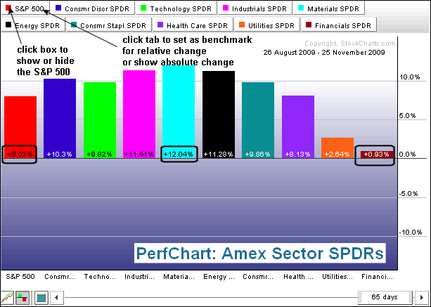
The first PerfChart shows absolute (actual) percentage change for the nine sectors and the S&P 500. Notice that the tab for the S&P 500 is white. Click this tab to change from relative performance (gray) to absolute performance (white). The security with the gray tab becomes the benchmark for relative performance. The red box for the S&P 500 is filled, which means the S&P 500 is shown. Click this box to show or hide the S&P 500 or any other security.
 Click this chart for details
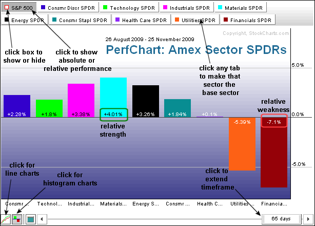
The second Perfchart shows relative performance (gray S&P 500 tab and hollow box). The percentage change in each sector represents the amount of overperformance (positive) or underperformance (negative). For example: if the S&P 500 is up 8.03% and the Financials SPDR (XLF) is up .93%, the relative performance for the XLF would be -7.1% (.93 - 8.03 = -7.1). The Materials SPDR (XLB) is up 12.04% over the last 65 days. XLB performance relative to the S&P 500 is +4.01%. (12.04 - 8.03 - +4.01). The Materials SPDR is outperforming the S&P 500, but the Financials SPDR (XLF) is underperforming.
 Click this chart for details
The first PerfChart shows absolute (actual) percentage change for the nine sectors and the S&P 500. Notice that the tab for the S&P 500 is white. Click this tab to change from relative performance (gray) to absolute performance (white). The security with the gray tab becomes the benchmark for relative performance. The red box for the S&P 500 is filled, which means the S&P 500 is shown. Click this box to show or hide the S&P 500 or any other security.
 Click this chart for details
The second Perfchart shows relative performance (gray S&P 500 tab and hollow box). The percentage change in each sector represents the amount of overperformance (positive) or underperformance (negative). For example: if the S&P 500 is up 8.03% and the Financials SPDR (XLF) is up .93%, the relative performance for the XLF would be -7.1% (.93 - 8.03 = -7.1). The Materials SPDR (XLB) is up 12.04% over the last 65 days. XLB performance relative to the S&P 500 is +4.01%. (12.04 - 8.03 - +4.01). The Materials SPDR is outperforming the S&P 500, but the Financials SPDR (XLF) is underperforming.


