|
|
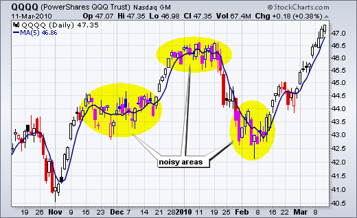
While hiding the price plot seems a bit counter-intuitive, the “invisible” plot can be a useful chart tool. With today’s volatility, price action can look rather noisy, especially during consolidations. Even close-only charts can look rather jagged. Chartists can smooth the data by using a moving average. Moreover, SharpCharts users can choose to show the daily price plot as invisible and only show the moving average. The first chart shows the Nasdaq 100 ETF (QQQQ) with candlesticks and a 5-day moving average. The yellow areas show some noisy periods with seemingly volatile day-to-day action.
 Click this image to see the settings
The second chart shows the same 5-day moving average without the daily candlesticks. It looks a lot less noisy.
 Click this image to see the settings
The second chart shows the same 5-day moving average without the daily candlesticks. It looks a lot less noisy.

The option to make a plot invisible can be found in Chart Attributes / Type. Select the “invisible” option and update the chart to make the candlesticks or bars disappear. You can even add another moving average and show two moving averages without the daily price bars or candlesticks.


