|
|
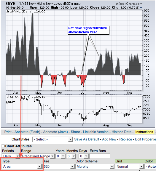
What’s the difference between Net New Highs and Cumulative Net New Highs? Net New Highs is simply the difference between new 52-week highs and new 52-week lows. For example, Net New Highs would be +80 if there were 100 new highs and 20 new lows. Daily statistics fluctuate along with the market. Net New Highs are generally positive when the market is moving higher and lower when the market is moving lower. Over a period of time, Net New Highs will fluctuate above and below the zero line, similar to an oscillator. Sustained market advances will show consistently positive Net New Highs. Sustained declines will show consistently negative Net New Highs. The chart below shows NYSE Net New Highs ($NYHL) as an “area” plot over the last five months. Notice how the indicator turns positive and negative with the market swings.

Click this image for a live chart
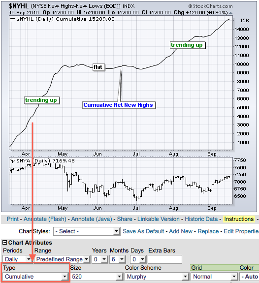
The Cumulative Net New Highs line transforms Net New Highs into a trending indicator. It is simply a running total of Net New Highs. The line rises each day Net New Highs are positive and falls each day Net New Highs are negative. Sustained positive readings in Net New Highs produce an uptrend in the cumulative indicator. Sustained negative readings produce a downtrend. The chart below shows NYSE Net New Highs ($NYHL) as a “cumulative” plot over the same five months. Notice how the cumulative version trends higher, flattens and then resumes its uptrend.

Click this image for a live chart

Click this image for a live chart
The Cumulative Net New Highs line transforms Net New Highs into a trending indicator. It is simply a running total of Net New Highs. The line rises each day Net New Highs are positive and falls each day Net New Highs are negative. Sustained positive readings in Net New Highs produce an uptrend in the cumulative indicator. Sustained negative readings produce a downtrend. The chart below shows NYSE Net New Highs ($NYHL) as a “cumulative” plot over the same five months. Notice how the cumulative version trends higher, flattens and then resumes its uptrend.

Click this image for a live chart


Posted by: james c. johnson September 17, 2010 at 17:22 PM