|
|
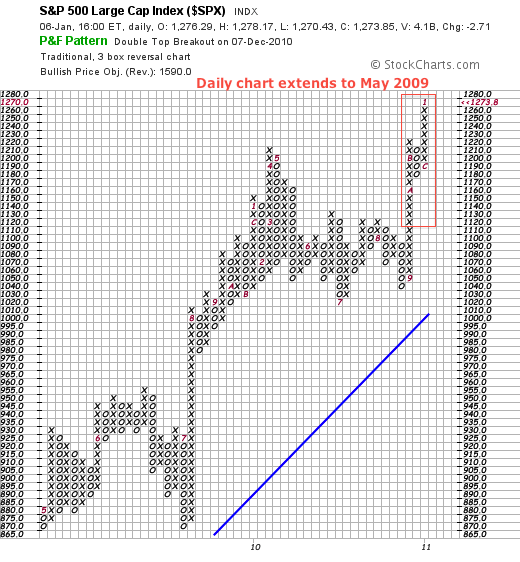
Daily Point & Figure charts often cover a long timeframe and are often best suited for long-term analysis. The chart below shows the S&P 500 daily P&F chart with traditional scaling. This means box size is 5 between 500.01 and 1000, and 10 between 1000 and 2500. This traditional P&F chart extends back to May 2009. Notice the red 5 in the bottom left hand corner.

Click this image for a live chart
Chartists can easily shorten the timeframe and expand sensitivity by selecting an intraday setting. Go to the “periods” setting in “chart attributes” just under the chart.While 60-minute charts might seem short-term oriented, 60-minute P&F charts often cover several months and can be used for a medium-term timeframe. The chart below shows the 60-minute P&F chart for the S&P 500 extending back to mid September, around four months. The red rectangle on the daily chart shows the period covered on the 60-minute P&F chart. Chartists can use the daily P&F chart to define the bigger trend and an intraday chart to identify smaller setups in harmony with that trend.

Click this image for a live chart


