|
|
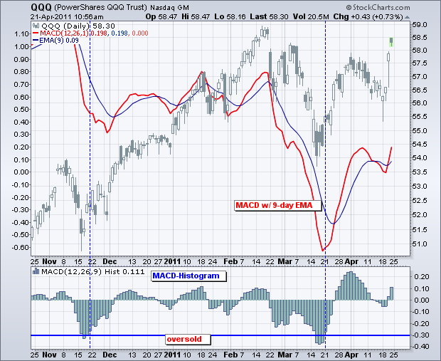
The MACD histogram measures the difference between MACD and its signal line, which is the 9-day EMA of MACD. This makes it an indicator of an indicator. Like MACD, the Histogram fluctuates above/below the zero line and produces bullish/bearish divergences. This indicator can be used to predict turns in MACD and, by extension, the underlying security. MACD-Histogram can also be used to define overbought and oversold conditions.

The chart above shows the Nasdaq 100 ETF (QQQ) with MACD behind the price plot and the MACD-Histogram in the lower window. Chartists can look back at the prior Histogram range to get an idea of overbought and oversold levels. These will vary according to the securities price and volatility. Basically, the Histogram is oversold when MACD extends too far below its signal line and overbought when MACD extends too far above its signal line. Looking back over the last six months, we can see that moves below .30 produced oversold readings for the Histogram in QQQ. A subsequent move back above this oversold level corresponded with reversals in mid November and mid March. Not all signals will look this good though. This article is simply designed to show chartists a new twist on a classic indicator.

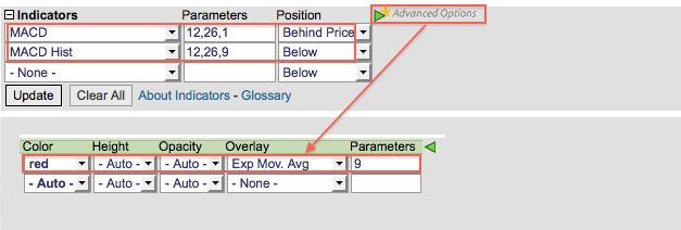
Charting Notes: the histogram was removed from MACD by setting the signal line at 1 (12,26,1). A signal line was then added by choosing “Exp Mov. Avg” in “advanced options” for the indicator. MACD was placed “behind price” to compare movements directly with QQQ. The MACD-Histogram is a separate indicator on SharpCharts.


