|
|
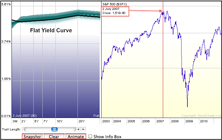
The Yield Curve can be measured two different ways at StockCharts.com. First, chartists can use the Dynamic Yield Curve tool see the current yield curve. Users can also animate the yield curve to see how it changes over time or click on the S&P 500 chart to see the yield curve at a specific point in time. The chart below shows a flat yield curve in early July 2007, four years ago. This flat yield curve preceded the 2007 and 2008 bear market.

Click this image for a live chart
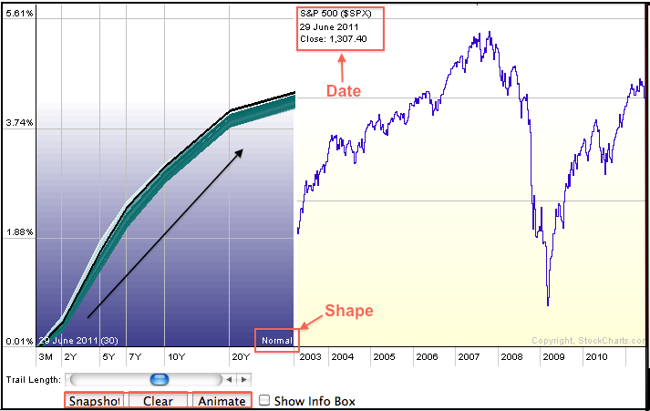
The yield curve typically reflects the difference between short-term interest rates and long-term interest rates. A normal yield curve has a positive slope where interest rates are higher as you go out the curve. The 3-month T-Bill Yield ($IRX) would be the lowest and rates would increase as the maturity extends (1,2,5,7,10,20 and 30 years). A flat yield curve forms when interest rates at the short end are virtually equal to rates at the long end, such as July 2007. An inverted yield curve occurs when rates at the short end are longer than rates at the long end. A normal yield curve is generally bullish for stocks, while a flat yield curve can lead to trouble and an inverted yield curve is considered bearish. The chart below shows the current yield curve, which is normal with a positive slope.

Click this image for a live chart


