|
|
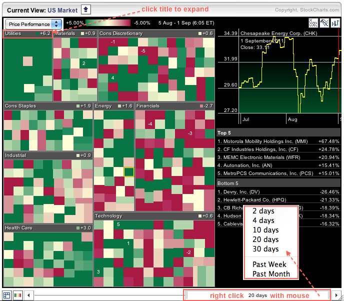
The Sector Market Carpet provides a wealth of information in color-coded format. Moreover, users can tweak this carpet with just a few mouse clicks to dive into the details. The first image shows a classic Sector Market Carpet with Price Performance. The first thing I did was to hover over the slider and right click on the mouse to show time period options. 20 days represents four weeks. Chartists can instantly see that the utilities sector is the strongest because it has the most green and the average change is +6.2%. The finance sector is the weakest because it has the most red and the average change is -2.7%.

Click this image for a live chart.
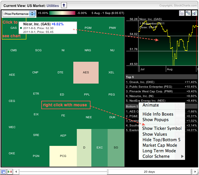
With the utilities sector showing relative strength, it would be nice to focus on the sector for more details. Clicking on the title bar shows a Market Carpet specific to the utilities sector. Users can hover over the carpet and right click on the mouse to see more display options. I chose “show ticker symbol” to see each ticker in each box. A quick chart can be shown for each stock by clicking on the corresponding box.

Click this image for a live chart.


