|
|
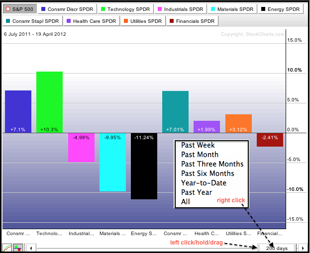
Chartists can use PerfCharts to rank relative strength for the nine sector SPDRs over various timeframes. The percentage change shown on this PerfChart is the amount of over or under performance relative to the S&P 500. This is not the absolute performance. 200-days is default setting, but users can quickly change this with the slider at the bottom. Right click on the slide to see the different timeframes or left click/hold on the edge and drag the slider to manually adjust the timeframe. Also note that the entire slider can be moved by clicking/holding in the middle and dragging.
Click this image for a live chart.
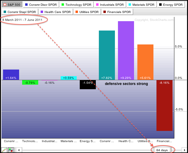
The second PerfChart shows sector relative performance for the three month period extending from early March 2011 to early June 2011, which is basically the second quarter of 2011. Notice that the three defensive sectors were showing relative strength and outperforming the S&P 500. The finance sector was showing relative weakness and underperforming the S&P 500. Relative strength in these defensive sectors foreshadowed the steep market decline from late July to early August.


