|
|
The Sector Summary gives chartists the ability to view sectors, the industry groups within the sectors and the stocks within these industry groups. Starting with the sectors, each section is shown as a sortable table. The first image shows the Energy SPDR (XLE) leading the way on March 14th. Users can click on the Energy Select Sector SPDR name to see the industry groups that make up the sector.

Click this image for a live table
The second image shows the five industry groups within the energy sector. It is sorted by percentage change by default, but users can click any of the column headings for a different sort. Click on the industry group name to see the stocks.

Click this image for a live table
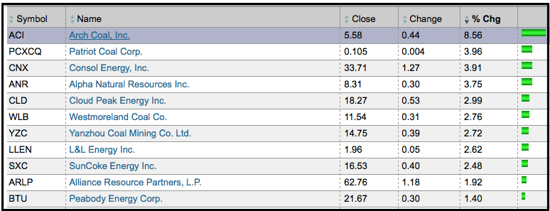
The third image shows the stocks in the Dow Jones US Coal Index. Notice that Arch Coal is the top performer. Users can click on the name to see a SharpChart.

Click this image for a live table

Click this image for a live table
The second image shows the five industry groups within the energy sector. It is sorted by percentage change by default, but users can click any of the column headings for a different sort. Click on the industry group name to see the stocks.

Click this image for a live table
The third image shows the stocks in the Dow Jones US Coal Index. Notice that Arch Coal is the top performer. Users can click on the name to see a SharpChart.

Click this image for a live table


