|
|
Chartists can track the yield curve by using the
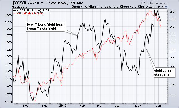
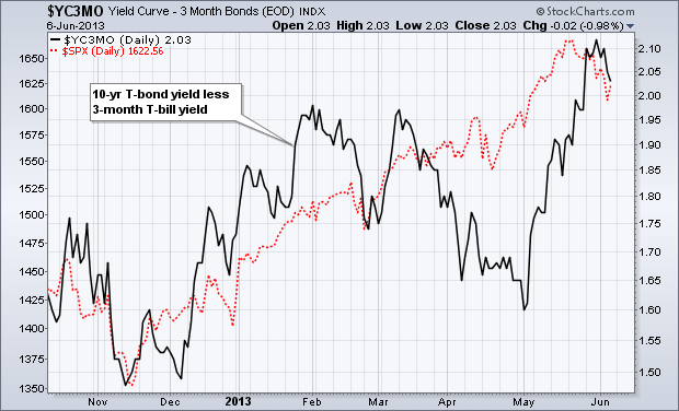
dynamic yield curve tool or the yield curve symbols. $YC2YR plots the difference between the 10-year Treasury Yield ($TNX) and the 2-Year Treasury Yield ($UST2Y). $YC3MO plots the difference between the 10-year Treasury Yield ($TNX) and the 3-month Treasury Yield ($UST3M). Even though the 10-year Treasury Yield surged in May, this long-term rate rose at a much faster rate than the short-term rate. This caused the yield curve to steepen, which is positive for the stock market and the banking sector.


Click these images for live charts.


Click these images for live charts.


