|
|
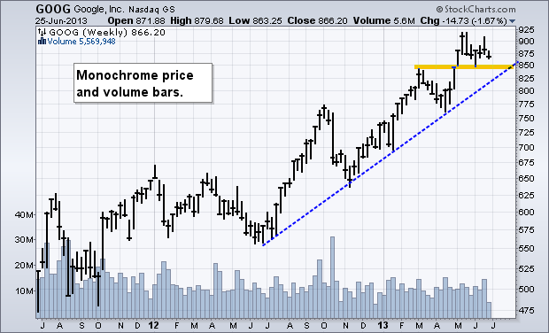
Chartists can add color to any chart by using the check boxes in the “Chart Attributes” section, which is just below the actual SharpChart. A regular SharpChart will show price bars and volume bars as one color. The first example shows Google (GOOG) with black price bars and blue volume bars. Chartists can determine the overall trend and identify patterns, but it can be difficult to differentiate up periods from down periods.

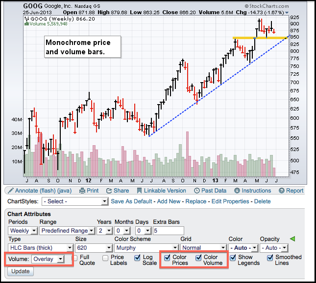
Chartists can bring charts to life by checking “Color Prices” and “Color Volume” in the Chart Attributes section. This makes it easy to differentiate up periods from down periods. The second chart shows the up weeks with black price bars and green volume bars. Down weeks are shown with red price bars and red volume bars. Note that an up period is when the close is above the prior period’s close. A down period is when the close is below the prior close. The small horizontal hash marks on each bar represent the close.

Click this image for a live chart

Chartists can bring charts to life by checking “Color Prices” and “Color Volume” in the Chart Attributes section. This makes it easy to differentiate up periods from down periods. The second chart shows the up weeks with black price bars and green volume bars. Down weeks are shown with red price bars and red volume bars. Note that an up period is when the close is above the prior period’s close. A down period is when the close is below the prior close. The small horizontal hash marks on each bar represent the close.

Click this image for a live chart


