|
|
There are several different ways of viewing advance-decline data and this article will highlight three of the most popular methods. In this example, we will look at different ways to analyze S&P 500 AD Percent ($SPXADP), which is advances less declines divided by total issues. For example, if 300 S&P 500 stocks advance and 200 decline, AD Percent would be +20% ((300 - 200)/500) = +100/500 = +.20 or +20%). This number is positive where there are more advances than declines, and negative when there are more declines. AD Percent is a breadth indicator that measures the degree of participation behind a price move. An advance with AD Percent above +70% reflects broad participation, while an advance with AD Percent near +10% shows narrow participation.
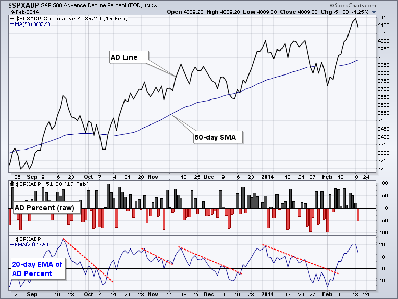
Now that we know how the indicator is calculated, let's look at three different chart variations for S&P 500 AD Percent ($SPXADP). The main window shows the AD Line, which is a cumulative measure of AD Percent. The AD Line rises when AD Percent is positive and falls when AD Percent is negative. A 50-day moving average was added as an overlay.
Click this image for a live chart
The middle window shows AD Percent in raw format using the new "histogram" option, which is shown as the first indicator option below (1). Chartists can now see perpendicular up bars when AD Percent is positive and down bars when AD Percent is negative. The bottom window shows the 20-day EMA of AD Percent. I added AD Percent as an indicator using the "price" function and then set its as "invisible" using the "style" drop down menu, which is shown as the second indicator option (2). The moving average was then added as an indicator of this indicator. Notice how the 20-day EMA of AD Percent oscillates above and below the zero line like a momentum oscillator. StockCharts calculates AD Percent, AD Volume Percent and High-Low Percent for several major indices, the nine sectors SPDRs and Gold Miners ETF (click here for a list).


