|
Q: How can I use the new "pseudo-symbols" to help understand what is going on with General Motors (GM) right now?
A: Recalls, GM Recalls, GM Recalls, GM Recalls. The continuous news is bashing the stock. For those hurt by the situation, this is truly a terrible time.
This is not an article to downgrade GM one more time. It is an article to help frame how much the recalls are affecting GM and how an investor can keep perspective on the situation through the charts. I want to discuss why understanding the industry and the sector are so important as well as how to put them on your charts easily.
First of all, which one of these is the GM line? The chart is set on the last 200 days which is the default.
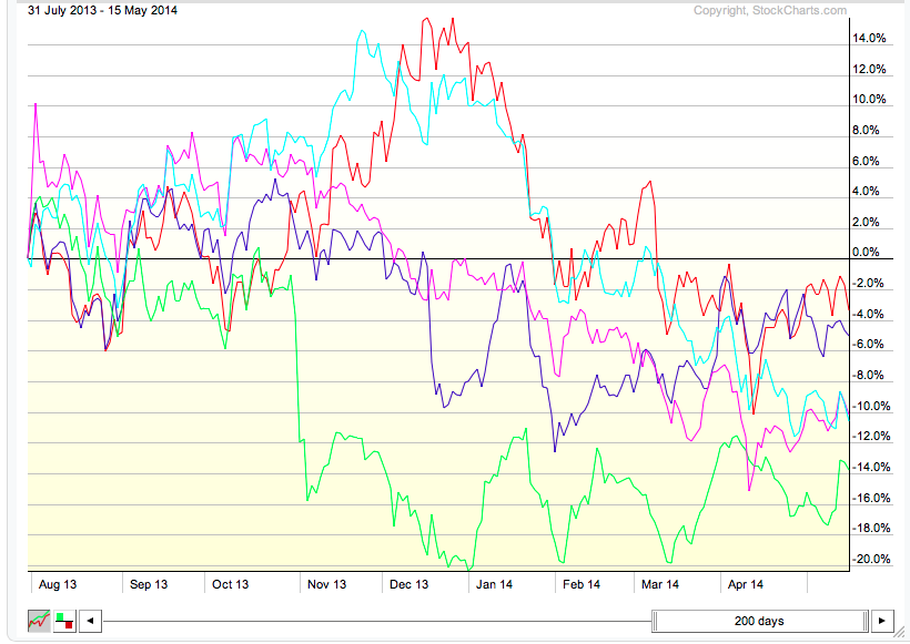
The reality is that out of 5 car manufacturers, you can't quickly point to GM stock. On January 14, 2014 Mary Barra took the reins as CEO of General Motors. On April 1, 2014 she testified in front of congress. Even with those two clues, it is still impossible to discern the stock from its peers. We need more information.
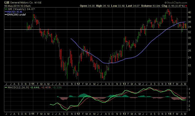
Below is the weekly chart of GM since the IPO at $33.00 which is drawn in with a white line. Even that does not help as much.
Here is the Perf Chart again with the legend. The red line is GM. Did you know that the best performer out of 5 auto stocks over the last 200 days is GM?

So we must be careful of letting the news flow taint our investment decisions.
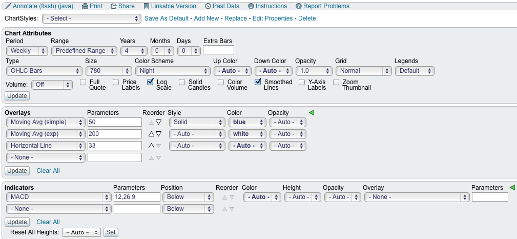
Two things would also help us though. One is seeing the industry group performance easily and another is the sector performance. We added some new tools to the StockCharts site this week to make this super simple.
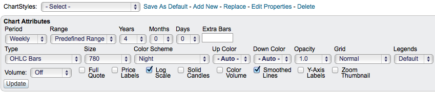
Let's go back to the GM chart in the 'Night' Color Scheme.
Here are the settings for that chart.
Below is how we can add information about the sector and the industry to compare how the stock is doing to the sector or compare how it is doing relative to the industry.
Notice the change in the indicator settings. I have closed the advanced options in case this is how it looks on your screen.
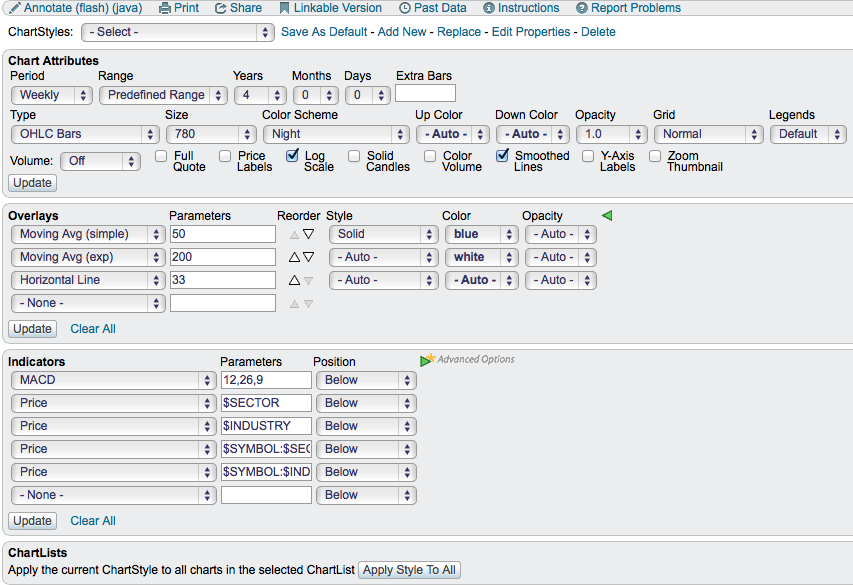
By using the Price indicator and using the word $SECTOR for the parameter, it will create a chart plot for the sector associated with the main chart symbol (In this case GM).
By using the Price indicator and using the word $INDUSTRY for the parameter, it will create a chart plot for the industry associated with the main chart symbol (In this case GM).
By using the Price indicator and using the expression $SYMBOL:$SECTOR for the parameter, it will create a chart plot for the main symbol compared to the related sector. Note the colon ' : ' between the two.
By using the Price indicator and using the expression $SYMBOL:$INDUSTRY for the parameter, it will create a chart plot for the main symbol compared to the related industry. Note the colon ' : ' between the two.
The chart will look like this.
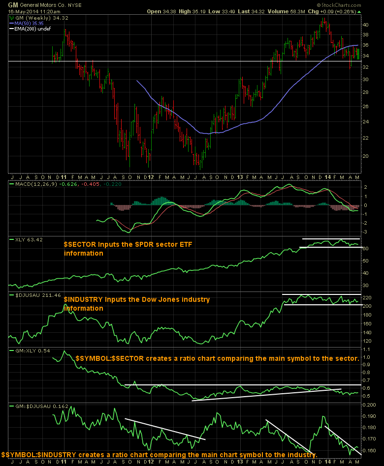
I drew the white lines on the chart. Now that you have the data on the chart, how can you use it?
Starting with the sector, you either want the sector to be just breaking a down trend or trending up. No need to invest in a down trending sector expecting higher prices. We can see XLY started trending up in 2012. It broke above the previous consolidation area on January 1, 2012. That is good, the sector was rising. Recently it has gone sideways at best.
Then the industry. The industry started to rise in January of 2012 and then started falling. This is real performance so it is the whole auto group rolling over. It broke the downtrend around mid year 2012. This was an interesting entry.
On the third plot, we can see GM:XLY. This is a comparison of how GM is doing to the sector. When this starts to rise, GM is outperforming the sector. We can see a rising trend compared to the sector from July 2012 until early January 2014.
On the final plot, we can see GM:$DJUSAU. This is a comparison or ratio of GM compared to its industry group. You will notice at times GM outperforms its industry group and then underperforms the industry group.
You can see in July of 2012 all four started moving higher. This was an excellent entry point!
Lets look since January 2014. XLY has gone sideways. On the next plot $DJUSAU (Dow Jones US Autos) has gone sideways. On the third plot GM has started to underperform the sector. On the fourth plot, GM has been underperforming the industry. Within the industry group there are twenty companies so the 5 in the PerfChart I started this article with are not broad enough to represent the whole industry. How long will this last? It would be nice to find a place where all four turn higher. Till then, it might be wise to turn off the news flow and watch the chart with these new fields to find a good entry.
If you like this idea and want to make it on all your charts, you can click on the chart above. This will bring it to life on your computer. Change the 'color scheme' to one you like inside the Chart Attributes area shown below.
On the top line of this information panel above, you will see 'Save as Default'. You can either do that to make this your favorite ChartStyle or 'Add New' and save it that way as an alternate ChartStyle. Forward this blog to anyone you know who might be interested in adding these fields. These new expressions of $SYMBOL, $INDUSTRY and $SECTOR are fresh this week! This makes relative strength work so easy!!
Now we can turn off the news flow and easily find when investments have the sector and industry trends supporting us! This data will help us find a good entry back into GM or can be used to find other companies starting to outperform.
Good trading,
Greg Schnell, CMT