|
Daily breadth data often looks erratic because it flips from positive to negative on a regular basis. Chartists can turn this erratic data into a readable format using three different chart functions. This article will show how to chart breadth data as a histogram, an AD Line and an oscillator.
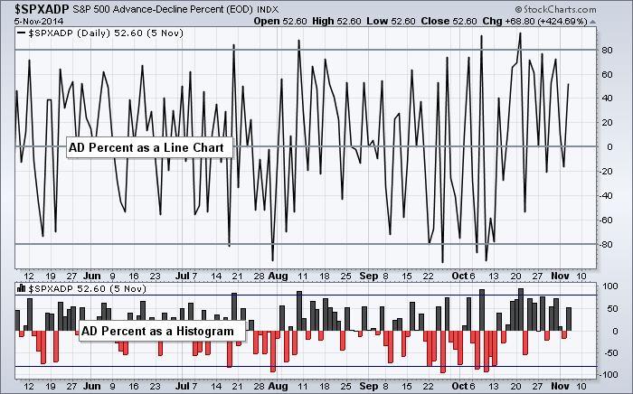
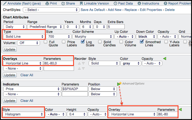
The chart above shows just how erratic AD Percent for the S&P 500 looks as a simple line chart (main window). We can still spot the big moves that exceed +80% and -80%, but it is hard to determine what is happening in between these levels. The solution is to plot this indicator has a histogram. The main plot can be changed to Histogram in the Type section under Chart Attributes. Chartists can also add $SPXADP as an indicator and choose Histogram as the Style. The image below shows examples for these settings.
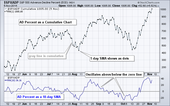
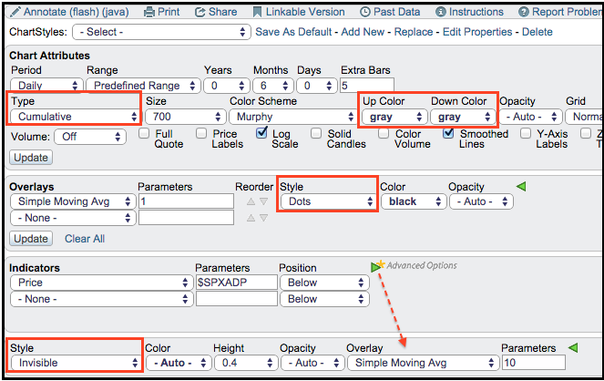
Chartists can also plot AD Percent as the AD Line or as a 10-day SMA, which acts as an oscillator. To change raw AD Percent into an AD Line, users can set the chart Type to Cumulative in the Chart Attributes section. The example below shows the AD Line in gray and a 1-period simple moving average as black dots, which make it easy to see the day-to-day moves. The indicator window shows AD Percent as a 10-day SMA. Simply add $SPXADP as an indicator, choose Invisible for Style and then add a simple moving average.