|
|
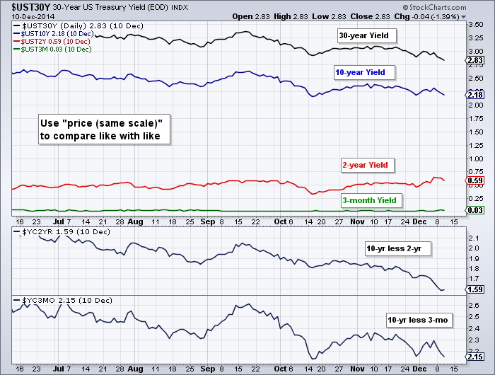
Chartists can view the difference in Treasury yields using a special overlay on SharpCharts. First, note that we have two symbols that capture the yield curve. $YC2YR captures the difference between the 10-year Treasury Yield and the 2-Year Yield. $YC3MO charts the difference between the 10-year yield and the 3-month yield. Chartists can also use the "price (same scale)" overlay to plot different yields in the same chart window. The chart below shows four different Treasury yields in the main window and the two yield curve indicators in the lower windows. The "price (same scale)" aligns the different yields on the same scale so we can see the differences. The 10-yr and 30-yr yields are above 2%, while the 2-yr and 3-mo yields are below 1%.
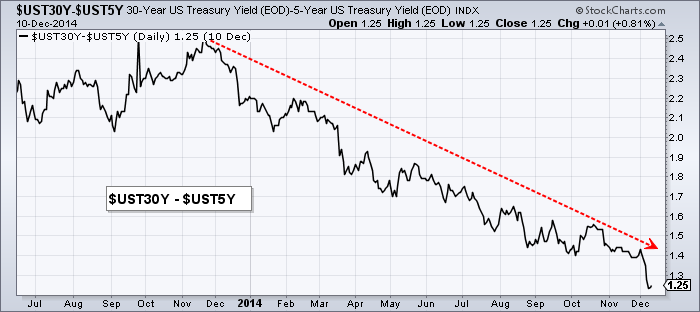
Chartists can also create a custom yield curve by using the minus function on two symbols. The chart below shows the difference between the 30-yr Yield and the 5-yr Yield by placing a minus sign or hyphen between the two symbols ($UST30Y-$UST5Y). This representation of the yield curve is still positive, but it has become less positive over the last twelve months. This means the spread between the 30-yr and 5-yr yields is narrowing. Note that this minus function can be used with any two symbols.


