|
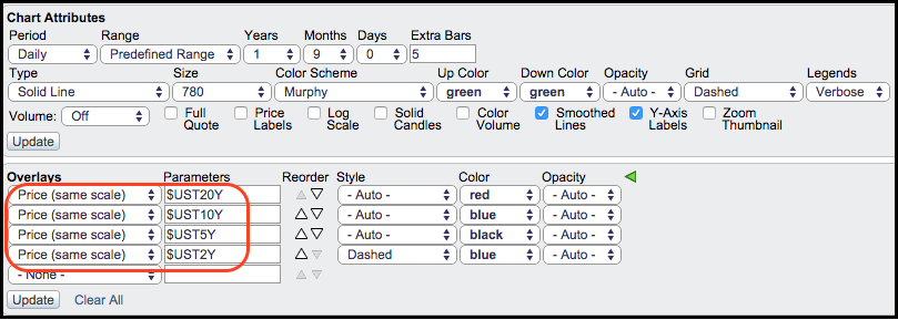
With lots of chatter regarding the 10-YR Treasury Yield and the yield curve, now is a good time to show chartists how to use the "Price (same scale)" feature to plot yields. This feature is good for plotting symbols that use the same scale, such as Treasury yields and the Bullish Percent Indices.
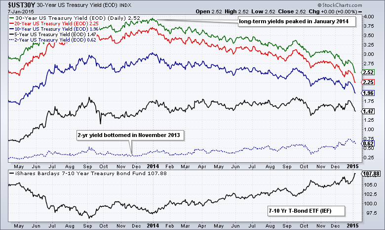
The chart above shows the 30-year Treasury Yield ($UST30Y) as the main symbol. I then added the 20-year Treasury Yield ($UST20Y), the 10-year Treasury Yield ($UST10Y), the 5-year Treasury Yield ($UST5Y) and the 2-year Treasury Yield ($UST2Y) using "Price (same scale)" as an added overlay. Also note that I changed the colors to better differentiate between these. Using the same scale makes it easy to compare the yields against one and other.
As you can see on the chart, the 30-yr yield is the highest, the 2-yr yield is the lowest and the 10-yr yield is in the middle. This is how it should be with a normal yield curve: yields increase along with the maturity. It is also worth noting that long-term yields have been falling since January 2014, but the 2-yr yield has been rising since November 2013.