In the last two weeks, I've heard this market described as "frustratingly neutral", "decidedly sideways", "stuck", and my personal favorite, the "sloppy choppy" phase. So how does the market breakout of this sideways period and move into a new bullish or bearish phase?
It starts with the S&P 500 and Nasdaq Composite and what I call the New Dow Theory.
What a Breakout Could Look Like
Now, there are more sophisticated methods for gauging Dow Theory signals, but I tend to keep things super simple. When both the S&P 500 and Nasdaq Composite are making a new swing high, that is a confirmed bullish signal. When either index makes a new swing high, and the other index does not confirm that new swing high, that is a bearish non-confirmation. When both the S&P 500 and Nasdaq Composite are making a new swing low, there's a confirmed bearish signal. When either index makes a new swing low, and the other index does not confirm that new swing high, that is a bullish non-confirmation.
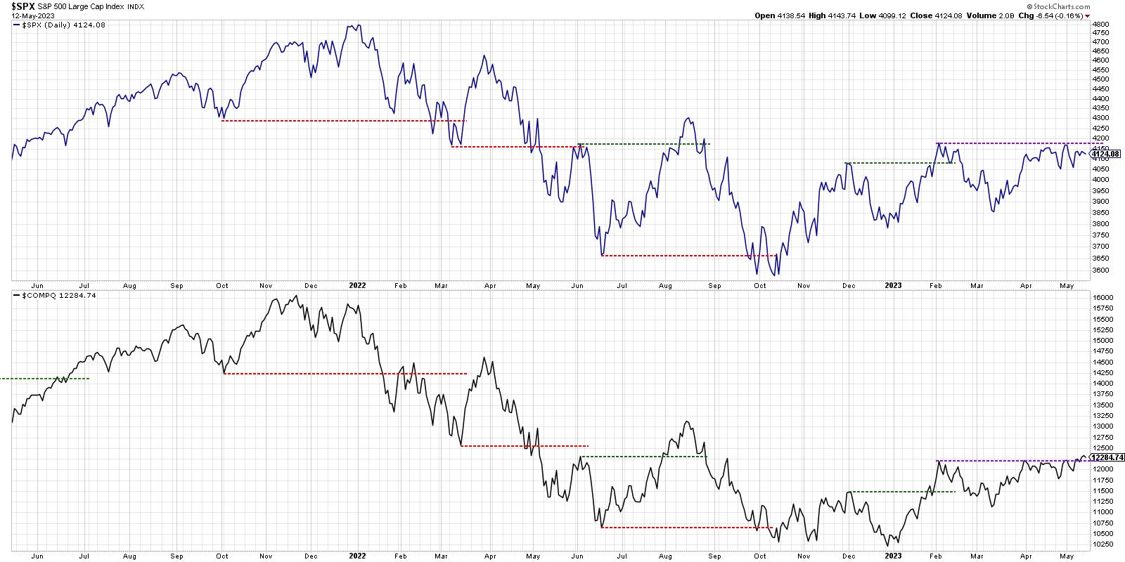
We can see that this week the Nasdaq Composite did indeed make a high for 2023, finally pushing above its February peak. The S&P 500, even with a fierce rally into Friday's close, still has not broken out to a new swing high.
If the S&P 500 would close above 4200 at some point next week, that would create what we listed above as a confirmed bullish signal. What if the SPX does not close above 4200? Then we would have a bearish non-confirmation and a likely retest of the March low.
Further Confirmation From Market Breadth
Now the issue with our growth-oriented, cap-weighted benchmarks is that they are very skewed to a relatively small number of mega cap stocks in sectors like technology and communication services.
We've been talking narrow leadership and questionable breadth conditions for a while now, and John Murphy included it as a key bullet point in his recent market note.
If we check out the advance-decline lines by cap tiers, you'll notice a huge difference between conditions for the largest vs. the smallest names in the equity space.
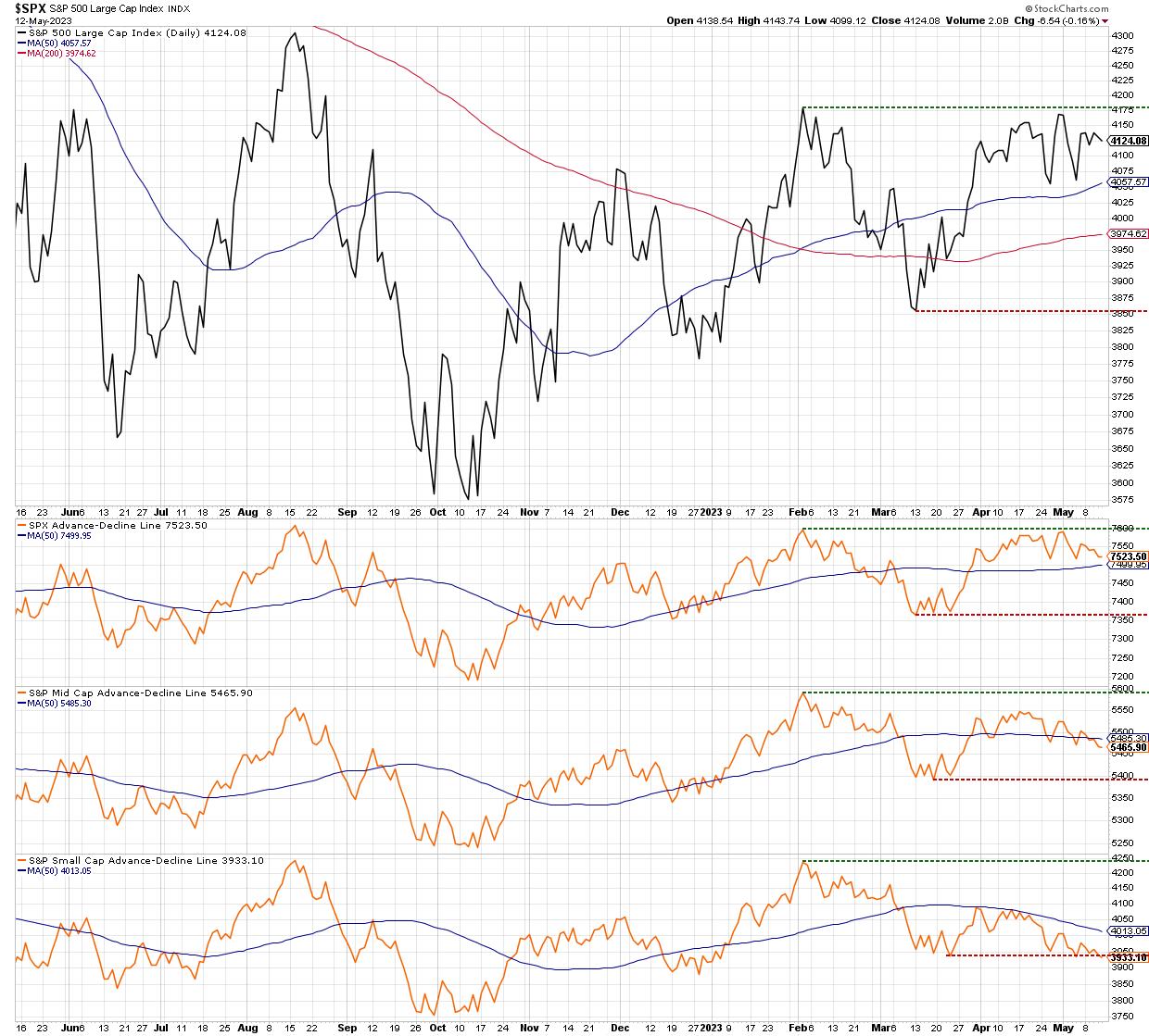
Below the S&P 500 price trend, you'll see three data series which represent the cumulative advance-decline lines for large caps, mid caps, and small caps. Note how the large cap A-D line is testing its February high, similar to the S&P 500 itself. The mid cap A-D line is well off its February high, and just broke below its 50-day moving average this week. At the bottom, you'll see that the small cap advance-decline line is testing its March low.
Talk about three very different takes on market breadth!
While our mega-cap dominated benchmarks can and do move higher based on the strength of the mega cap trade, the weakness in the smaller stocks out there suggests less of a "risk-on" environment, and more of a "getting large and defensive" feel.
The bear case from here would start with the small cap A-D line making a new low for 2023, as well as the large cap breadth line not pushing above its February high.
Investor Sentiment and Economic Growth
Our final chart today addresses the relationship between the equity markets and other asset classes. Here we see the S&P 500 at the top, followed by three key ratios that provide fascinating insights into market sentiment and economic outlooks.
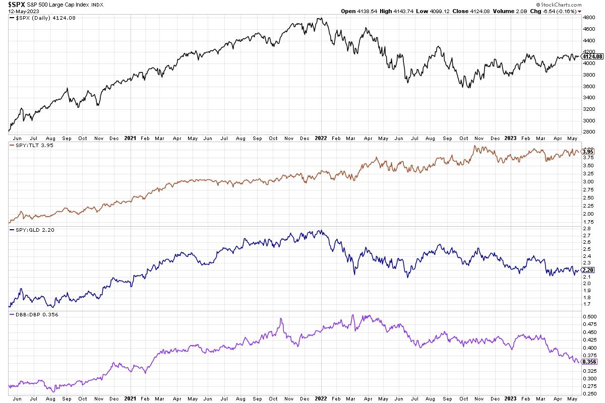
The first ratio is stocks vs. bonds, using the SPY and TLT ETFs. Note how this ratio was in a clear uptrend for about three years, starting just after the 2020 market low. It definitely paid to own stocks over bonds from 2020 through 2022.
Now look at the last six months, and you'll see how stocks and bonds have been pretty much a wash since October of last year. That's right, owning stocks or bonds would given you pretty similar returns, even with equities rallying strongly off their October lows.
The next panel down shows stocks vs. gold, or what I think of as "paper vs. rocks". Now in the rocks-scissors-paper challenge I often find myself in with my seven-year-old son, paper covers rocks. But in the financial markets in 2023, rocks have done much better due to the strength in gold and precious metals. So you've been much better off owning gold over stocks or bonds since the end of 2021.
At the bottom, we have two ETFs of which you may be a bit less familiar. Here, we're comparing base metals (DBB) vs. precious metals (DBP). When economies are growing, you need lots of copper and aluminum and other practical materials to build cities and other things. When the economy is weaker, precious metals tend to thrive, as they are considered a good store of value and tend to be as recession-proof as anything can be. And, of course, weaker economies mean less demand for base metals.
So what does it mean that this ratio has been trending lower over the last 12 months? It certainly does not mean that the economy is doing well, and arguably it indicates that the actions taken by the Fed to raise rates and slow the economy has had its intended effect.
Can stocks move higher while this ratio goes lower? Of course. But just as we've discussed regarding small-cap stock performance and offensive vs. defensive sectors, I'd feel much better about upside potential if ratios like this were trending higher rather than lower!
Want to digest that last chart in video format? Just head over to my YouTube channel!
RR#6,
Dave
P.S. Ready to upgrade your investment process? Check out my free behavioral investing course!
David Keller, CMT
Chief Market Strategist
StockCharts.com
Disclaimer: This blog is for educational purposes only and should not be construed as financial advice. The ideas and strategies should never be used without first assessing your own personal and financial situation, or without consulting a financial professional.
The author does not have a position in mentioned securities at the time of publication. Any opinions expressed herein are solely those of the author and do not in any way represent the views or opinions of any other person or entity.


