TAKEAWAYS
- Momentum indicators like RSI can indicate overbought and oversold conditions, suggesting a short-term reversal.
- A bearish divergence, with higher prices and a lower RSI, often occur at the end of a bullish phase.
- By analyzing the range of the RSI, investors can confirm the overall trend phase and also identify tactical turns within larger trends.
Novice investors usually go on a "Holy Grail quest" early on, reading books and watching videos and searching for that elusive one indicator to rule them all. After 23 years of analyzing the markets using technical analysis, I will tell you one thing for sure...
There is no Holy Grail.
What I will also tell you is that there are a number of technical indicators that do a very good job of helping the astute investor to analyze trends, quantify investor sentiment, and anticipate inflection points in price.
One of my favorite indicators to do all of the above is the Relative Strength Index, or RSI. Created by Welles Wilder and promoted in his classic text New Concepts in Technical Trading Systems (featured in our Recommended Reading List!), the RSI has become my go-to oscillator to better understand price dynamics.
Today, I'll show three ways that I use the RSI to identify short-term price swings, determine trend phases, and anticipate market turns.
Overbought vs. Oversold
When I was first introduced to technical indicators, I was kindly asked (that is, forced) to prove out the calculations to about 20 indicators in Excel. The idea was that, by understanding the math behind each indicator, I could better understand how it was using inputs of price and/or volume and how the output could be used to anticipate turning points.
Wilder originally designed RSI for the commodity markets, and for him it was all about mean reversion. In other words, the goal was to buy low and sell high, and RSI was a tool to try and optimize those entry and exit points.
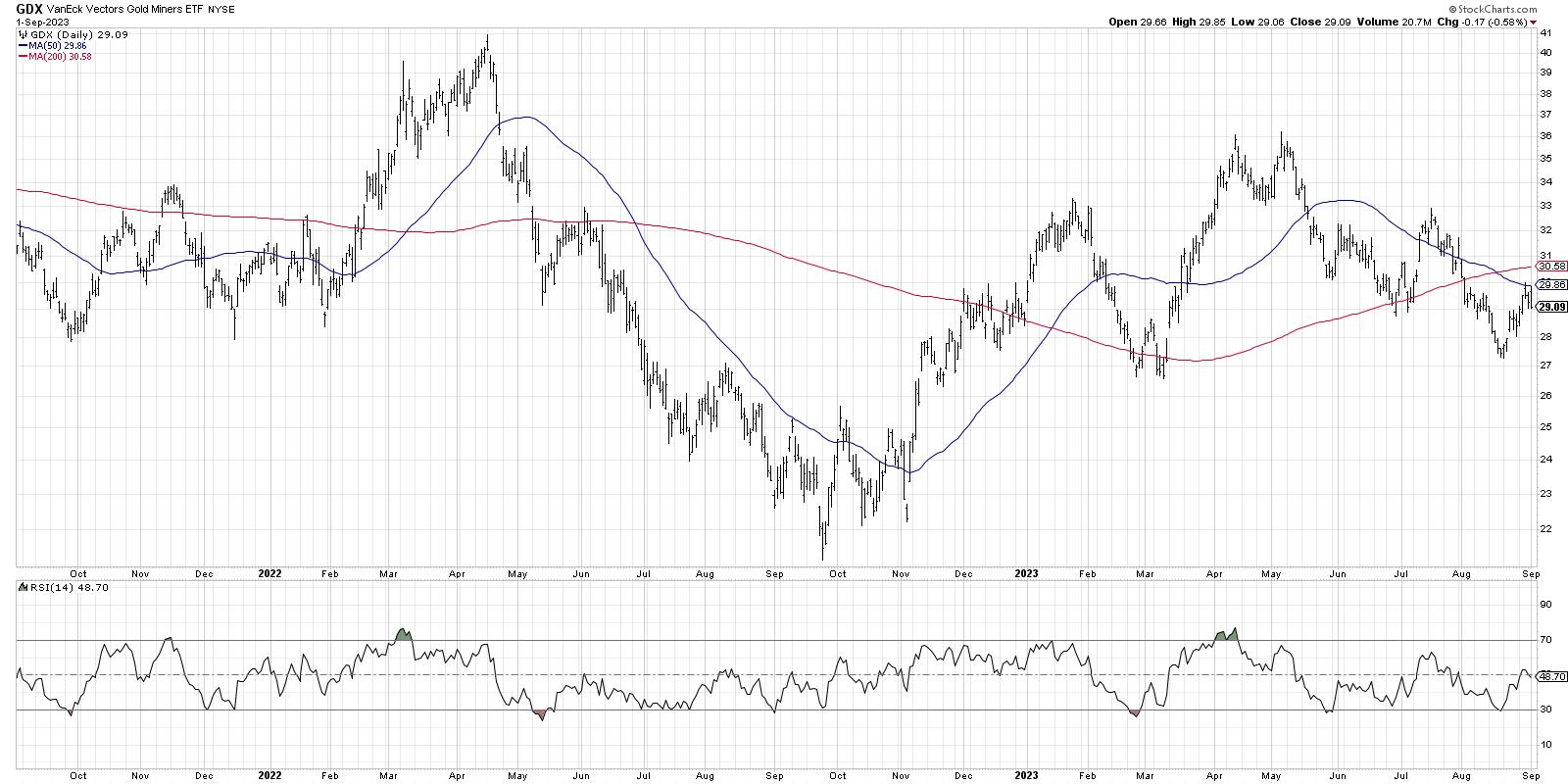
The chart of gold miners has plenty of examples of where overbought conditions were followed by short-term drops, and oversold conditions usually happen right before a bounce higher. To be clear, the real signal is not when the indicator enters the overbought/oversold region, but rather where it exits that extreme condition.
Buy signals in February, May, and August 2023 all worked quite well, as gold stocks bounced higher in each instance. Sell signals in January and April 2023 also worked out, with price pulling back in both cases.
Sometimes, those extreme readings become a little more complex, and we need to add divergences to our technical analysis arsenal.
The Dreaded Bearish Divergence
It makes sense that, when a stock is an uptrend, the RSI will tend to get to the overbought region. Price is going higher, driven by stronger upside momentum, so an overbought condition should be expected. So when the price continues higher not on stronger momentum, but weaker momentum, that's when we may need to take action.
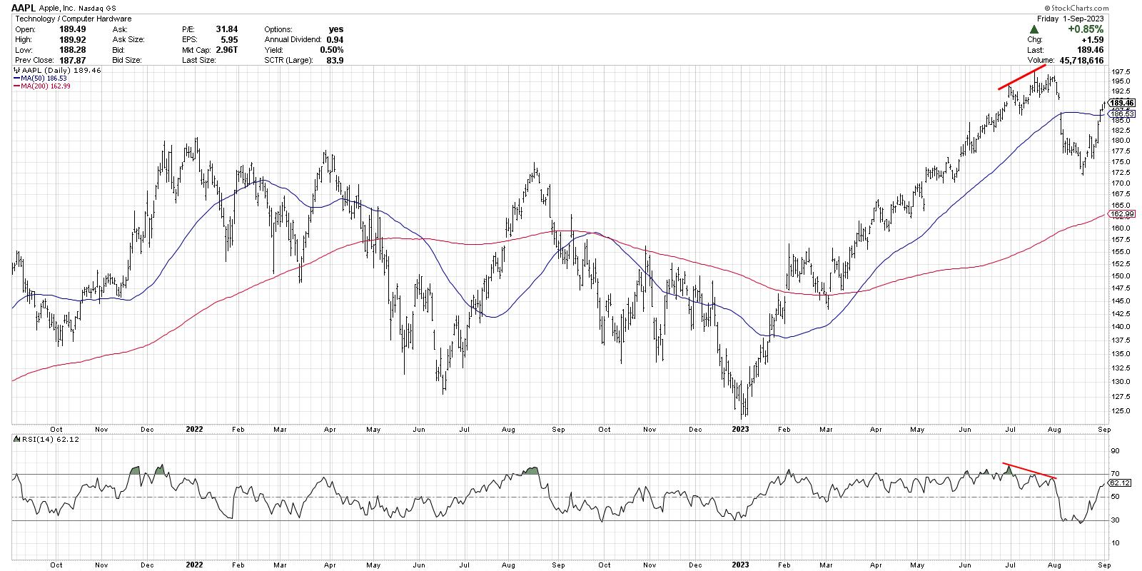
Notice how Apple made higher highs every month from January to July? Now focus on the highs in late June and mid-July. The price of AAPL continued to grind higher, but the RSI actually sloped lower. This pattern of higher prices and lower momentum is called a bearish momentum divergence and usually indicates a bullish phase that is "running out of gas". In other words, the end of the trend is near!
We noticed bearish divergences on key growth stocks back in July, which meant the subsequent drop in August was a likely next step for the markets. But how can we relate short-term RSI signals to long-term trends? This is where Connie Brown's work completely changed how I use the Relative Strength Index.
Using RSI to Determine Trend Phases
The above example using gold stocks provided a decent illustration of overbought and oversold conditions. But sometimes the RSI never gets to an extreme reading. Does that mean the indicator is broken? No, it means the price is trending.
In Connie Brown's groundbreaking book, Technical Analysis for the Trading Professional (another book featured in our Recommended Reading List!), she explains how the range shown by the RSI over time can tell you about the overall trend structure.
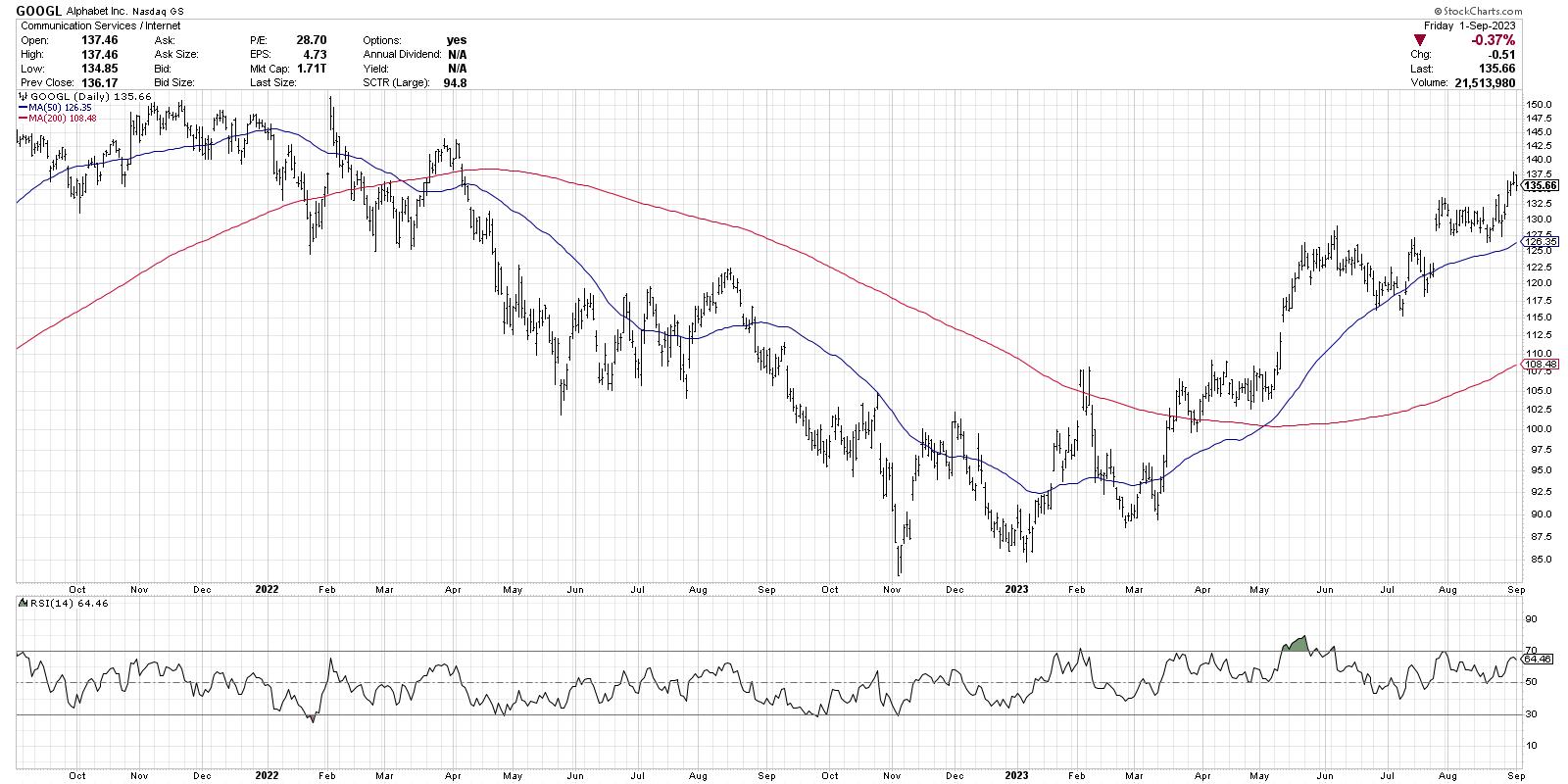
When a chart is in a confirmed downtrend of lower highs and lower lows, the RSI often becomes oversold on the downswings. But the countertrend moves back to the upside usually stall out with an RSI around 60. You'll see the opposite in an uptrend, where the RSI often becomes overbought on a move higher, but rarely breaks below 40 on pullbacks.
Here's that same chart of GOOGL but with the phases indicated with a shaded RSI.
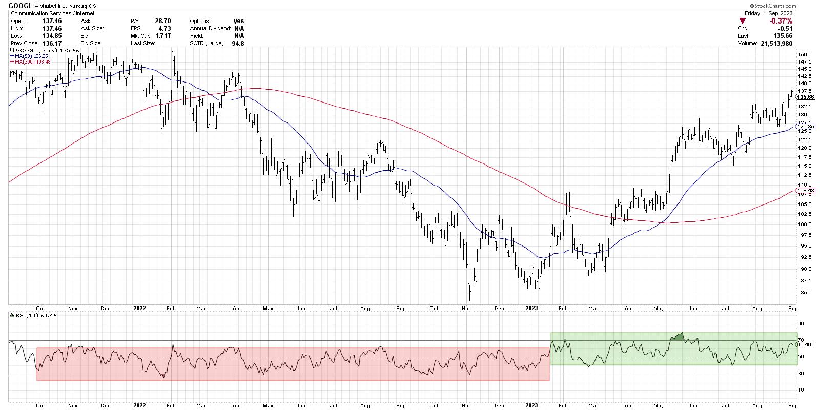
Through the end of 2022, Alphabet was in a clear downtrend phase. The fact the RSI never really broke above 60 on upswings tells us that, while we are seeing some countertrend bounces, the overall trend remains bearish. Note how the pattern changes in January 2023, with the RSI pushing up to 70 on a rally. This was an early indication that something had changed and that the overall downtrend phase was evolving into a new uptrend phase.
As long as GOOGL becomes overbought on upswings, and the RSI remains above 40 on pullbacks, the RSI is telling us that the overall trend remains bullish.
I've found the Relative Strength Index to be an effective way of anticipating turning points, recognizing trend shifts, and confirming market phases. By applying indicators like RSI in a consistent and disciplined manner, an astute investor can use price momentum to better identify entry and exit points in any market environment.
RR#6,
Dave
P.S. Ready to upgrade your investment process? Check out my free behavioral investing course!
David Keller, CMT
Chief Market Strategist
StockCharts.com
Disclaimer: This blog is for educational purposes only and should not be construed as financial advice. The ideas and strategies should never be used without first assessing your own personal and financial situation, or without consulting a financial professional.
The author does not have a position in mentioned securities at the time of publication. Any opinions expressed herein are solely those of the author and do not in any way represent the views or opinions of any other person or entity.
