 The Relative Rotation Graphs, both daily and weekly, for US sectors are showing big disconnects between sectors.
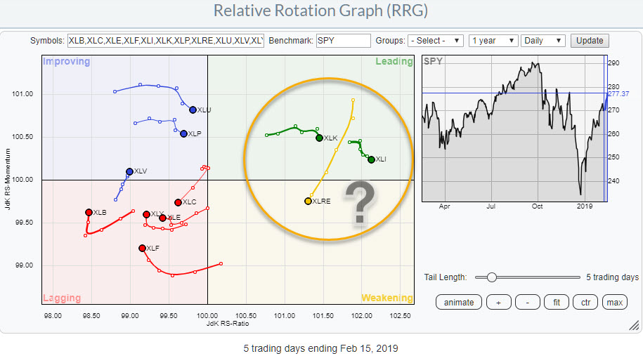
The image above holds the US sectors and shows daily rotations.
It is immediately obvious that there is a big gap/disconnect between the right (=positive) side and the left (=negative)side of the graph.
At the right-hand side of the RRG, we only find XLK and XLI inside the leading quadrant and XLRE already well inside the weakening quadrant. ALL other sectors are left to the center of the graph at a JdK RS-Ratio level less than 100.
Weekly
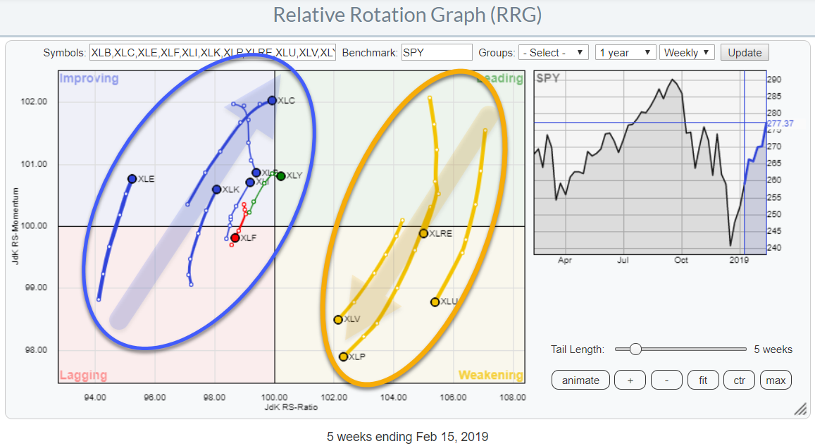 Switching to the weekly version of the RRG reveals a similar disconnect and very pronounced RRG-headings for two groups of sectors.
At the right side of the RRG, we find XLRE, XLU, XLP, and XLV inside the weakening quadrant at RRG-Headings between 180-270 degrees.
On the opposite side, almost all inside the improving quadrant, we find the remaining sectors with the majority at positive RRG-Headings.
For the near term, I am interested in the sectors that are rolling over downward inside the leading quadrant.
Technology - XLK
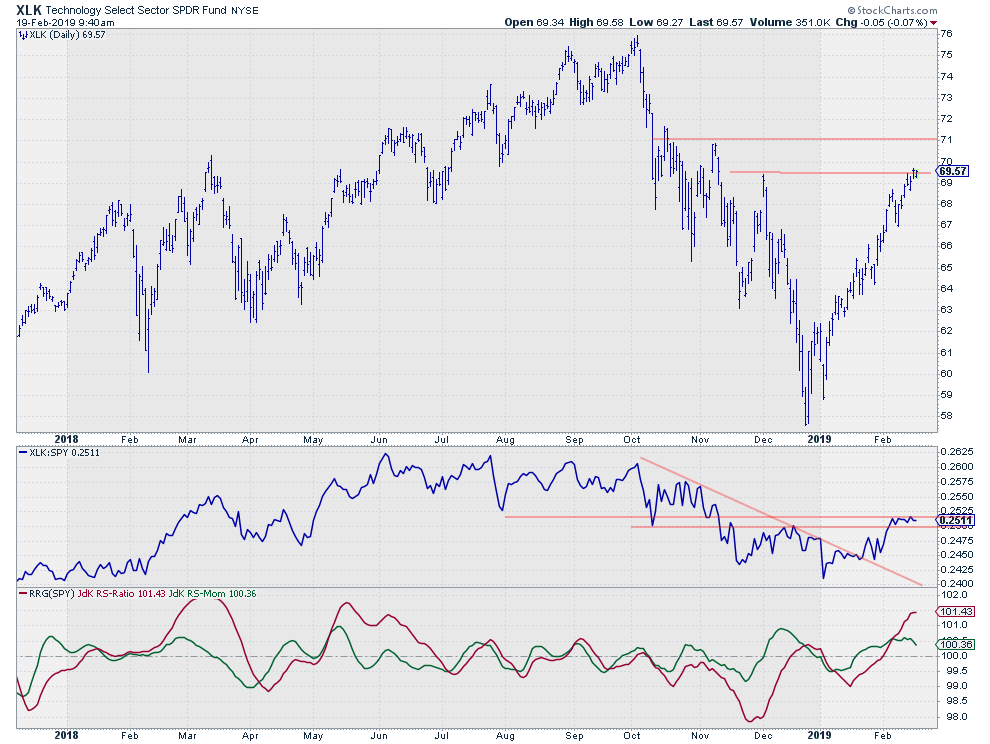 On the RRG, the technology sector is starting to roll over downward. It is starting to lose its upward momentum (relative) causing the strong relative uptrend to slow down.
On the daily chart above that slow-down of relative strength is illustrated by the RS-Line moving sideways over the past few days. Als the RS-Ration line is at high levels compared to its own history.
Given the steep rise in the price chart, one could argue that some sort of pause would be in order. But in all honesty, I am probably already in that mindset since XLK traded at $63.
On the weekly RRG, XLK is inside the improving quadrant and at a positive RRG-Heading towards the leading quadrant. The question is if that move will be strong enough to actually rotate into the leading quadrant. With the tail of XLK on the daily RRG already rolling over downward that is a difficult call.
With XLK reaching resistance between $70-$71, the RS-Line hovering sideways in a resistance area, and RS-Ratio at high historical values I prefer to remain cautious for the time being.
Industrials - XLI
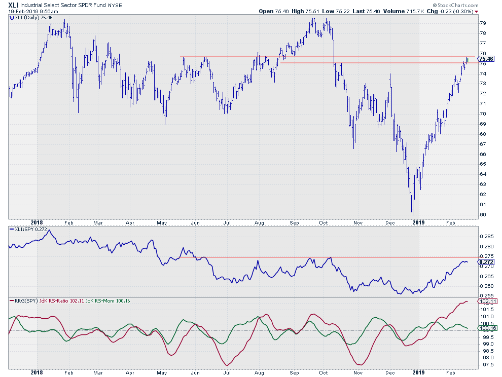 The Industrials sector is somewhat similar. Rolling over downward, while inside leading, on the daily RRG and Heading towards the leading quadrant, while inside improving on the weekly version.
XLI is closer to the 100-level and seems a bit further into the process than XLK. However, on the daily RRG, XLI also is a bit further ahead in the rotation than XLK and heading down faster.
On the price chart, XLI is inside a resistance zone between $75-$76 after a super-steep rally out of the $60-low in December. Relative strength broke its (one-year-old) falling resistance but is now approaching a horizontal resistance barrier while the Jdk RS-Ratio line is at its highest level since November 2016.
Even if we have seen the low for this sector, it does not like a good entry point at the moment. The risk/reward is simply too high. At least for my taste.
Where Is The Volume?
With these, supposedly, offensive sectors leading the way up and now, at least for the time being, losing momentum again. And defensive sectors still at the right-hand side of the Relative Rotation Graph but heading South, the question arises; What does this mean for the general market?
As you know, I don't usually write too much about $SPX or SPY and short-term developments. We have great commentators like Tom Bowley who shares his insights with regard to the daily price action of the indexes and a lot of stocks on a daily basis in his blog Trading Places with Tom Bowley. If you are not aware of Tom's work please check it out and subscribe to his blog as it will bring you up to date on market developments in a few minutes of your time every morning.
In situations like this, where bullish and bearish arguments are battling for victory I always try to take a step back and look at things from a distance and very often go back to the basics.
One of the first things that I learned when I started to study technical analysis was that "volume" can be very helpful in providing clues that may be neglected when you focus too much on price development. For example, almost perfect looking patterns or formations on the price chart may be negated and rendered void because they are not supported by volume. A very important premise related to volume analysis is that "Volume must rise in the direction of the trend"!
So when the trend of the market is up, we should see rising volumes during the rallies and falling volumes during setbacks. Vice versa, when the trend in the market is down, we should see rising volumes on the legs down and falling volumes during recoveries.
With that in the back of my mind, I annotated the chart of SPY below.
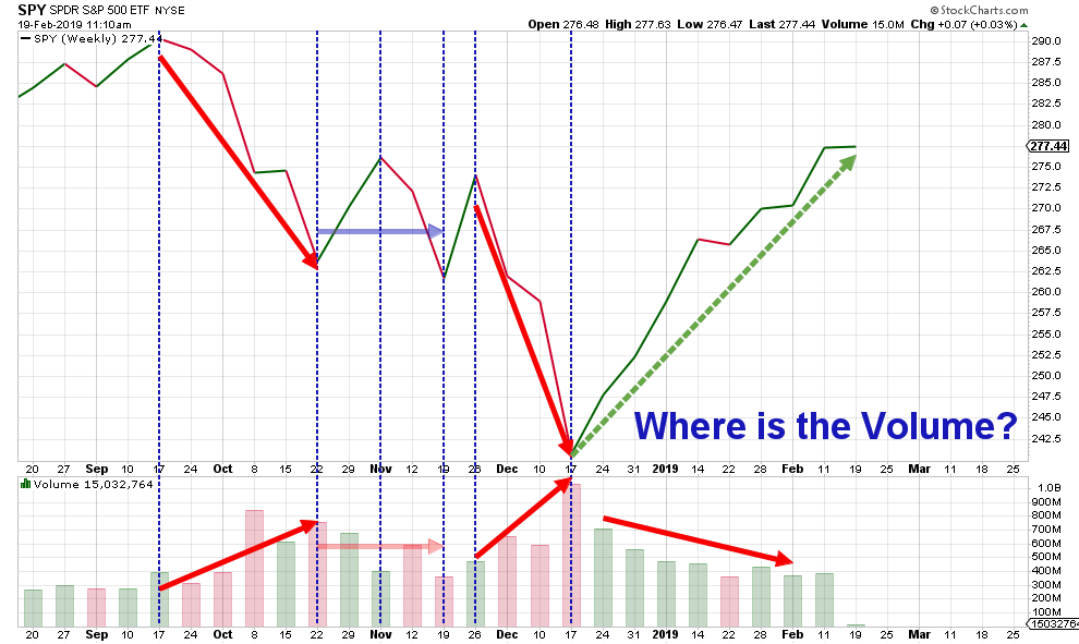 What I noticed is that since the top was formed in SPY in the week ending 17 September 2018, there have been two meaningful declines, from 17 September to 22 October and from 26 November to 17 December. From 22 October to 26 November was more or less sideways.
During these two declines, the volumes were rising, but, more importantly, since the start of the current rally volume is declining!
In other words, the volume pattern that we are seeing since the start of the decline in September is the pattern that comes with a downtrend!
All in all, the evidence, as far as I am concerned, is not pointing in one direction. It's not the end of the world, it happens from time to time and it reminds me of a great aviation quote which Dave Keller brought back to memory not too long ago:
It's always better to be on the ground wishing you were in the air than being in the air, wishing you were on the ground....
Lagging but not missing out
Based on these observations you can imagine that I am currently overweight or invested in defensive sectors, wishing that positions were more geared towards offensive sectors. But it also means that I am not completely missing out on the recent rally although definitely lagging its performance.
This is one of the things that I want to talk a bit more about on the Market Watchers Live show this coming Thursday. Investing and building a portfolio is completely separate from analyzing markets and making calls on trends and deciding to buy or sell. It's a discipline and a process where private investors can, still, learn a lot from institutional investors.
So I hope to find you on the other side this Thursday 2/21 at 12:00 pm ET.
Also if you have any questions that you would like me to answer in the show please feel free to post them in the comments below and I will try to address them if reasonably possible.
Let me know what you think of this usage of RRG in the comments below. If you would like to receive a notification when a new RRG blog article is published, simply "Subscribe" with your email address using the form below.
Julius de Kempenaer | RRG Research
RRG, Relative Rotation Graphs, JdK RS-Ratio, and JdK RS-Momentum are registered TradeMarks ®; of RRG Research
Follow RRG Research on social media:
If you want to discuss RRG with me on SCAN, please use my handle Julius_RRG so that I will get a notification.


