Funny how the stock market does a complete turnaround in two weeks, isn't it? If you haven't already read my July 7th article, "Today Smells Like A Short-Term Bottom.....Maybe", go back and check it out. If you're going to short-term trade equities, it's obviously very important to swim with the current, not against it. Getting a feel for the primary trend is a great start to great trades, especially if you trade ETFs. I generally trade individual stocks and that's the second part of the equation - trading the right stocks.
So here we are two weeks later and we've seen the NASDAQ reach new all-time highs while both the S&P 500 and Dow Jones flirt with the same. As a trader, the question becomes "is this rally sustainable"?
Barring a bearish reversing candle at major resistance, I look to the action underneath the market and try to evaluate the strength of momentum. Let's start there with a look at the weekly S&P 500 chart:
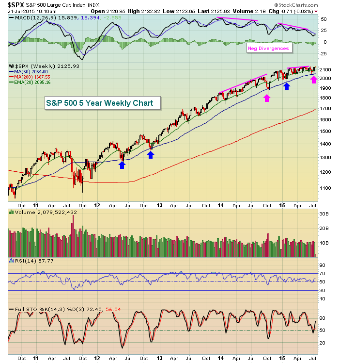
Weekly negative divergences always bother me. They don't guarantee us a bear market or even an extended period of selling, but they do provide a warning of slowing momentum. And while negative divergences on 60 minute charts or daily charts can be rectified within days or a couple weeks, negative divergences on the weekly charts can many times take months to play out. Even worse, many weekly negative divergences precede bear markets. HOWEVER, note the five arrows on the rising 50 week SMA that mark great support. Two of those arrows (pink) represent consolidation and a 50 week SMA test AFTER a negative divergence printed. I look for one of two things with a negative divergence. Either selling down to test the rising 50 period SMA OR sideways consolidation to allow the rising 50 day SMA to move higher and meet price. The first pink arrow followed a period of solid selling while the second pink arrow followed more basing and consolidation. In both cases, however, the selling was enough to unwind the momentum issues before the S&P 500 either moved to fresh new highs or approached them. The weekly MACD is now very close to its centerline, which by definition tells us there are no momentum issues to worry about. After all, the 12 week EMA has been converging with the 26 week EMA literally since the beginning of 2014 and now there's little difference between the two. Barring a heavy volume breakdown beneath the 50 week SMA, I believe the S&P 500 remains poised for higher prices - strictly based on this chart. Price action is squeezing between that rising 50 week SMA, currently at 2054, and 2130 price resistance. Let's see which breaks first. I do have other concerns as I'll discuss later.
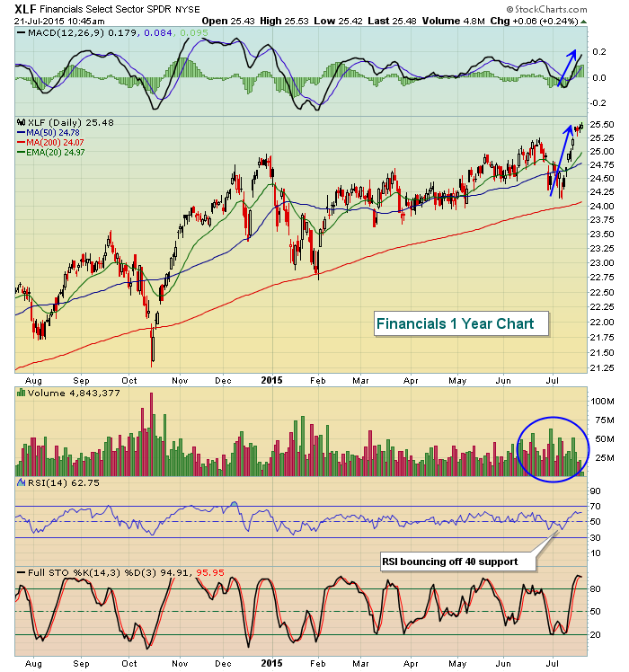
One major sign of encouragement is that market rotation continues and new leaders are emerging to support higher prices. I've recently written about the internet space, which just broke out of a long-term bullish ascending triangle pattern. Leadership from the likes of Facebook (FB) and Google (GOOGL) has been the key here and I expect based on the chart that we're going to see continued leadership from this space throughout the balance of 2015. Even more encouraging, however, is the fact that financials have broken out. Rarely do financials break out just as economic conditions weaken. In fact, the opposite typically happens as market participants anticipate economic weakness and flee those stocks that would be impacted by rising treasury prices and lower yields - namely, banks. Yet check out the charts of the XLF (financials ETF) and the Dow Jones U.S. Bank Index ($DJUSBK):
XLF:
$DJUSBK:
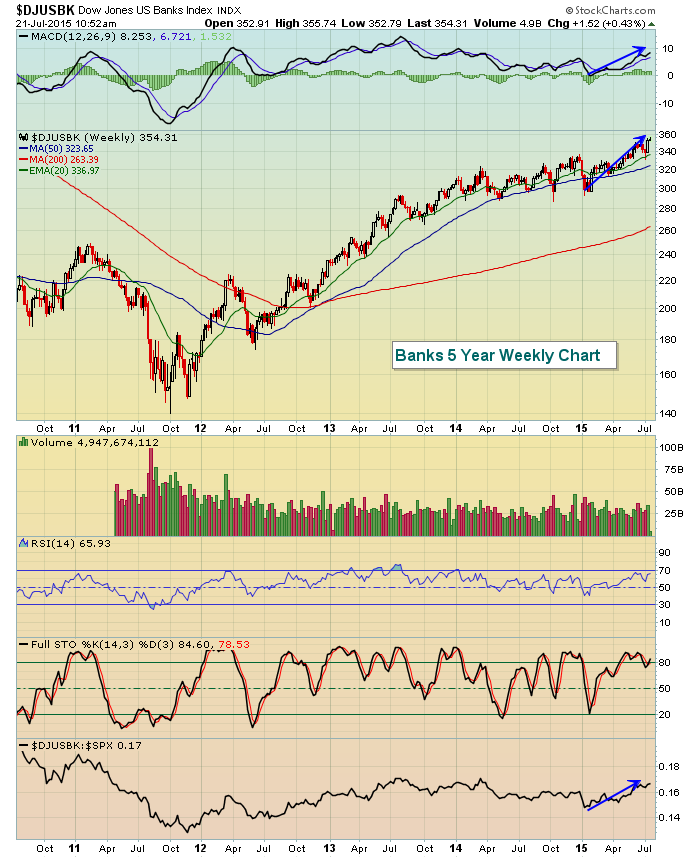
Volume trends have improved significantly on the XLF as it breaks to new highs and begins to lead the market. Within the financial space, we're seeing banks behaving as bullishly as any industry group. We need to understand that the stock market looks ahead in pricing areas of the market. I cannot think of many bearish scenarios where banks would be leading the market into breakout territory. Therefore, if the S&P 500 eventually follows the NASDAQ to all-time highs with banks leading the charge, it would be very difficult for me to grow bearish. What could derail this bullish move in banks? Higher treasury prices and lower yields. Other than that, I'd expect to see the relative strength in banks continue to build. It's one of my favorite areas of the market in the second half of 2015.
There are two concerns I have with the "under the surface" signals in the market. One is the relative underperformance of small cap stocks since early 2014. There is a relative inverse head & shoulders pattern in play, however, so I'm willing to be patient to see if this relative pattern breaks out to the upside. Check out the chart:
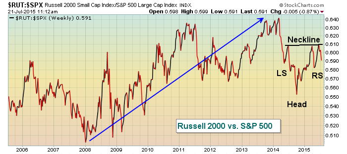
It's always better to see money flowing to the more aggressive areas of the market, especially during breakouts. So if we see the S&P 500 break out again in the near-term, it will be important to see relative strength return to the Russell 2000.
Another area where we haven't seen a breakout in the more aggressive area is with consumer stocks. When the S&P 500 moves to fresh highs, I like to see it accompanied by new relative highs in the XLY:XLP ratio. This tells me that traders are betting on continuing economic improvement, which would benefit the XLY to a greater degree than it would the XLP. Here's the chart:
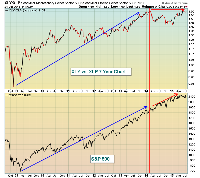
The red vertical line shows that the S&P 500 was being supported by a higher XLY:XLP ratio through the beginning of 2014. Since then, however, the XLY:XLP ratio has been flat while the S&P 500 continues marching higher. I would feel better about the sustainability of this market advance if we see more participation on the XLY vs. the XLP and a return to leadership from the small cap stocks. Thus far, I'd consider both of these charts to be caution flags, not the start of a bear market. Significant price breakdowns on heavy volume could lead to additional selling, though, so that's what I'll be watching for.
It is worth mentioning that this week is the second worst week of the year historically on the S&P 500 since 1950. We typically see runups into earnings season, which is what we just saw again. This week typically represents profit taking. Also, the mid-July to late-September period is the worst 2+ consecutive calendar month period for the S&P 500 as well.
Based on all of this, I don't believe the bull market is over but further choppiness and consolidation throughout the summer months seems to be the most likely course.
Happy trading!
Tom