SITE NEWS
RECENT ADDITIONS TO STOCKCHARTS.COM
• Have you seen the
new-and-improved version of CandleGlance? Our awesome mini-charts tool just received a full refresh to match the new site design that we've been rolling out this year. We made the version of this page completely mobile-friendly, and made the chart settings panel easier to use. Give it a look and let us know what you think!
• We've also launched an
updated version of our SCTR Reports page with an improved table design. The best new feature of the updated table design is the search function. Look for the search box in the upper right corner of the table, then simply type in the symbol you're looking for and ta-da! There it is.
Check it out!
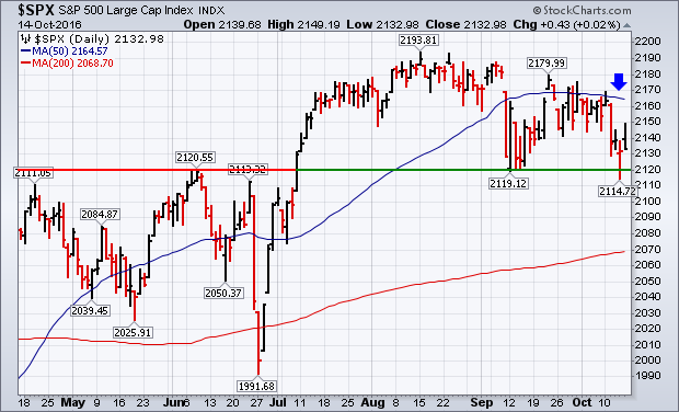
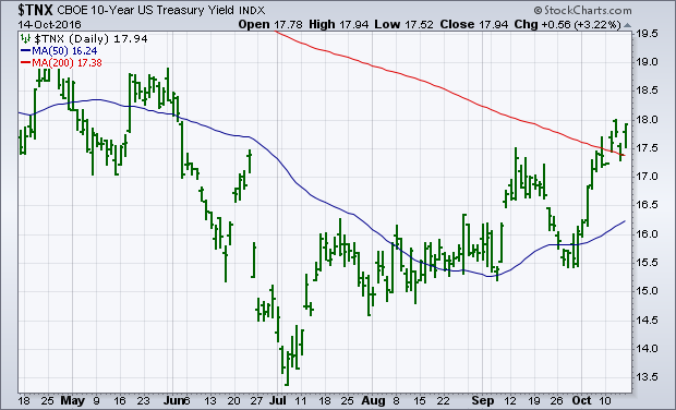
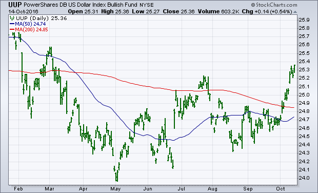
A morning bounce in stocks faded by the end of the day. Chart 1 shows the S&P 500 ending the day at its low. That keeps stocks in a short-term downside correction and well below a falling 50-day average (blue arrow). It also leaves open the possibility that the September low could still be retested. Rising bond yields continue to weigh on stocks. Chart 2 shows the 10-Year Treasury Yield ending the week on a strong note after bouncing off its 200-day moving average. That pushed bond prices lower again. The jump in yields pushed utilities lower while supporting financials. Rising Treasury yields continue to push the dollar higher. Chart 3 shows the U.S. Dollar Index (UUP) ending the week at a seven-month closing high. That's also weighing on large cap stocks.
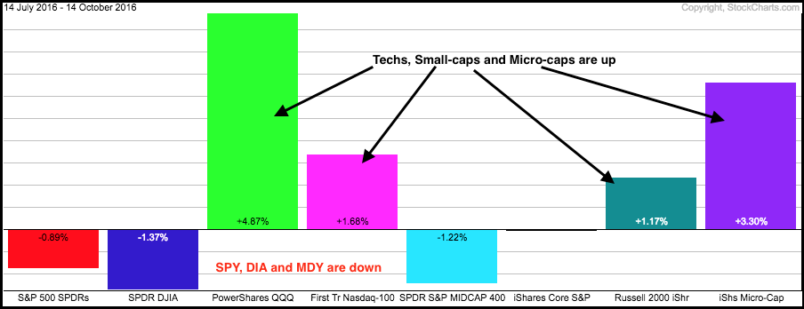
The broader market is incredibly mixed over the last three months. Even though performance divergences reflect a divided market, the major index ETFs are holding above their June highs and I view this as a correction within an uptrend. The PerfChart below shows eight major index ETFs with four up and four down. The Russell 2000 iShares, Nasdaq 100 ETF, Nasdaq 100 EW ETF and Russell MicroCap iShares are up, while the S&P 500 SPDR, Dow Diamonds, S&P SmallCap iShares and S&P MidCap SPDR are down. Basically, small-caps and techs are strong, while large-caps and mid-caps are weak.
Despite this mixed performance, the four major index ETFs shown below are holding above their June breakouts. The blue dashed lines on the chart below mark the June highs. All four ETFs broke above these highs in July and hit ALL TIME highs in August-September. Not just new highs, but ALL TIME highs. Furthermore, the ETFs were up double digits on the last advance and a corrective period is perfectly normal. Also notice that QQQ and IWM led the prior charge with gains of 17% and 16%, respectively.
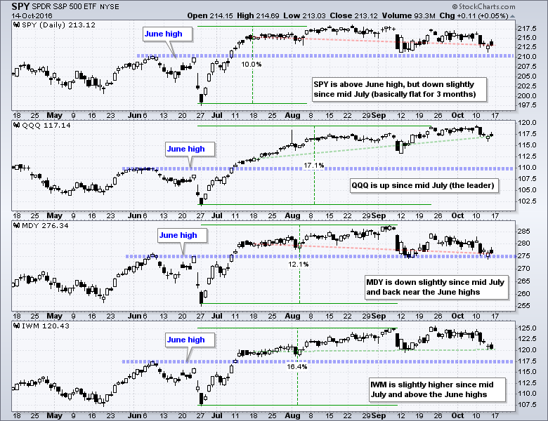
The bigger trend is currently up and this suggests that price action since early September is part of a corrective process. At what point does a correction turn into something more? The June highs and July breakouts might be a good place to start because a strong breakout should hold. QQQ is not even close to the June highs (blue line), but SPY and MDY are close to these breakout levels. IWM is still above the June highs. I would become concerned if/when three of the four ETFs on this chart break below their breakout levels (blue lines).
Follow me on Twitter @arthurhill - Keep up with my 140 character commentaries.
****************************************
Thanks for tuning in and have a good weekend!
--Arthur Hill CMT
Plan your Trade and Trade your Plan
*****************************************
BONDS ARE BREAKING MEANINGFUL TREND LINES
by Greg Schnell | The Canadian Technician
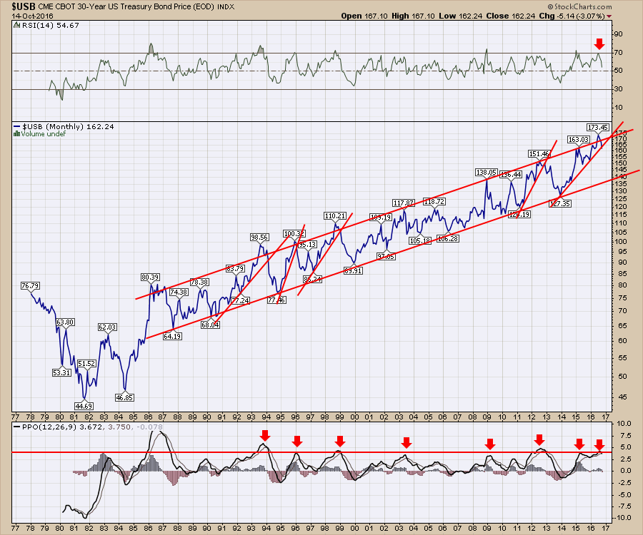
The 30-Year Bond ($USB) broke down through a long term uptrend this month but the bigger picture shows something else. There is still a major uptrend channel. However, we appear to be on a big countertrend move starting now. Interestingly, four other countertrend moves went all the way to the other side of the channel. Also of note is the PPO. It shows a rollover from the current high level so this move is just getting started.
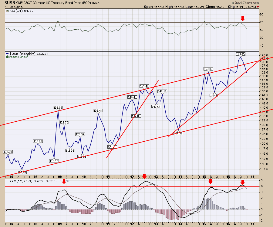
Zooming in on the last ten years, a major rollover occured on the $USB when all the central banks applied QE at the end of 2012. This would be appear to be setup to the same extreme. However, we don't seem to have the same support for this move currently.
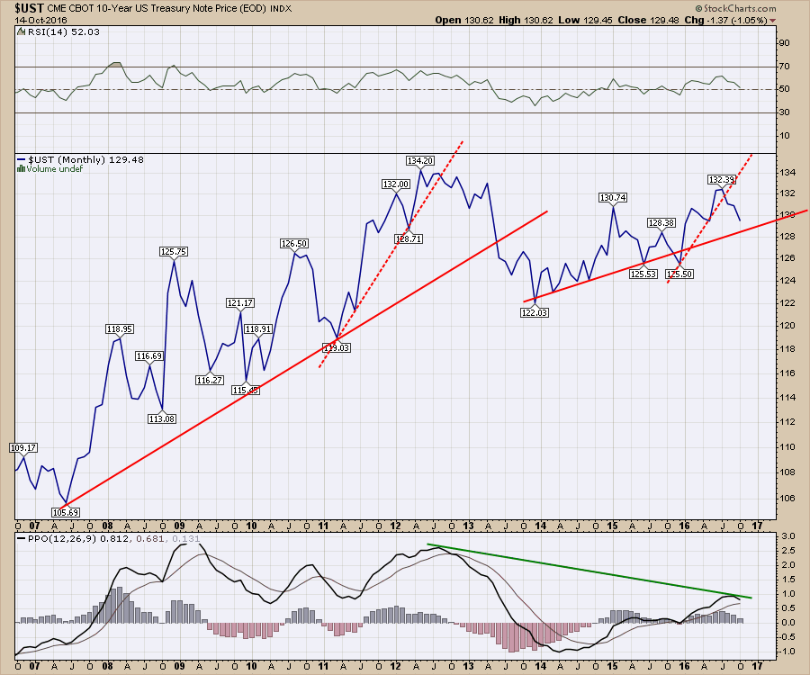
 Below is the chart of the 10 Year Treasury ($UST) price. Notice that it is starting a free fall below the dotted trendline. The PPO has a lot lower momentum than on the previous peak. Technically, this chart is well set up to move lower. There is a little support at the solid red trendline. If that does not hold, this will probably mark an extreme move down. That would confirm what the 30-Year chart above looks to be telling us.
 With the foreign currencies breaking down, it is important to watch for other significant changes. These bond charts are also breaking trend lines on the monthly charts. There are a lot of charts breaking trend lines in sympathy with these bond and currency charts. If you would like to see more about the current market setup and the litany of trend lines breaking, please follow the link to my most recent webinar. Commodities Countdown 2016-10-13 Webinar. This is an important time to be aware of the changing facades of the market.
Good trading,
Greg Schnell, CMT, MFTA.
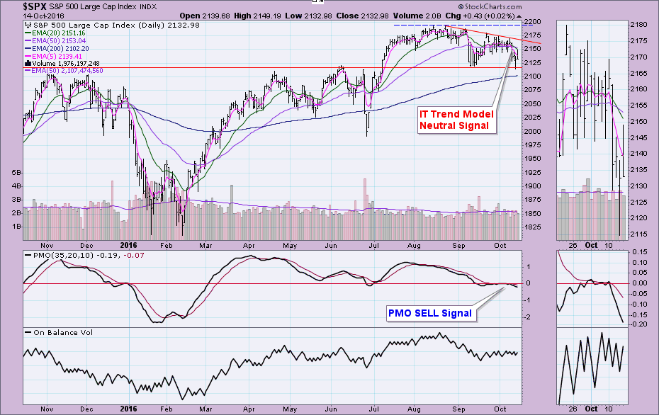
The DecisionPoint Scoreboards had significant changes this week. Note the difference between last Friday's DP Scoreboard and today's. Scoreboards went from very bullish to very bearish in one week. The intermediate-term BUY signals that were replaced on the SPX and OEX had been in place since March!
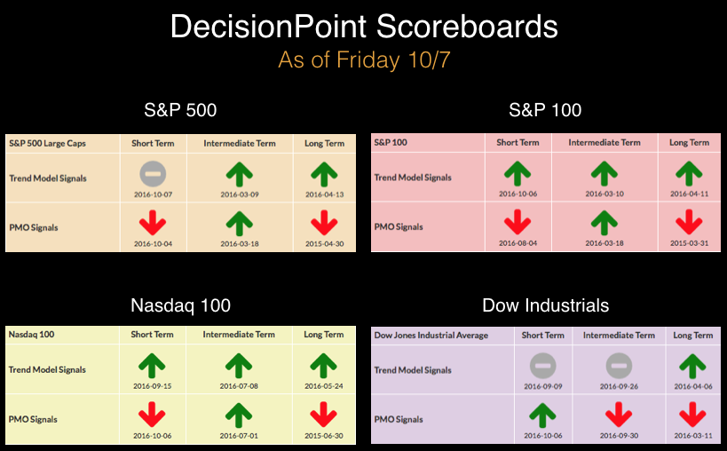
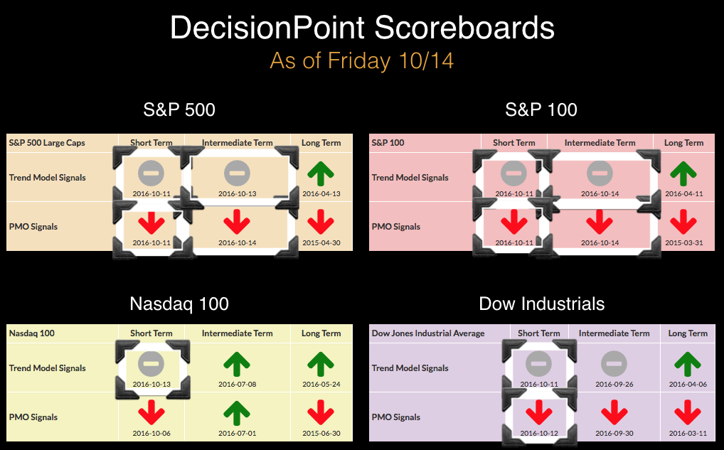
We've seen quite a bit of whipsaw on our short-term signals, but they seem to have settled in with the intermediate-term signals in the bearish position.
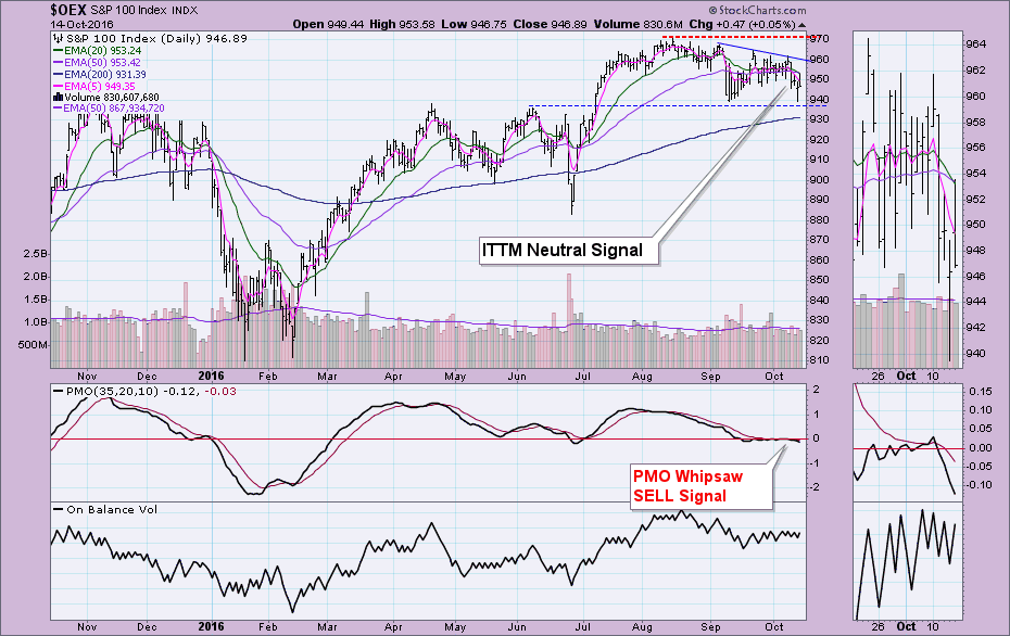
The Intermediate-Term Trend Model (ITTM) Neutral signals are generated by 20/50-EMA negative crossovers. They are "neutral" because the 50-EMA is above the 200-EMA which implies the OEX and SPX are in bull markets or have a bullish bias. The model won't go on a SELL unless the long-term shows a bearish bias. You'll notice on the daily chart both the ITTM and ST Price Momentum Oscillator (PMO) signal changes. The declining tops trendline suggests that bulls are losing steam. Support is holding for now, but the new bearish signals suggest it won't.
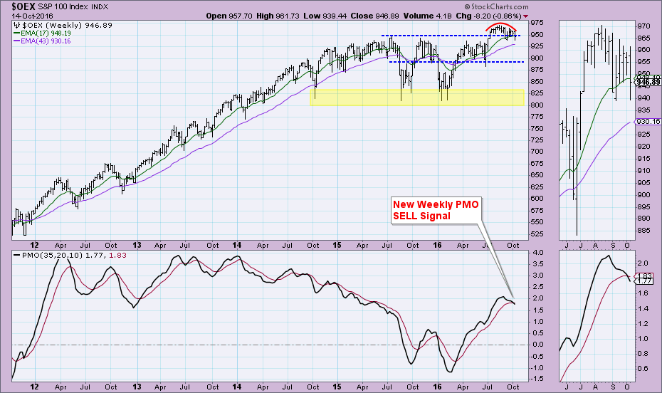
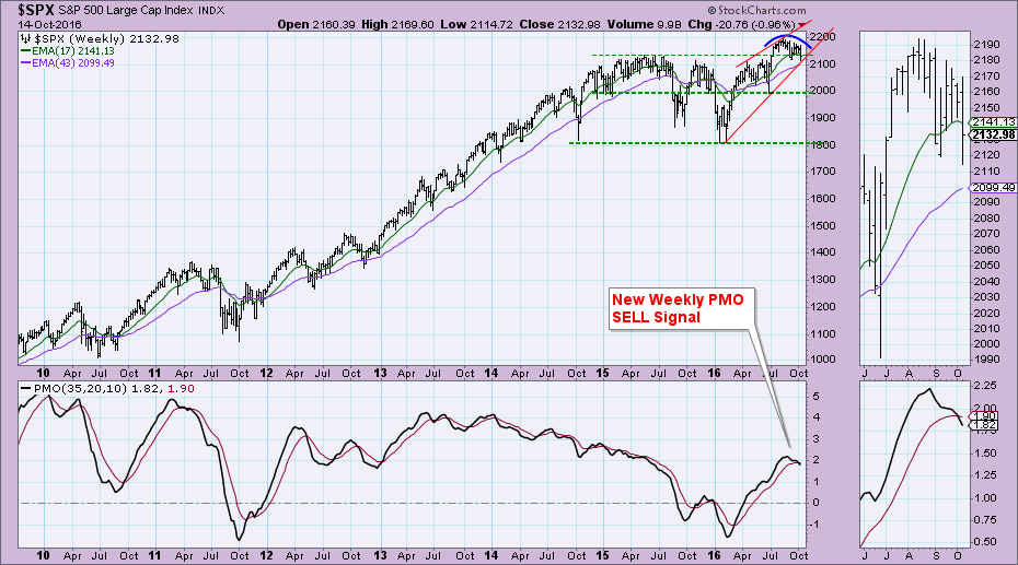
You'll find the new Intermediate-Term PMO SELL signal on the weekly chart. We don't get whipsaw on these signals and they tend to be very prescient. The rounded top and breakdown from support is bearish.
We have a similar configuration on the SPX. A declining tops trendline that is holding as overhead resistance and horizontal support. Combining the two and we see a descending triangle. This is a bearish formation that if executed would confirm the PMO SELL signal and STTM (negative 5/20-EMA crossover) & ITTM signals.
The weekly chart doesn't inspire confidence. A rounded top and a rising wedge are both bearish patterns and suggest more decline. You can already see the breach of horizontal support. The weekly PMO SELL signal is the most concerning.
Conclusion: It may seem that I'm always writing about signal changes and to some degree that is true given all of the whipsaw short-term signals. However, these ITTM Neutral and ST PMO SELL signals replace BUY signals that had been in place since early March--not even Brexit threw those signals off. I wrote today in the DP Alert blog that there is the possibility of a short-term rally right now based on short-term indicators, but the keyword is "short". Unfortunately, the intermediate-term signals have very bearish implications.
Come check out the DecisionPoint Report with Erin Heim on Wednesdays and Fridays at 7:00p EST, a fast-paced 30-minute review of the current markets mid-week and week-end. The archives and registration links are on the Homepage under “Webinars”.
Technical Analysis is a windsock, not a crystal ball.
Happy Charting!
- Erin
We've entered a very strong historical part of the year for our major indices and most sectors and industry groups. Today, I want to focus on one of the best of the best, the Dow Jones U.S. Steel Index ($DJUSST). Average DJUSST monthly gains over the past 17 years are as follows from October through December:
October: +2.8%
November: +4.3%
December: +4.3%
Those are average monthly gains over a 17 year stretch. Given this historical strength, it would seem like a good time to evaluate the technical merits of the group. So let's check out the longer-term weekly chart:
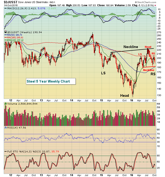 So is the glass half empty or half full? I see two head & shoulders patterns - one bullish and one bearish. But neither are confirmed until we see the heavy volume breakout. Therefore, the two necklines are what I'd be paying attention to. That gives us a trading range of 180-225. But because of the historical tendencies of steel over the next few months, I'd give the technical edge to the bulls. It also helps that the DJUSST is trading much closer to short-term neckline support of 180 than it is to long-term neckline resistance of 225.
Happy trading!
Tom
We're now in the thick of Q3 earnings season when thousands of companies will report their numbers over the next several weeks. Earning season kicked off when Alcoa reported its numbers early last week and served as the poster child of why it's a crap shoot at best to hold a stock into its earnings reports.
You can see in the chart below that AA reported its numbers before the market opened on October 11 and you can also see that the stock got crushed, losing almost 17% over the next few trading days.
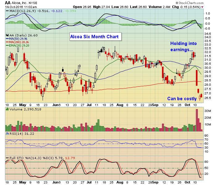 Interestingly, AA had climbed nicely off of its recent bottom on September 20 and looked poised to go higher But traders were disappointed in their numbers with the stock pulling back to levels not seen since mid May.
Not every stock that reports earnings gets slammed like Alcoa did. Plenty of stocks move higher after they report results. But the problem is there's simply no way of knowing how the market will respond to an earnings report, and therein lies the problem; it's just not worth the risk.
At EarningsBeats we scour the market for companies that beat earnings expectations and have solid charts. And instead of participating in a trade into an earnings reports we watch to see the market reaction once the numbers are released and how the stock performs in the following days. Then once the dust settles a stock might become a high reward to risk trading candidate and end up on our "Candidate Tracker." This in turn allows our members to decide if they wish to take on a position. If you would like to see a sample of our Candidate Tracker just click here.
Earnings season can be an exciting time for traders. It's the time of year when companies get to show their financial strengths and weaknesses. It's also a time to be careful to not put your precious capital at unnecessary risk.
At your service,
John Hopkins
EarningsBeats

I've annotated the six charts I presented to you in my September 20, 2016 blog which was an exercise in Selling. If you missed that blog, I suggest you review the un-annotated charts first, and then mark them up yourself before you peek at my annotations. Here's the
Read More


 Interestingly, AA had climbed nicely off of its recent bottom on September 20 and looked poised to go higher But traders were disappointed in their numbers with the stock pulling back to levels not seen since mid May.
 I've annotated the six charts I presented to you in my September 20, 2016 blog which was an exercise in Selling. If you missed that blog, I suggest you review the un-annotated charts first, and then mark them up yourself before you peek at my annotations. Here's the