| THIS WEEK'S ARTICLES |
| The Market Message |
| Railroad Stocks Lead the Transports and Industrial Sector Higher |
| by John Murphy |
Editor's Note: This article was originally published in John Murphy's Market Message on Friday, April 19th at 10:21am ET.
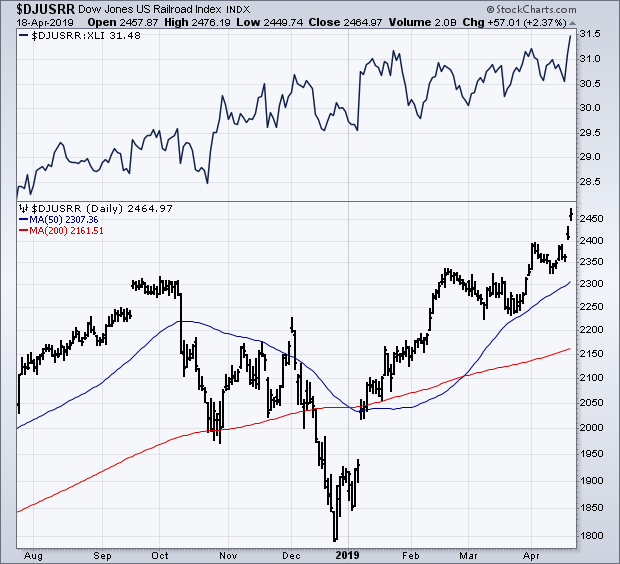
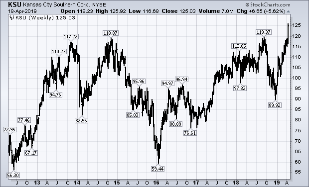
Two stock groups did better than the rest of the market this week. Transportation stocks had another strong week. As did the Industrial Sector SPDR (XLI) which was the week's strongest sector. Both have one group to thank for their strong performance. And that's railroads which are included in both groups. And the rails have become market leaders in both. Chart 1 shows the Dow Jones US Railroad Index climbing this week to a new record. The rails have been the strongest part of the Dow Transports all year. They've also become leaders in the industrial sector. The solid line in the upper box is a relative strength ratio of the railroad index divided by the Industrial SPDR (XLI). That ratio hit a new high this week. A ratio of the rails divided by the SPX did the same. All of the rail stocks hit record highs this week, and were XLI leaders. Kansas City Southern (KSU) was the week's biggest rail percentage gainer. And achieved an impressive bullish breakout.
The weekly bars in Chart 2 show KSU breaking through its 2014 and 2018 highs to a new record. That's a positive sign for that stock, the Dow Transports, and the Industrial sector (XLI).
Chart 1

Chart 2

|
| READ ONLINE → |
|
|
|
| The Canadian Technician |
| Insurance Companies Are Popping To New Highs |
| by Greg Schnell |
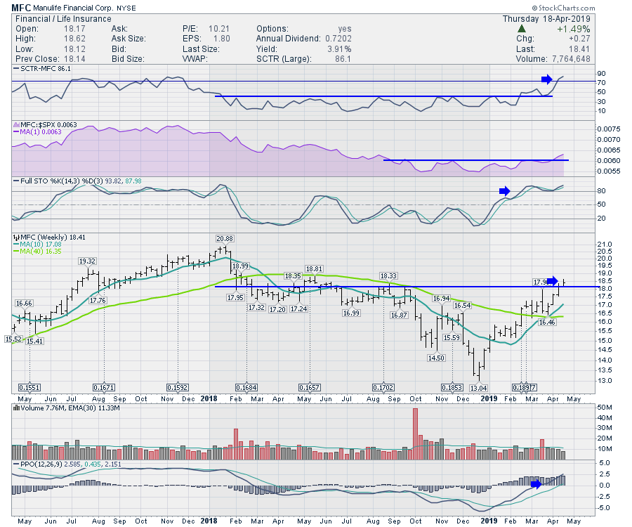
Across the broad spectrum of insurance companies, the life insurance industry group has a group of names huddled at or around 52-week highs. With nice strong dividends, these stocks look set to surge. A good example to look at is Manulife Financial (MFC).
MFC currently has its highest SCTR ranking in over a year, while its PPO, which shows momentum, has moved into positive territory. This move started just recently in March and has continued into April. The Full Stochastic continues to reside in the strong area above 50. Notice the drop downs on the price chart show when the dividends will be paid.

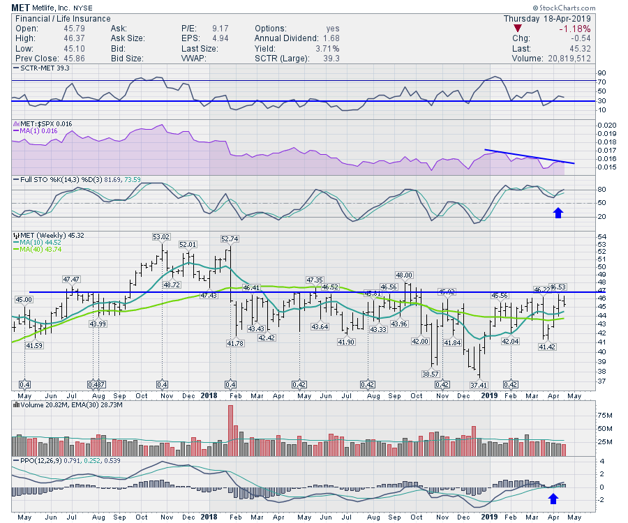
MetLife (MET) isn't as strong, but it is sitting just below resistance. Looking through the indicators, the SCTR ranks the stock price performance against large cap companies. This has not started to thrust higher yet, so that is a warning to be cautious. We would like to see MET accelerate a la the MFC chart above. MET's relative strength is currently drifting lower. What we would want to see is it starting to outperform the $SPX, which would be shown by a rising area chart (in purple).

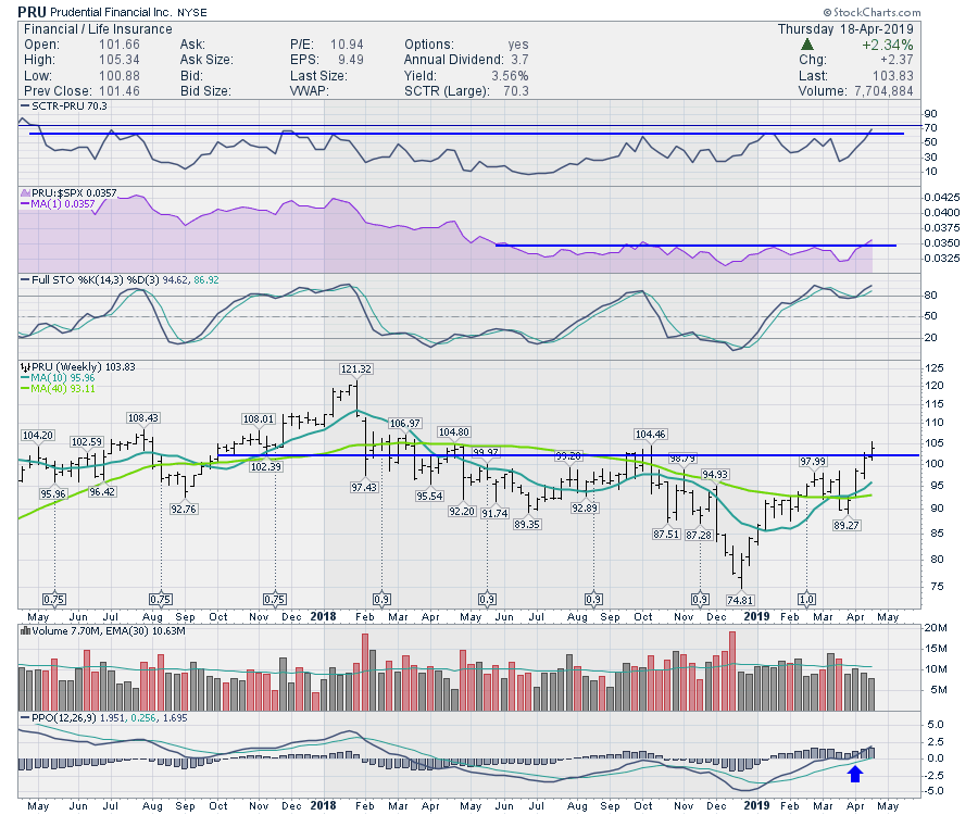
Prudential (PRU) is showing the chart shape we want to see as it advances. The SCTR ranking is moving to a fresh high! This chart shows the price action moving the fastest we have seen in two years. That's powerful. The relative strength is making new 10-month highs. Over the last year, the relative strength has moved sideways. and the stock has basically tracked the S&P 500. Now, however, we see it accelerating. The full stochastic is also holding up at a high level and could stay up there for a long time. Notice the momentum on the PPO starting to surge to new 52-week highs; that is also bullish.

The bottom line is that this group looks like it is starting to surge, much like the banks, brokers and asset managers. A broad surge in the financials is trying to take place here. It would be very helpful to keep this bull market running.
Good trading,
Greg Schnell, CMT, MFTA
Senior Technical Analyst, StockCharts.com
Author, Stock Charts For Dummies
Want to stay on top of the market's latest intermarket signals?
– Follow @SchnellInvestor on Twitter
– Connect with Greg on LinkedIn
– Subscribe to The Canadian Technician
|
| READ ONLINE → |
|
|
|
| Earnings Beats |
| Profiting from Companies that Beat Earnings Expectations |
| by John Hopkins |
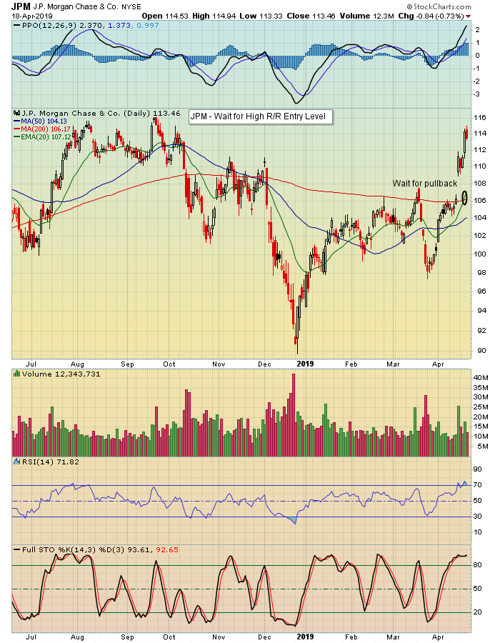
Earnings season is off and running and already some companies that beat expectations could set up as high reward-to-risk trades. JP Morgan (JPM) is a perfect example of a company that reported stronger than expected numbers; you can see below the positive response from the market below.

In the week since JPM reported its numbers, the stock has risen by 8.7% and has moved closer to testing the September 20-21, 2018 highs. It could still get there, but it's now technically overbought and this is certainly not a good time to chase. Instead, for those who are patient it makes more sense to wait for the stock to pull back to key support, perhaps close to the 20/200 day moving averages, which in this case happens to be close to the level the stock was at before it gapped up after earnings.
We see this play out quite often on those companies that gap higher after earnings; sooner or later, they settle down, profit-taking kicks in and they are ripe for a nice score. The key becomes waiting patiently for the stock to pull back to a key price or technical support level, with a tight stop in case it continues moving lower. Thus, you have a high reward-to-risk opportunity.
Over the next several weeks, thousands of companies will report earnings. Many of these companies will beat earnings expectations, gap higher and ultimately work their way back down to a suitable entry level. These are the types of companies many traders are attracted to; they are what I call the "best of the best." In fact, we will be conducting our Quarterly Earnings webinar this Monday, April 22, where I will be joined by StockCharts.com Senior Technical Analyst Tom Bowley. We'll be discussing companies that recently reported earnings along with companies that will be reporting soon and looking at their historical tendencies, i.e. how these companies have performed in the recent past after posting their numbers. In addition, we'll share over 100 companies currently on our Strong Earnings ChartList, including potential entry and exit levels, with participants. If you want to join us, just click here to learn more.
There are many factors that impact the price of a stock, but nothing to the same degree as earnings. If you are able to key in on those companies that beat earnings expectations, you will put yourself in a good position to profit, especially if you are patient and are able to enter trades on your terms.
At your service,
John Hopkins
EarningsBeats
|
| READ ONLINE → |
|
|
|
| The Traders Journal |
| How to Approach Investing Like Pro Sports and Make the Playoffs! - ChartPack Update #23 (Q1, 2019) |
| by Gatis Roze |

Pick the pro league of your choice. You can have the most expensive talent on one team, but without the right organization, routines and strategy, you won’t make the playoffs.(Presently, for example. you might consider the NBA’s Los Angeles Lakers with one LeBron James and friends).
Something similar happens with investors. Being the smartest, most educated high IQ individual in the arena does not guarantee you profits. In fact, hubris often results in the opposite becoming true — based on the fact that those kinds of investors often believe the normal rules of organization, routines and strategies don’t apply to them. That is, until they finally learn that the market humbles everyone equally. The sooner you get your ego out of the way and embrace the realities of your “Investor Self” (chapter 3 of Tensile Trading), the sooner you’ll become a consistently profitable investor.
So for those of you “smarter-than-the-average-bears” out there, stop acting like a giant bi-polar gorilla holding onto your outdated beliefs. It’s much like playing NHL hockey without a helmet. In Darwinian terms, you will soon be taken out of the game.
On the other hand, the stock market is a jigsaw puzzle we’ve solved for you. All those missing pieces are there in the ChartPack. Grayson and I have been using it to trade our accounts for over a decade, and since we made it available to StockCharts.com subscribers in 2013, the thousands of users have contributed mightily to the many muscular enhancements. You provide the discipline. The Tensile Trading ChartPack dashboard will provide the organizational roadmap and specific ChartLists of routines to follow. So here are just a few of this quarter’s updates. It should be noted that many minor updates occur continuously between these major quarterly updates, and we only highlight the more significant ones in these blogs.
#10.1 — Permission to Buy — Trend
This is an example of how small improvements contributed by the user community and incorporated into the ChartPack have rendered it more powerful each quarter since we first released version 1.0 in 2013. Recently, a longtime user pointed out that we are all conditioned to think green lights mean go, yellow lights mean caution, and red lights mean stop. She suggested we incorporate that visually into the Daryl Guppy Moving Averages chart. Visually, the chart now starts by plotting short term averages in green, then blue, brown, orange, gold, purple, pink and finally the last MA in red. Visually, it works nicely.
#10.4 —Bullish & Bearish Dashboard of 16 Longterm Indicators
This essential collection of 16 historically significant charts illustrates the weight of fundamental market indicators, such as the Unemployment Rate, Industrial Production, S&P 500 Earnings, and Leading Sectors, as well as Technical Indicators such as momentum, the volatility index and a number of breadth indicators. Together, they provide a powerful picture of the markets and the balance of evidence for either a bullish or bearish scenario.
There are a couple of enhancements to note on the breadth charts. Chart #4.5 is based on $NYHL and shows the New Highs minus New Lows on the NYSE. Chart #4.96 replaces #4.95 and shows $NYUD. This second breadth indicator shows the total volume of advancing stocks minus the total volume of declining stocks (A/D) on the NYSE. Historically, a rising market making higher price highs which is not confirmed by rising positive A/D volumes becomes susceptible to exhaustion and will turn down.
#10.9 —Sample ChartStyles
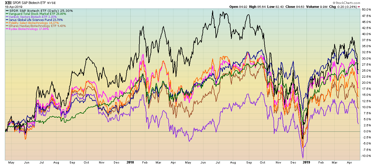
At our recent Investor Boot Camp, we presented our “Best of Breed” methodology in detail, and it was recommended that we add this chart style to the samples ChartList. We have now done so. In this example, the chart represents one asset class — Biotech. Other asset classes are similar in that the “best” ETF for that asset class is the ticker at the top of the chart and plots in black. The total market (as represented by Vanguard Total Market) VTI is always plotted in green. The balance of the candidates are a mix of the top performing no-load mutual funds and “Best of Breed” ETFs.
The purpose of these “Best of Breed” charts is three-fold:
- When new “champion candidates” present themselves, it’s quick and easy to insert them side-by-side with existing champions to compare performance — thereby answering the question, “can new candidates dethrone the present champions?”
- These “Best of Breed” charts also answer the second question of whether this particular asset class has active mutual fund managers who have proven over time that they are able to outperform their benchmarks and earn their higher expense fees or whether a low cost passive ETF is the champion.
- As part of a monitoring routine, these “Best of Breed” charts point out which asset classes are outperforming the market and deserve more of a financial allocation and which asset classes need to be reduced. Also, within each asset class, it monitors the investors “owned” ticker symbol versus its brothers and sisters in this particular asset class to ensure that the investor remains invested in the “Best of Breed” for each asset class.

#217 — Gold
Gold versus the US Dollar has has a strong inverse relationship historically. We changed the data to weekly (from daily) to make this inverse relationship even more visually obvious.
#420-12 to 420-90 — Fidelity Sector Portfolios
An intriguing trend across the Fidelity portfolios presented itself this past quarter. A significant number of funds reduced their total positions by substantial percentages. For example, the Communications Equipment fund shrank its portfolio size from 60 positions last quarter to 39 as of the latest update. The team behind the Gold fund reduced their position allocation by exactly 50%. Similar moves were noticed in Consumer Discretionary and Computers. Considered in the context of a market that has bounced from a sharp decline in late 2018 and is now trying to test old highs, these total positions reductions are an interesting theme.
Here are a few other quick highlights:
- One stock that appeared across a number of Fidelity funds was Tronox (TROX), a specialty chemicals company that has been trending nicely since the start of 2019. The indicated institutional support here, spread across multiple large funds, could be an important boost to this growing small-cap stock.
- The Energy Service portfolio saw lots of change, with a few big name adds and drops.
- The Industrials portfolio also saw some substantial shifts in the past quarter, with General Electric (GE) returning to the top 10 holdings lists after being dropped last quarter. A few other notable adds and drops in this fund make it a good ChartList to take a closer look at.
Already have the ChartPack? Here's how to upgrade:
- Log in to your account, then visit the "Manage ChartPacks" page (accessible from the bottom of the Members Dashboard or from the "Your Account" page).
- In the table that appears, find the entry for the "Tensile Trading ChartPack" (if you don't see the Tensile Trading ChartPack listed, that means that you haven't purchased it. Click Here to do so now).
- Click the "Re-Install" button next to the Tensile Trading ChartPack to start the update process
The download should take about 15 seconds, after which you can explore the new ChartLists and other updates!
New to the ChartPack? Here's how to install it:
If you'd like to add the Tensile Trading ChartPack to your StockCharts account, Click Here.
Trade well; trade with discipline!
- Gatis Roze, MBA, CMT
- Grayson Roze, Business Manager, StockCharts.com
StockMarketMastery.com
Co-Authors, Tensile Trading (Wiley, 2016)
Co-Presenters, How To Master Your Asset Allocation Profile
|
| READ ONLINE → |
|
|
|
 |
| DecisionPoint |
| Five 5G Technology Stocks to Ponder |
| by Erin Swenlin |

5G is the next generation of mobile broadband and will eventually replace (or augment) your 4G LTE connection. With 5G, we should see exponentially faster download and upload speeds. All eyes are now turning toward the companies that will help launch the advent of this exciting technology. I picked out five stocks that looked interesting in this new space.
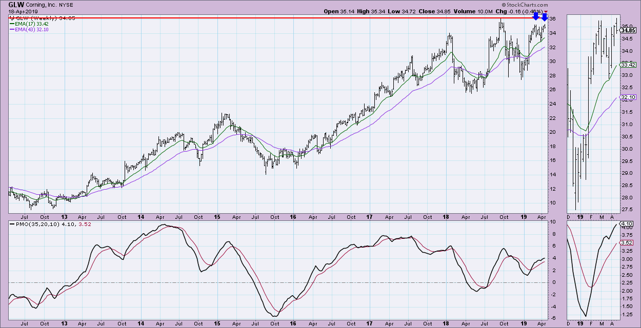
Corning Inc (GLW):
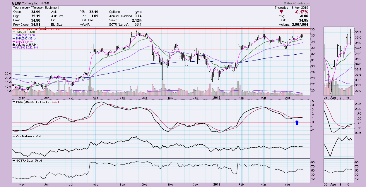
I decided to go through these five on a short-term and intermediate-term basis. GLW has been struggling with overhead resistance, but, with the new PMO BUY signal, it is likely we will see a breakout. However, with the PMO decelerating, GLW might be looking at another trip down to test $34 or $33.

The weekly PMO on all of these five stocks look pretty good and GLW is no exception. My only caveat with an intermediate-term investment is that it might be a good idea to wait and see if a double-top develops, as there could be a better entry on the horizon.

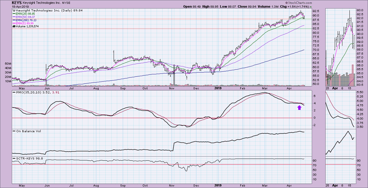
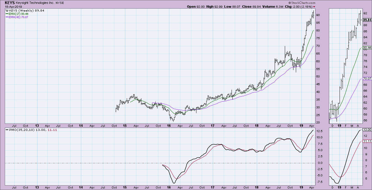
Keysight Technologies Inc (KEYS):
KEYS probably has the least desirable chart going by the PMO, which once again failed to get a BUY signal, instead kissing the signal line headed back down--a bear kiss. This suggests a breakdown. However, it is hard to argue with a near perfect SCTR ranking and healthy, rising OBV.

KEYS is making new all-time highs every time it breaks out. It doesn't have a lot of weekly data, so although the PMO is looking very overbought, a normal range has not really developed. This makes it hard to know whether it is overbought or not.

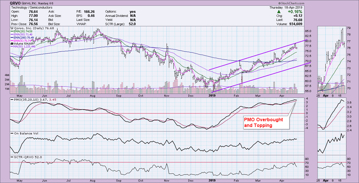
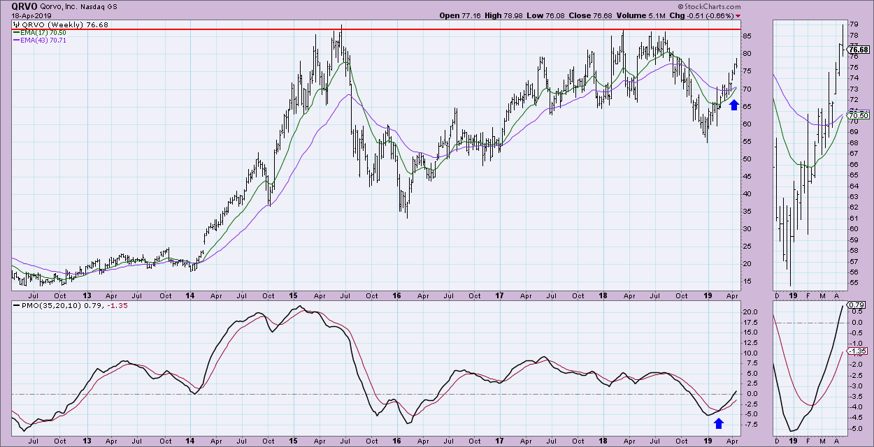
Qorvo Inc (QRVO):
I see a good looking rising trend channel--not too steep. However, for a short-term investment, I would watch out. With the PMO so overbought and turning lower, it may be time for price to test the bottom of this rising channel.

The weekly chart looks great, but, given the possibility of a short-term pullback on the daily chart, I might wait to enter even in the intermediate term. However, once that happens, I'm liking QRVO on an intermediate-term basis.

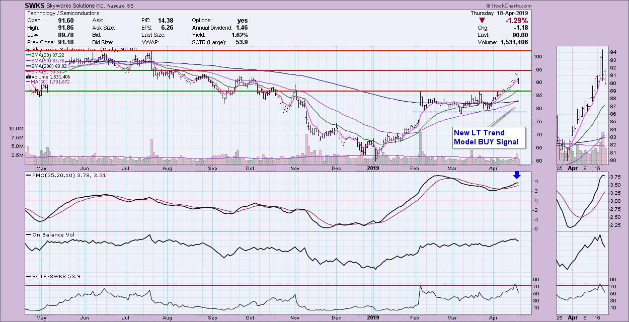
Skyworks Solutions (SWKS):
The PMO is topping. I would look for a test of support at around $86. The DecisionPoint Long-Term Trend Model executed a new BUY signal when the 50-EMA crossed above the 200-EMA, suggesting that Skyworks is moving into a bull market configuration.

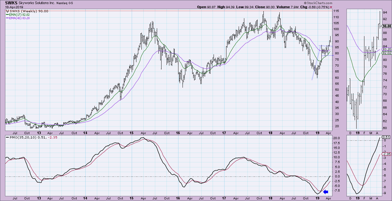
I very much like this weekly chart. We got a PMO BUY signal in oversold territory, which has since been rising with very little hesitation. SWKS recently broke out from a bull flag formation; if you do the measurement on the flag pattern, the minimum upside target would be right at the all-time highs, around $115.

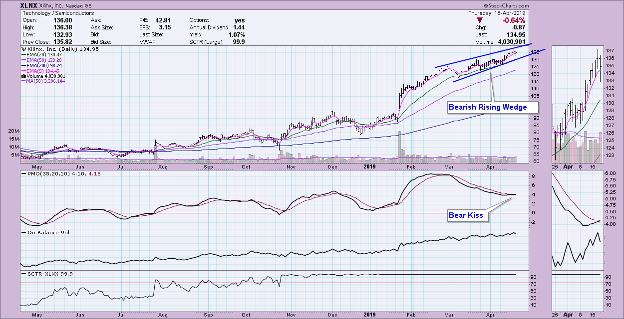
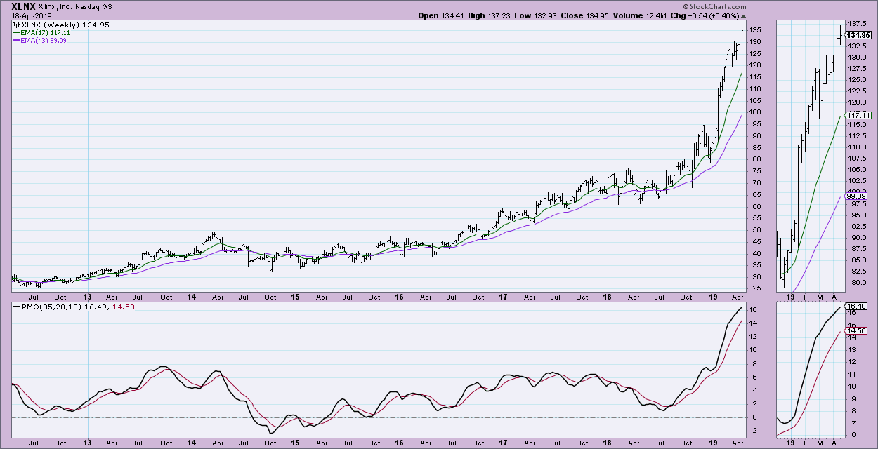
Xilinx Inc (XLNX):
I don't like the short-term bearish rising wedge. The PMO has turned down just below the signal line--another bear kiss. The good news is that the SCTR remains high and OBV is rising nicely.

Clearly XLNX is in a near-vertical move higher. These steep rising trend lines are very difficult for price to remain above. I feel like I would be chasing XLNX in the intermediate term. It needs a pullback. The weekly PMO is very overbought.

Watch the latest episode of DecisionPoint with Carl & Erin Swenlin LIVE on Fridays 4:30p EST or on the StockCharts TV YouTube channel here!
Technical Analysis is a windsock, not a crystal ball.
Happy Charting!
- Erin
erinh@stockcharts.com
Helpful DecisionPoint Links:
Erin's PMO Scan
DecisionPoint Chart Gallery
Trend Models
Price Momentum Oscillator (PMO)
On Balance Volume
Swenlin Trading Oscillators (STO-B and STO-V)
ITBM and ITVM
SCTR Ranking
**Don't miss DecisionPoint Commentary! Add your email below to be notified of new updates"**
|
| READ ONLINE → |
|
|
|
|
|
| MORE ARTICLES → |
|

