| THIS WEEK'S ARTICLES |
| Market Roundup |
| Trick or Treat for Global Equities? |
| by Martin Pring |
Editor's Note: This article was originally published in Martin Pring's Market Roundup on Wednesday, August 21st at 9:36pm ET.
During my many decades in this business, I have never heard of a recession so well-advertised as the one we are witnessing currently. It’s a fact that financial market events that are widely expected rarely take place; someone who knows a train is on the way is almost certain to get off the tracks ahead of time. So it goes in the financial markets. If you think a recession is coming, you sell. Why stay around for the carnage? From a contrarian point of view, the fact that the market has held up so well is very bullish. More to the point, positive market action is starting to be reflected in the charts.
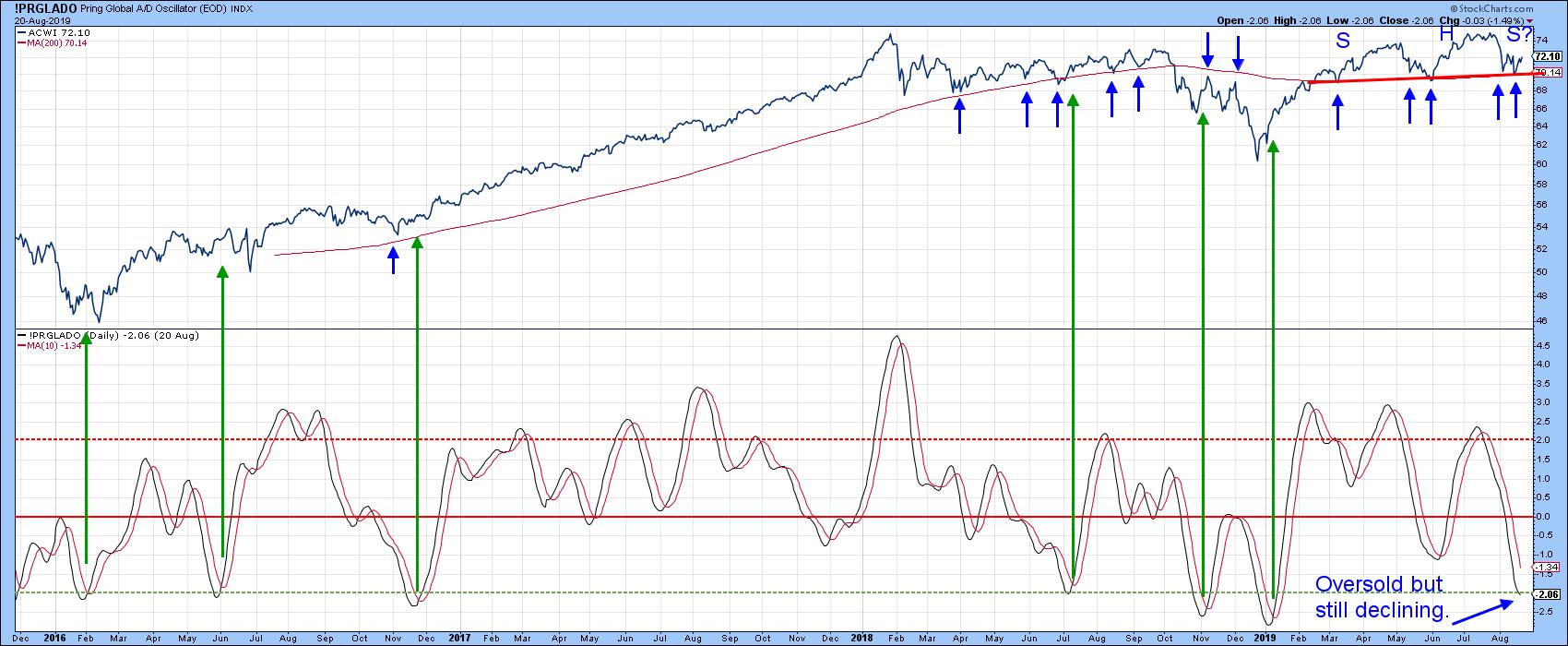
Chart 1 could look pretty scary if the MSCI World ETF (ACWI) were to break below the $70 level, as that would complete a nasty-looking potential head-and-shoulders top. That $70 zone takes on added importance as the 200-day MA is in the same area. Right now, the average is completely covered by the trend line, indicating a very formidable support barrier. In order to obtain some indication of how significant a particular MA timespan might be, it’s a good idea to visually review its support/resistance qualities in the past. In this instance, the 200-day period has been pretty impressive, as you can see from the numerous small blue arrows. The $70 area is therefore a must-hold one. However, current technical evidence suggests that it is unlikely to be breached. One reason I say that is the oversold nature of my Global A/D Line price oscillator. The chart shows that, when it has reached an overstretched level in the past and reversed to the upside, some form of rally has usually followed. Currently, it is declining, so we can’t yet say that another buy signal has been triggered. However, we can see some green shoots from the US market, which is where global upside leadership is currently coming from.

Chart 1
Good luck and good charting,
Martin J. Pring
The views expressed in this article are those of the author and do not necessarily reflect the position or opinion of Pring Turner Capital Group of Walnut Creek or its affiliates.
|
| READ ONLINE → |
|
|
|
| Art's Charts |
| Bonds, Gold, the PPO and Extreme Conditions |
| by Arthur Hill |

The 20+ YR T-Bond ETF (TLT) and Gold SPDR (GLD) are on a tear, but they are getting stretched by one key metric and could be ripe for a corrective period.
There are numerous ways to measure overbought (extended) conditions. Indicators like RSI (above 70) and the Stochastic Oscillator (above 80) have clear levels that mark overbought levels. Other indicators, like the Percentage Price Oscillator (PPO) require a little more guesswork, educated guesswork, of course. Wait a minute? The PPO is a moving average based momentum oscillator! How can we use it to measure overbought conditions? Let's see.
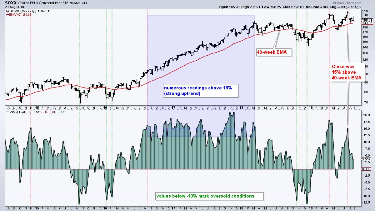
The PPO measures the percentage difference between two exponential moving averages. Chartists can set the short EMA to 1 to measure how far the close is above/below the long EMA. A 1-period EMA is equal to the close. Thus, the weekly PPO(1,40,0) would measure the distance between the close and the 40-week EMA. Looking at a five year chart, we can then get an idea of what constitutes an overextended condition for the PPO(1,40,0). By the way, I set the last parameter, which is for the signal line, at zero to show the PPO as a histogram.

The chart above shows the Semiconductor iShares (SOXX) with the PPO(1,40,0). A reading above +15% seems to mark overbought conditions, while a move below -10% marks oversold conditions. However, notice how the ETF became "overbought" in August 2016 and the PPO then exceeded +15% numerous times until March 2018. Sometimes securities become overbought and remain overbought in strong uptrends, especially stocks in a bull market environment. The oversold levels (PPO < -10%), on the other hand, marked pretty good entry points over the last five years.
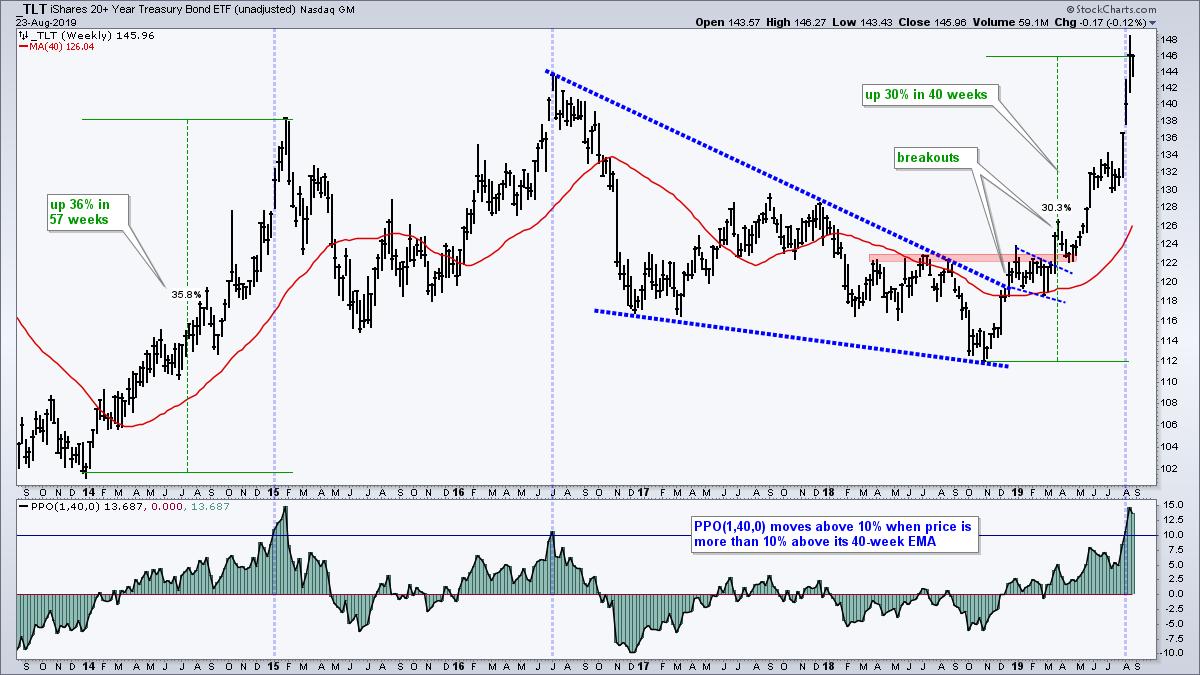
Now let's turn to bonds and gold. TLT surged over 30% from its late October low and hit a new high in August. It looks like blue skies, but TLT looks extended as the PPO(1,40,0) moved above +10% for the third time in five years (blue lines). While three instances are not enough to base a signal, it is not hard to figure out that TLT has come very far very fast, and a corrective period could take hold soon.

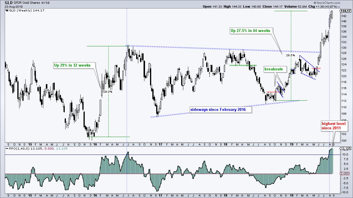
The next chart shows the Gold SPDR (GLD) with the PPO(1,40,0). GLD is up 28.5% since October and hit a string of new highs over the last two months. This is clearly a major breakout and the long-term trend is up, but GLD is quite extended with the PPO moving above 10% this month. As with TLT, GLD has come very far very fast and a corrective period could take hold sooner rather than later.

Keep in mind that overbought (and oversold) present up with a double-edged sword. On one hand, it takes strong upside momentum to become overbought. This is long-term bullish. On the other hand, securities that rise too far too fast are vulnerable to a corrective period, which could involve a pullback or a consolidation. A weekly overbought condition, such as I am seeing now in bonds and gold, puts these two in no man's land. Too strong to short, but too overbought to buy. Discretion is sometimes the better part of valor.
|
| READ ONLINE → |
|
|
|
| The Canadian Technician |
| Large Cap Tech Idles |
| by Greg Schnell |
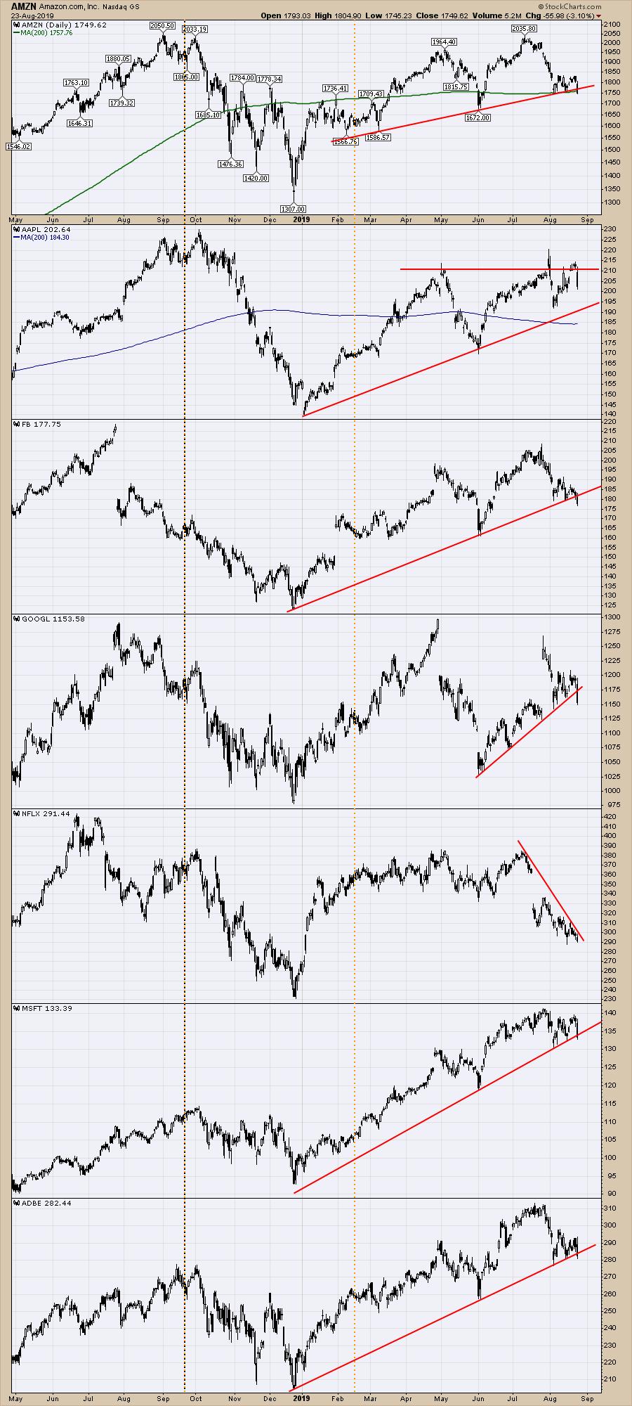
One of the interesting parts about the markets over the last few weeks has been the quiet price action in the large cap tech names, in contrast to Consumer Staples names like Wal-Mart (WMT) and Target (TGT) being fantastic performers this year. Of the list below, only Microsoft (MSFT) and Adobe (ADBE) made new highs in July before the August pullback started. Five of the seven are close to their support trend lines, while Netflix (NFLX) is currently trending down and does not have a support line.

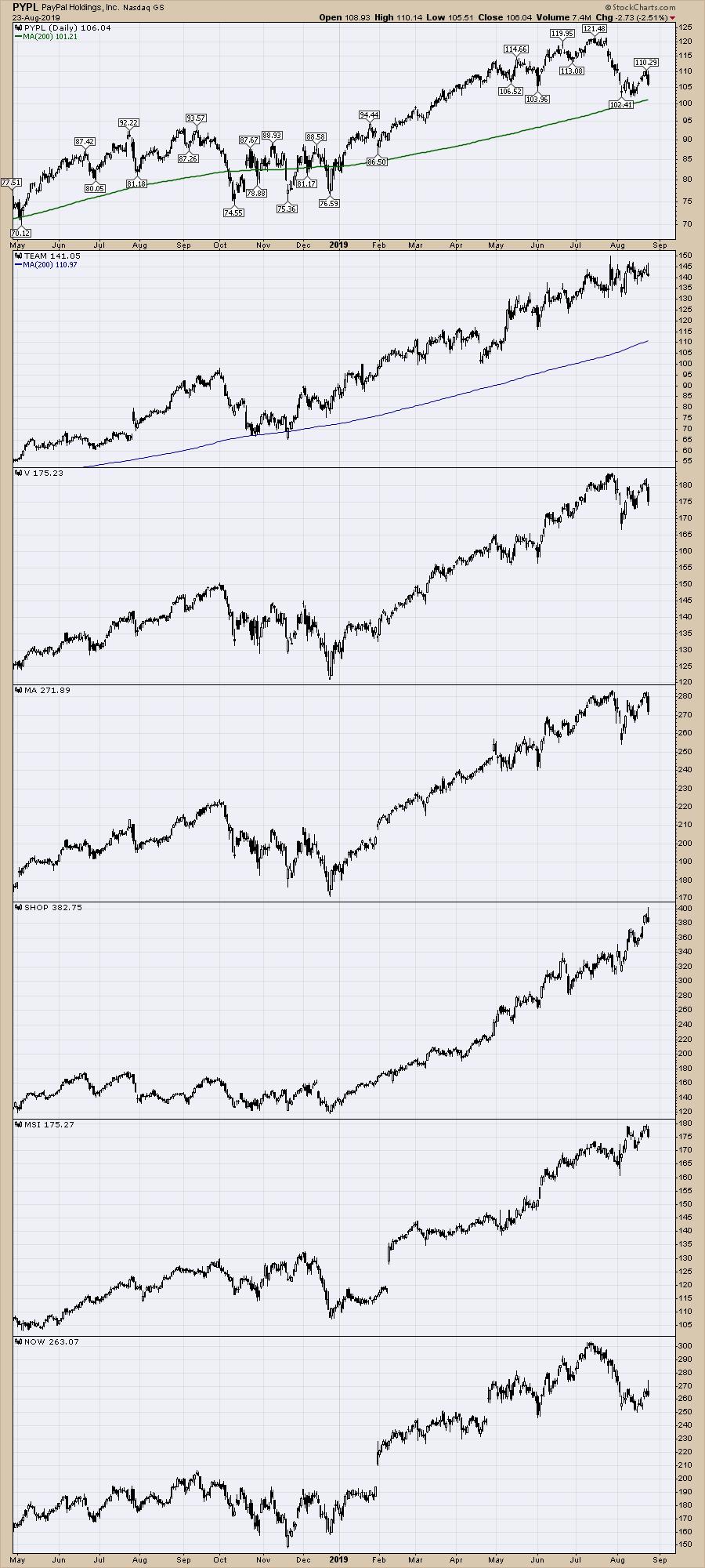
When we look at some of the payment leaders and software stocks that have been powerful performers over the last year, we can see that these names continue to be at or near all time highs. While PayPal (PYPL) and ServiceNow (NOW) are down about 10%, the rest of the list looks set to build higher highs.

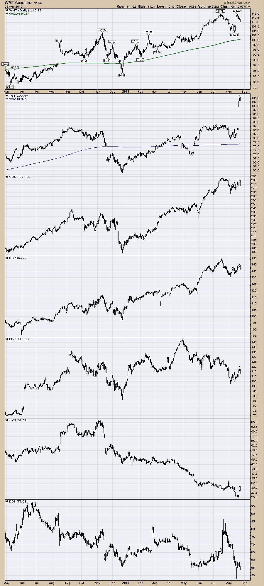
Interestingly, some of the high profile retailers have performed better over the summer months. Having Walmart and Target perform as strong as the high flyers illustrates a big shift to defensive when we compare this group to the first chart.

I keep watching for broader signs of life in retail, like the FIVE chart shown above breaking the downtrend. All of the names had a rough fourth quarter with the overall market last year, so I am wondering if we will get the opportunity to keep riding the strong names into the 4th quarter. I don't think the old mainstream department store names will be starting a new long-term rally this year, but the season for Walmart, Target and Costco (COST) looks to have begun in June.
This posture into defensive-but-strong retailers looks good on the backdrop of a strong broad market like the $SPX. If that market struggles, I expect even these strong retailers to stall. Stay cautious!
|
| READ ONLINE → |
|
|
|
| ChartWatchers |
| Here's to the Future! |
| by John Hopkins |
Recently, Tom Bowley announced to the StockCharts community that he will soon be returning to his "roots" at EarningsBeats.com. When Tom first approached me with the idea, I let out a big "Woohoo!". In all seriousness, it was a joyful day for me, as Tom and I go back together over 30 years, when his accounting firm handled the books for a different company I owned at the time. When we both moved on from our respective ventures, we began a company called Invested Central in 2004, which was dedicated solely to technical analysis education.
At one point during the early years of Invested Central, Tom and I hosted a radio show that was ultimately broadcast in over 20 cities throughout the US - a radio show that was actually about technical analysis. You can imagine someone spinning the dial on their radio and landing on our show hearing things like "Slow Stochastics" and "Relative Strength Index" and "50-day moving averages" and wondering what in the world had they landed on! But the show did have a lot of loyal followers, and it was during that period of time that Tom and I struck up a relationship with Chip Anderson and the StockCharts team. This ultimately led to Tom becoming a Senior Technical Analyst for them just as EarningsBeats.com was getting off the ground. And what a great relationship it has turned out to be all the way around.
Now that Tom is "re-joining" me at EarningsBeats as Chief Market Strategist, we're looking forward to an even stronger relationship with the StockCharts team. For example, Tom plans to continue to provide content at StockCharts via the Trading Places, ChartWatchers and Don't Ignore this Chart blog articles, in addition to hosting a show at StockCharts TV. Stay tuned! And given Tom's unique experiences at both StockCharts and EarningsBeats, I believe members of both communities will benefit immensely. VERY exciting!
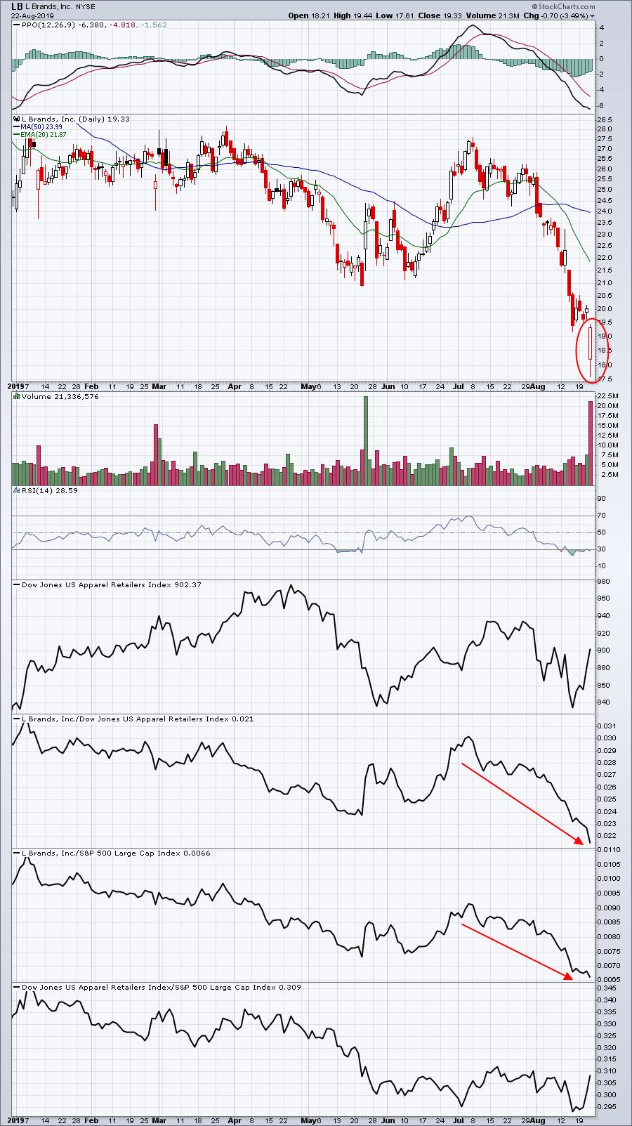
With so many great opportunities ahead for both StockCharts and EarningsBeats, I want to personally invite those of you who have not yet taken the plunge to sign up for our FREE newsletter, the EarningsBeats Digest. This newsletter is published every Monday, Wednesday and Friday, focusing on earnings-related topics and Relative Strength. Just click here to start receiving our FREE newsletter. In fact, this past Friday, Tom wrote an article in the EB Digest that focused on Relative Weakness, warning signs ahead of L Brands (LB) earnings. A sneak preview of the chart accompanying Tom's EarningsBeats Digest article is below.

I have had the privilege of writing articles in ChartWatchers for many years now alongside some very smart and talented people. Tom and I look forward to continuing our collaboration with StockCharts while providing the best technical analysis education we can, especially to those of you who have been such a tremendous part of our success.
At your service,
John Hopkins
EarningsBeats.com
Better Timing. Better Trades.
|
| READ ONLINE → |
|
|
|
| The Traders Journal |
| Investing With Metaphors: These Three Are Giants! |
| by Gatis Roze |

A personal secret: investing with metaphors has always enlightened and disciplined me, helping me grow as an individual investor. One of the most fertile areas for applying this axiom has been car collecting since, much like investing, it’s never black and white. The reality is that both are extremely personal.
Both are also cursed by other similarities. In both camps, everyone wants to take the elevator to market literacy and profits. What I preach is that you have to take the stairs, folks (sigh)! Ever notice that on a cruise ship those people taking the stairs look more fit. Those taking the elevator, less so. It’s precisely the same principle with investing and car collecting — simply substitute the word “profitable” for “fit”.
Okay, so here are the metaphors with three absolute rules that apply to them.
- Trade what you know and know what you trade. In other words, don’t stray beyond the boundaries of your competence. The temptations to do so will confront and tempt you constantly, but don’t do it.
- Know your investing timeframe and trade your timeframe. If you’re comfortable being a long-term investor, then don’t stray into day trading. Sure, when you’re at cocktail parties, it’s sexy to talk about such trades. But sharks that lure you into the water with big fish stories are the same sharks that’ll eat you alive.
- Know thy self. The markets are an expensive place to discover who you really are.
Here’s a personal example pertaining to cars. Yes, Tesla delivered over 95,000 electric cars last quarter alone. My personal take on electric cars is that they have removed so many key elements of an all-encompassing car experience. Call it the law of unintended consequences. A single electric car battery weighs about 1,000 pounds and has an average life of seven years. Fabricating one requires processing more than 500,000 pounds of raw materials somewhere on the planet. For now, I’ll stay with gasoline-powered cars.
My reasoning goes like this. I love the way my Audi sports car greets me upon startup with its own deep throaty hello. I love the way my Shelby GT 500 accelerates from first to second to third, and at each stage physically nudges me into the next with an acoustic sauce that’s slightly different for each gear as it blends the sound of wind, tires and exhaust into a tasty concert. One can’t help but feel engaged by the physical aspect of shifting gears with your hands and feet. My point is that that I know myself. Electric cars are not for me.
So here’s the car collector metaphor and how to apply the same time-tested directives to optimize your investment portfolio. Car collecting is divided into three categories, predominately based on mileage parameters.
- The first category I’ll label the “Race to Zero Collectors”. This category is for cars with less than 1,000 miles on the odometer. These individuals see car collecting simply as an asset class. They see their specialty cars as art on wheels and love to brag about their garage beauties — but they are most definitely NOT drivers. At the Barrett-Jackson auctions in Scottsdale, I once heard two collectors arguing about the value of their respective cars. Both owned 2017 LaFerraris. One had 97 miles on the odometer; the other had 212 miles. And yes, you’d be shocked at how the auction block would over-value the lower mileage car. Hence my label for this category as the “Race to Zero Collector”. If you are in this category and temporarily lose your discipline, just momentarily, and run the odometer into four digits, it will cost you mightily. Know any short-term investors who held onto a position through a corrective pullback and then suddenly became long-term investors? Yeah — it happens.
- I’ll label the second car collector category as the “Dainty Driver Collectors”. This group has cars with more than 1,000 miles on the odometer but always under five digits. I can talk to these folks, but I don’t want to join their club. For me, having to worry about surpassing 10,000 miles simply kills the joy of ownership. I see this group as similar to fossilized individual investors who won’t buy individual stocks. Just ETFs and index funds. I’m sorry — where’s the joy? Where’s the passion? That is “no heart” investing.
- The third and final category is the “Driver Aficionado Collectors”. This is my club! These folks are less collectors and more “gear heads”. We love to drive fast stylish cars. We like to invest across a wide open spectrum. I’m pulled forward by my passion and my heart for both disciplines. I love stocks. I love ETFS and mutual funds. I love different asset classes. My portfolio — and my garage — reflect that love. This isn’t just talk. My Shelby has over 10,000 miles and my 2017 Audi coupe already has nearly 7,000 miles. I drive them to work. I drive them on dates with my wife. I drive them whenever the mood (and the weather) are agreeable. I’m not focused myopically on the odometer to stay below 10,000 miles. I know my category. I know my priorities. I know myself.
The bottom line? Understand which club you are joining when you buy a collector car or any equity. Have a plan. Know your timeframe. Stick to the plan. You can’t bounce around from one club to another. It will only hurt your profitability.
Upcoming Class:
"The 10 Stages of Stock Market Mastery"
Next month – Saturday, September 28th at 9:00am – come join me here in Seattle for a special one-day seminar. In my "10 Stages of Stock Market Mastery" course, I'll cover the most important aspects of my personal investing system and share with you the routines and strategies I've used to trade the stock market for a living for more than 25 years.
If you're anywhere near the Seattle area (or if you're up for a quick trip out to the PNW!), this is a great chance to spend some quality time learning more about the markets, focusing on your portfolio practices and strengthening your investing approach.
For complete details and registration info, CLICK HERE.
See you on the 28th!
Trade well; trade with discipline!
- Gatis Roze, MBA, CMT
StockMarketMastery.com
|
| READ ONLINE → |
|
|
|
| SPECIAL EVENT ANNOUNCEMENT |
| Calling all Toronto-area investors and traders! Our very own Greg Schnell will be speaking at the upcoming Toronto MoneyShow, September 20th - 21st. Free to register and attend, come down to hear Greg share his latest market analysis, see the charts he's watching most closely and meet the man himself in person. Plus, hear other great presentations from a long list of incredible speakers. Click the banner below to learn more and register. |
 |
| LEARN MORE → |
|
| DecisionPoint |
| Introducing "WealthWise Women" and the Pink Line |
| by Erin Swenlin |
Last week, Mary Ellen McGonagle and I had the pleasure of speaking at The Money Show as part of the "Women on Wealth" panel, where we discussed how we can bring women to the "investment table" through education, engagement and empowerment. The presentation was unexpectedly powerful as many in the audience basically followed us out into the hallway to talk more about the educational series, newsletter, workshops and mentoring that we are in the process of building and providing. Keep an eye out! There is a clear need to bring absolute beginners into the fold and provide the tools we need to keep reinforcing the concepts we present. To better serve that community, we have changed our name to "WealthWise Women." Be sure to check out the YouTube videos of our previous shows or live on Thursdays at 3:00p EST. Join us with your friends and family!
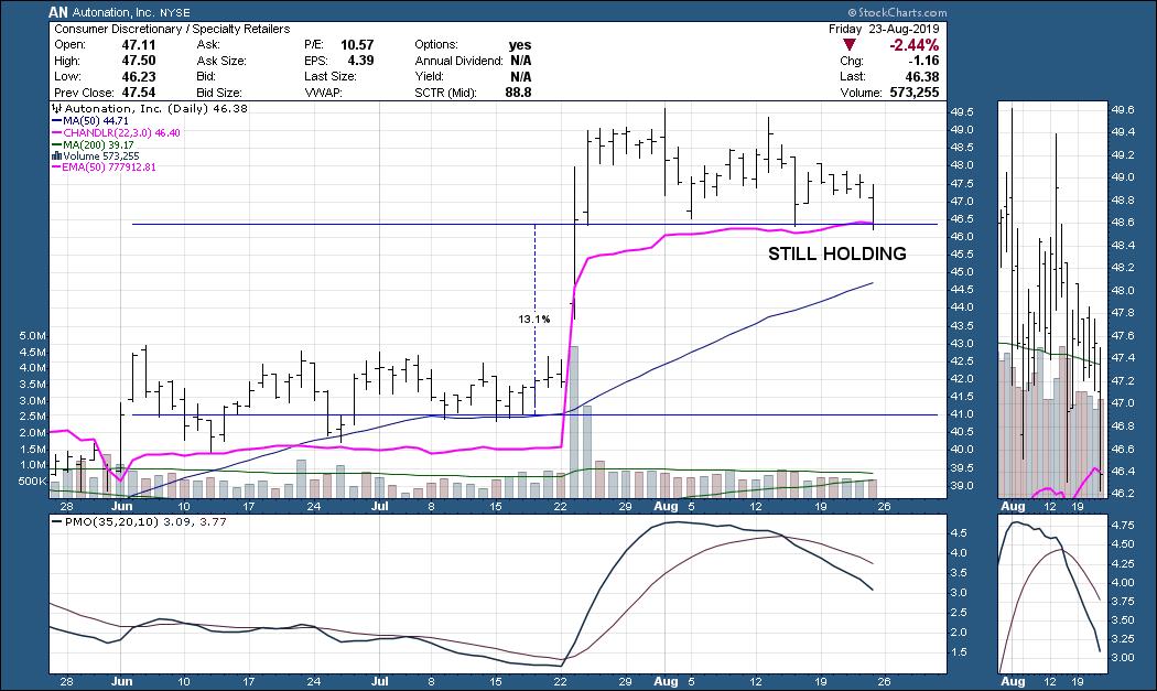
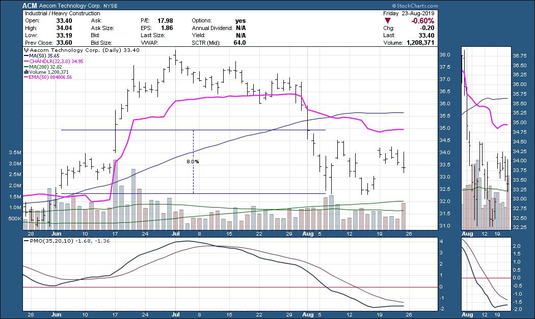
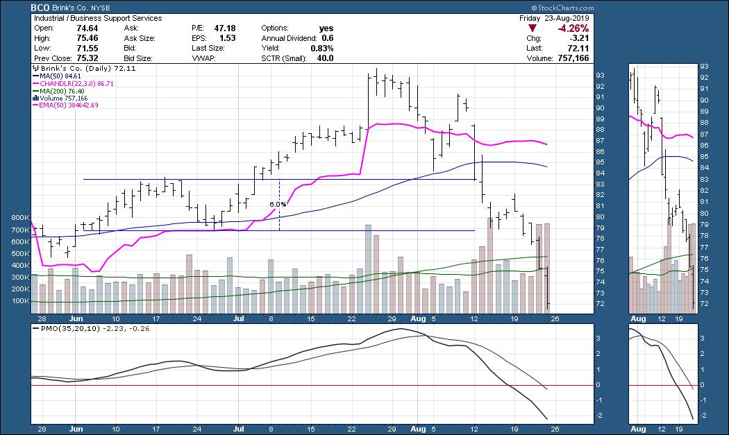
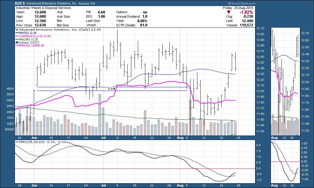
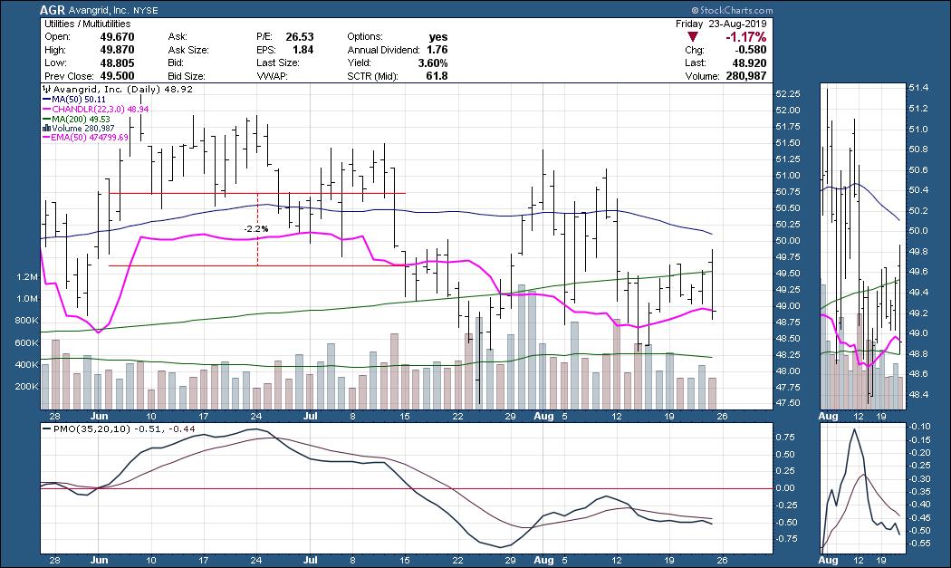
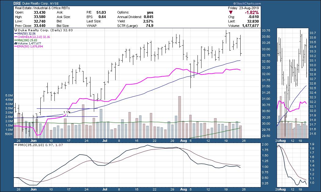
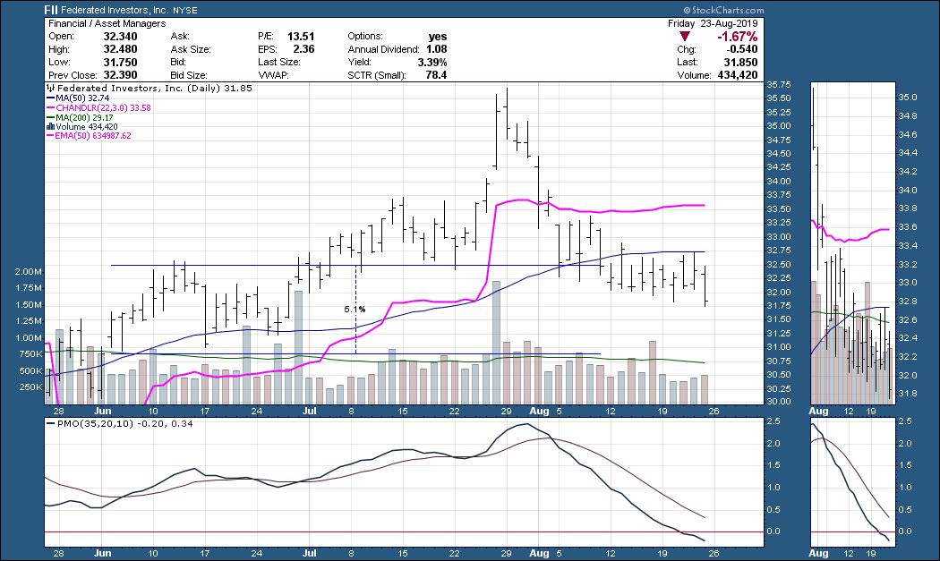
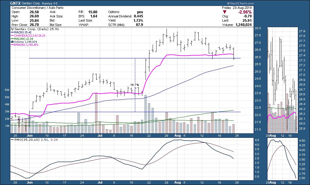
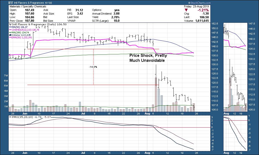
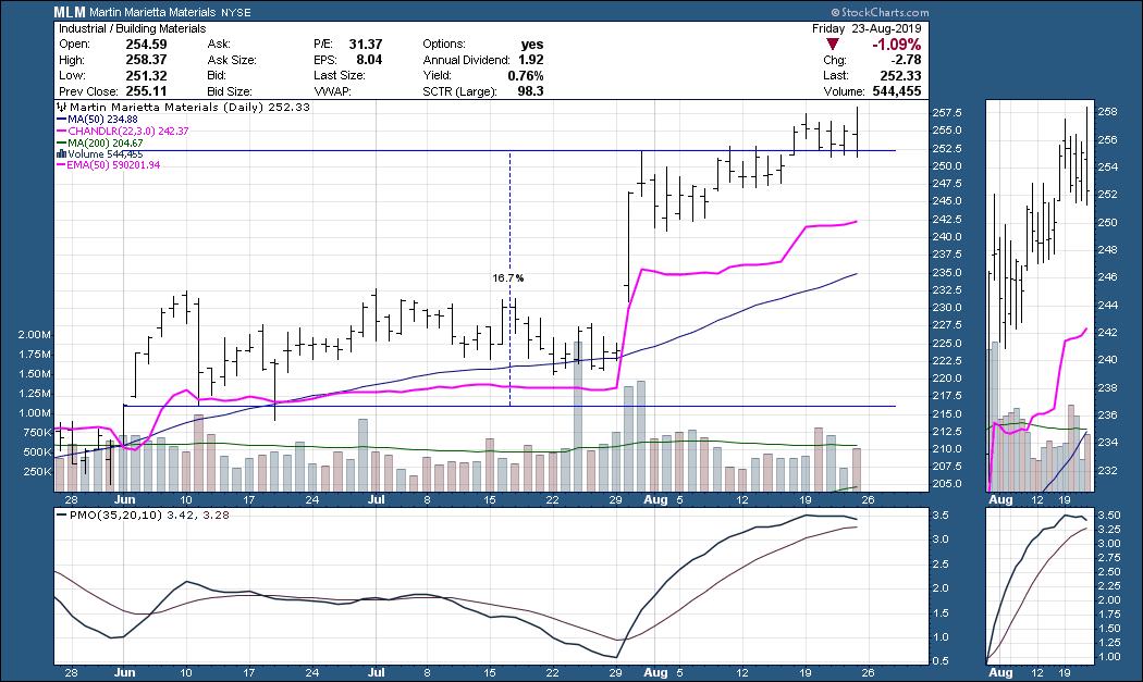
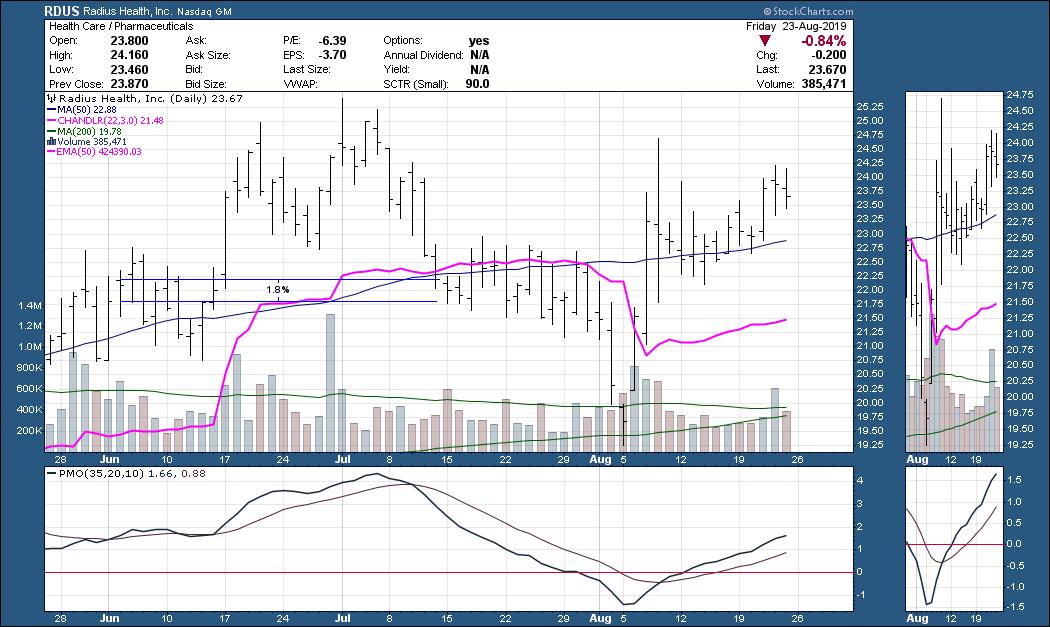
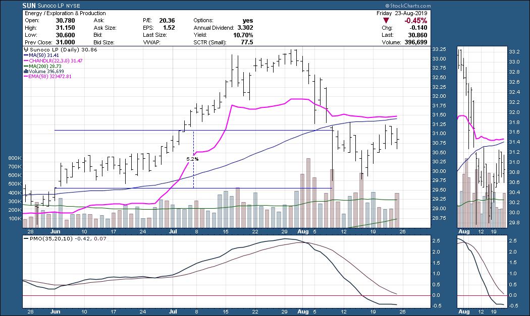
One of the concepts that I have been rolling out on the tech side of our process is the "Pink Line" model. This model is quite simple and is primarily based on the 50/200-SMAs and a pink chandelier exit, with a little momentum thrown in on the side.
- The wind must be at your back: 50-SMA and 200-SMA are rising. Price is above the 200-SMA. (I also recommend checking whether the SPX is doing the same thing before entering)
- Conservative buy points occur when price crosses above both the 50-SMA (blue line) and pink line.
- A more aggressive play would be buying when price rises above either the pink or blue lines.
- The exit "attention flags" occur when price crosses below either the pink line or the 50-SMA. I recommend analyzing the chart to determine if there is too much weakness.
- The actual "Pink Line Exit" occurs when price drops below both the pink and blue lines.
Given the market's volatility and the fairly new IT Trend Model Neutral signals that have arrived on the major indexes, I'm not going to suggest new longs. There were only 7 "buys" today on the Pink Line scan - and they were mostly bond funds.
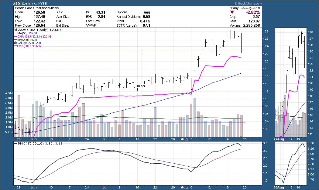
I wouldn't buy if the market itself is volatile or showing internal weakness. So I thought it would be instructive to step back in time to June 3rd (first trading day). Admittedly, the market probably set its last low for some time on that day, but we were also seeing moving averages and the PMO perking up as quickly as June 4th. I ran the scan as if I were running it after the close on that day and came up with 30 results. Using ONLY the mechanical pink line conservative entry of a cross above both pink and blue and an exit when the close fell below both lines, I found somewhat surprising results.
Below are a selection of charts. I checked all 30 charts and, based solely on the mechanical model, I tallied 16 winners, 9 continued holdings that are still up and 5 losers going by the model's criteria.


Conclusion: The mechanical model was successful, but it did have the advantage in this sample, in that the first trading day of June turned out to be pretty much the market bottom. There is more back-testing to do. I believe that using the DecisionPoint PMO and Trend Model for the SPX as a safe entry screen could improve results by preventing you from opening longs at the wrong time. You can ensure the wind is at your back before entering any new positions using DP analysis. What I mean is that everyone should watch the DP Scoreboards on your homepage! We picked up Neutral signals this past week, so now we wait for another IT Trend Model BUY signal or PMO BUY signal to clue us into opening possible longs. Stay tuned as I continue to back test. I did note that trying to enter the market starting in July was a bad idea, with losers equaling winners. However, had we watched momentum on the SPX, we would have seen it shift lower in mid-July before the bloodbath at the beginning of August. Mechanical signals and models are great, but there is generally some analysis work to do. Remember, I wouldn't have been able to enter all 30 positions on June 3rd - I would've had to do my homework and pick the best candidates based on my analysis process.
Watch the latest episode of DecisionPoint with Carl & Erin Swenlin LIVE on Fridays 4:30p EST or on the StockCharts TV YouTube channel here!
Technical Analysis is a windsock, not a crystal ball.
Happy Charting! - Erin
erinh@stockcharts.com
Helpful DecisionPoint Links:
Erin's PMO Scan
DecisionPoint Chart Gallery
Trend Models
Price Momentum Oscillator (PMO)
On Balance Volume
Swenlin Trading Oscillators (STO-B and STO-V)
ITBM and ITVM
SCTR Ranking
**Don't miss DecisionPoint Commentary! Add your email below to be notified of new updates"**
|
| READ ONLINE → |
|
|
|
|
|
| MORE ARTICLES → |
|
